
Once Again, Don’t Get Your Science from Facebook!
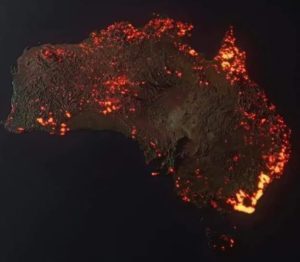
A visualization of the Australian fires that have happened recently (by Anthony Hearsey and Creative Imaging: click for more info)
I have made two posts so far cautioning people to be very skeptical of science-related Facebook posts (see here and here). In general, you should be skeptical of anything on any social media site, but science is easily skewed and misrepresented, especially when people are trying to show their own virtue by championing some cause.One case in point comes from the Australian bushfires that are wreaking havoc throughout the country. My Facebook feed recently showed me the image you see on the left. The person posting wanted to make me aware of how devastating the bushfires in Australia have become, so he posted this picture. While it does indicate an incredible level of devastation, it isn’t really true. There are two problems with the image. First, it looks like a satellite photo that is showing the fires burning right now, but it is not. It is an image that was developed on a computer, and it doesn’t show how Australia is burning right now or at any other time in the past. Each “flame” in the image represents a fire that burned sometime this season. In other words, it shows any region of Australia that had a fire this season, but it shows that region as on fire right now. In fact, many of the fires depicted on this image have been extinguished.
There is a bigger problem that is common with all visualizations of this kind. When you make an image like this, you need to add “fire” in the region where there is or was a fire. However, the image represents something very, very large. Suppose there was a fire that burned three square miles. That’s a big fire, but in this image, it would be represented by a red dot that is one millionth the size of the image. Thus, it wouldn’t show up. In order to make it show up, you need to make it bigger. However, that makes it look like more than three square miles were burned.
This issue is called “gridding.” When dealing with a large object, it must be partitioned into small sections by drawing a grid. If the sections in your grid are very large compared to the areas that you are depicting, the resulting depiction is deceptive. So, in fact, even considering all the fires that have happened so far this season (extinguished or not), they haven’t covered as much of Australia as the “flames” on this map.
Now don’t get me wrong. I am not saying that the fires in Australia are nothing to be worried about. They most certainly are devastating! They probably represent the worst bushfires in the past hundred or so years. That’s a bit hard to tell, because some of the most devastating fires in Australia occurred in the past, when news coverage wasn’t very good. We know, for example, that in 1851 widespread bushfires killed at least 12. In 1939, bushfires killed at least 71. While it does look like the current bushfires are burning a larger area than any of the previous ones, it is hard to say that with certainty. Regardless, the image above definitely overstates their severity.
The other thing that has to be said is that these bushfires are not the result of “climate change,” AKA global warming. In fact, we know that many of them are the result of arson. Since November, 24 people have been arrested in Australia for deliberately starting fires. In addition, another 183 are facing legal action because they did not obey fire-related laws, which might have led to even more fires. Thus, while it is popular to blame “climate change” AKA global warming for these fires, irresponsible and/or evil people are at least partially to blame. In addition, bushfires like these have been around long before carbon dioxide levels were rising in the atmosphere.
But wait a minute. These fires are spreading so quickly because there is a severe drought in Australia. Couldn’t the drought be caused by “climate change,” AKA global warming? Not based on the data we have right now. In 2017, a report on global droughts was published by the NOAA. The following graph, which depicts the percent of the globe that experienced drought each year, comes from that report:
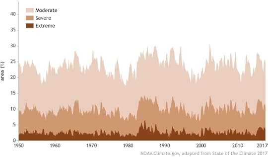
Notice that the percent of the globe that has been in any level of drought shows little (if any) trend since 1950. If “climate change,” AKA global warming were producing more droughts or increasing the severity of droughts, it should show up in a graph like this. It does not.
Once again, I am not downplaying the devastation that is occurring in Australia. In fact, I have donated to the relief effort, and if you feel led, you should as well.


Jay L. Wile's Blog
- Jay L. Wile's profile
- 31 followers

