Creating your cover
You've developed a sparkling personality, put together a wicked booth, and tracked down the best cons you can reach with your limited travel budget. Now you need a great cover to seal the deal.
There is no shame in paying someone to design the cover for you, but there is a good chance you'll still have to assemble the final product for print. Graphic design majors can do this in their sleep, but writers might not be quite as comfortable, so here's a brief overview of how to do it. Every printer will work a little differently, but I will be showing you the process of creating a cover for Lightning Source, who we are using to put out season one of The Wonderboy Serials.
First off, ensure that you are working in CMYK versus RGB. RGB is often the default and is used for images that will only be viewed from a computer screen. CMYK is standard for commercial printing.
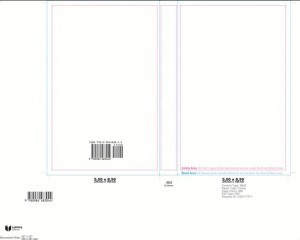
Second, ensure that you are leaving sufficient bleed for your project. Bleed is basically an extra quarter inch on all sides that gives the printer room for error. This is a little more complex for a novel because you have the spine to consider when designing the project. Check out the image below for the guidelines Lightning Source gave me for my project.
This template was designed for my specific page count using an engine on their site. What I like about this template is it gives you clear bleed lines. If you have Photoshop, or a similar editing program, you can delete the white space so the image becomes transparent. You can then lay your cover image under the lines, making the process fairly idiot proof. If you are using Publisher, which I have in the past and it worked fine, you just need to watch your rulers closely.
Also, even though the bleed lines are clear, refrain from moving your logos, or text too close to the edge. It will make the cover look crowded.
IF YOU PURCHASE YOUR OWN ISBN NUMBERS, DO NOT PAY FOR BAR CODES! As you can see, the bar code was already placed for me. Most printers can create a bar code for you for free and there are programs online that will allow you to do it yourself. The first time I bought an ISBN, I chipped in the extra $50 for a bar code and it didn't even work, so just get the ISBN number and let your printer create the bar code for you.
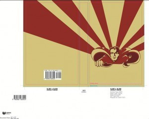
Here is the cover image placed.
Notice that the beams extend out to the edges beyond the bleed lines. I don't mind losing that part of the image and I also want to make sure that no white space will show if there is a deviation in where the paper is cut. I also dig having the image wrap around the spine, but even if you don't, make sure that the spine doesn't clash with what's happening on the front and back. For the anthology, I took the original Issue One cover design by Karen Martin and extended the beams out to the back. I also gave myself plenty of room on the top and bottom of Wonderboy to put on the necessary info. For good cover images, ere on the side of simplicity. A single, striking image will do more to sell a book than a lush and complex cover.
What I believe needs to be on every cover is:
FRONT: Reputable review quote(media or notable author, not your mom)SMALL, Title BIG, Author(s) MEDIUM.
BACK: Description(not too long, not too short, just detailed enough to grab the reader's attention), publisher logo(if you are self-published, create your own small press and throw the logo on there), price, website, bar code. Some people will throw more quotes on the back, but it can look cluttered if you aren't careful. I also tacked on the Wonderboy logo for balance.
SPINE: Title, author name, publisher logo.
Once you are done, check your printer's preferences. Some will want a .jpeg, some will want a .pdf, some might want the original Photoshop document so they can tweek as needed. Also, make sure you are saving it as a high resolution image. Jpeg and TIF will give you the option of saving at 300 dpi or 150 dpi. If you save at 150, the print image will look pixilated and cheap. Also, don't use a compressed image on your cover. Check the file size if you aren't sure. If it's a 72 kb image you pulled off your Facebook page, it will look gross once it's printed.
Finally, be prepared to make changes when the printer sends it back to you. I have sent several projects to the printer and still get them shot back to me for making stupid mistakes like not centering the text, not embedding fonts and, sigh, forgetting to take the guidelines off the finished product. It happens. Just stick in there and know that once the cover is done and looks stellar, it will do a lot of the heavy lifting by drawing customer interest to your table.
Here is the final product of the season one anthology of The Wonderboy Serials.
Good luck!


