
Making of a Cover, Part Five
The last few weeks have left me worn and tired. I have been working tirelessly on perfecting the cover of The Unfettered Child while also working with my editor to perfect the manuscript.
What more could be done with the cover, you ask? Actually, so much more. I find something more to fix almost every time I looked at it. It’s been a while since I did part four of this series, so let’s back up to then:
 The cover first uploaded to Amazon.
As you can see, I had Samara standing in the corner, looking kind of vague, her feet shrouded in shadow (okay, a gradient really), and striking a tree in the distance. Something nagged at me when I presented this cover, from the beginning. I couldn’t put my finger on it right away.
Then a comment on Twitter shined a spotlight on the issue before me. The comment was: “Dude spent 8 years at magic school just to burn down a tree. That’s dedication to a grudge there…”
It was a funny comment, but it raised the question, “Why is she attacking a tree? Also, why should the tree be focused on at all?” So I jumped back into the file and started making adjustments. First, I wanted to focus more on Samara. I came up with this:
 Samara centered in the image.
I still had issues with the above image, something seemed off. One, she was still attacking the tree, which didn’t sit well with me. I decided to enlist some help.
I went on over to Reedsy.com and signed up for an account. I already knew the website had tons of resources for authors and decided to look there first. However, I also knew that I didn’t have a lot of funds for this, and I know a thing or two about Photoshop.
So I made a bid on Reedsy to five artists that looked appealing to me and might be willing to help with my request, which was coincidentally unique. Two of the cover artists flat out rejected it due to being too busy, and the rest sent me quotes.
My first quote was basically, “Yeah, your cover sucks. Let me do it over from scratch for lots of money.” The second quote was much more diplomatic, but essentially the same.
Along came Gwen (@UponADayDreamer), who offered to be an “art coach.” I have to admit I had no idea what that entailed, but I decided to plunge in and see what happens. At the very least, I might learn a thing or two.
The first thing she asked for was composition thumbnails. I said to myself, “What the hell is a composition thumbnail?” Instead of sounding dumb by asking her, I asked my friend Google. Google rarely lets me down, and didn’t this time either. So, in short order, I did this thing.
For those of you who also had no idea what a composition thumbnail is, I won’t make you ask Google. Basically, you’re blobbing your figures with grey scale to help determine where the light sources are, which will in turn help you figure out shading.
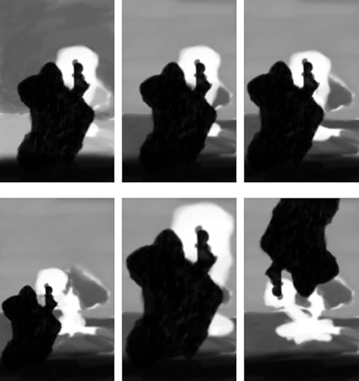 Composition Thumbnails. The last frame is a joke, of course.
 The last five of these were to see what a lighter sky and a darker ground would look like. Also, re-positioning the figure, having the tree and not having the tree.
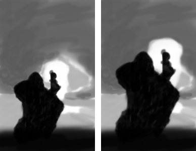 More thumbnails
These two were with the dark sky. I decided I like the larger figure and the darker sky out of these, so we moved on.
She then asked for more with more details drawn in. This was where I had to raise my hands in supplication. I told her, “I can do photo manipulation, but I’m no artist. I can’t draw details.” So she told me to gray scale the work and make thumbnails like that. This time, she wanted me to change a few things.
First, she said, “Your story takes place on a tundra. Oak trees do not grow on the tundra. You need to replace it with a pine or birch tree.” Fair enough. Then, she said, “You need to make it larger to show scale better. But also try some different things. Have her strike a different type of object, maybe a person, also try to just have absorbing the lightning from the sky, leaving the tree alone, and also absorbing the lightning with no tree.”
So I sent her these thumbnails next:
 More details in the composition thumbnails.
As you can see, in the top left corner, she is absorbing lightning and the tree is left alone. In the top right, the tree is gone and she is absorbing the lightning. In the bottom left, she is shooting a camp fire. Last, she is attacking the tree.
I personally liked the tree gone and her absorbing the lightning, so we went with that.
Next, I sent her the image I was going to use for the full cover (which I don’t have a color image for anymore:
 Full cover with first “absorbing the lightning” image.
 She told me that she didn’t like two bolts coming down, so I removed one, and it did look better. I sent that to her and she suggested I put one in the back part of the cover, striking in the distance. So I sent her this:
You’ll also note that I removed the solid black on the bottom on these last two images, and just had Samara’s shadow there. The dark shadow behind her was there for a reason. I did not get my daughter’s feet in that picture and I was trying to cover it up.
I actually have a ton of images showing the multitude of changes we went through. It was a very big back-and-forth game for weeks. Each time, we would improve the image a little more. We adjusted the lighting and shadows, added the grass, and finally, she convinced me to plunge in and try to draw her feet in. I did, with great results. The final image was truly a masterpiece. The best art I have ever done.
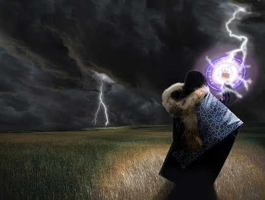
 The Unfettered Child without title
After we finally finished the image, we moved on to the text, but we were dangerously close to running out of time, and I couldn’t afford to tack on hours to keep going. However, in the last two emails she sent, we managed to fix the text for a great end result. We lowered the U in “Unfettered” and the C in “Child,” centered the title, and brought it lower. Next, we had the lightning shoot through the D of my last name, which was a really nice effect. Last, I added a tagline, and it is just amazing. Check it out here:
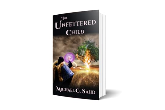
 The final cover
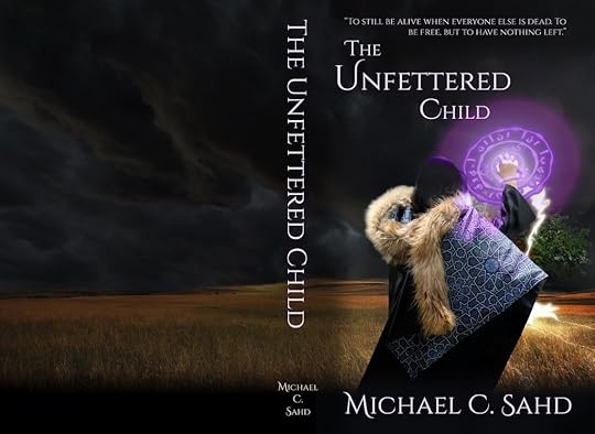
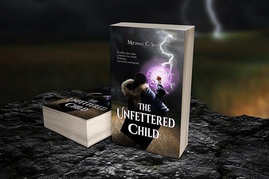 The final mockup
What do you think?
~Michael C. Sahd


