
Design Mistakes: The 3 Biggest Color Palette Missteps (& How to Get it Right)
 image source via jungalow | design by Justina Blakeney
Hey guys, resident color expert Ryann here. Alright, maybe “enthusiast” is a more apropos term but if eagerness and excitement over the nuances of color counts for anything, rest assured you are in good hands. At any rate, what better way to initiate my one-year performance review than to have me tackle an installment of our Design Mistake series. Let’s see if I am up to the task.
When it comes to picking a color palette, it seems easy enough, right? You pick some colors you like, paint some walls, buy some things in said colors and boom, room done. But well, sadly, it’s a bit more nuanced than that. Maybe in your mind, avoiding “ugly” colors is half the battle, but let’s stop for a second to say that there are no ugly colors…just unfortunate pairings or use of color. There is A LOT we can dive into, but today, to keep it focused, I’m going to walk you through a few color “scenarios” and show you examples of rooms that didn’t quite get it right and rooms that did. And don’t worry, all this information is coming from the brain-trust of EHD, so you can rest assured all this information is designer- (and not just Ryann-) approved.
1. Boring Neutrals:
First, I want to say that neutrals get a bad rap. Arlyn wrote a whole post earlier this year that walked through the seven keys to decorating with beige successfully and if your idea of a bold statement color is taupe, go read it. And for anyone who wants to immediately scroll down to the comments to say neutrals are not color, I say keep reading because yes, around here, whites and beiges can comprise a color palette and you should know how to get it right, too. Alright, let’s look at some rooms.
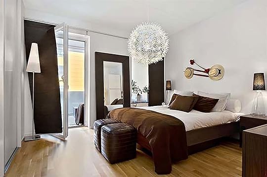 image source
Why it isn’t working: I know for a fact some of you are not on board with a brown room at all (as discussed in the comments in this post a while back), and I get it. The 1970s were scarring to some due to the wood paneling frenzy and the ’90s only brought horrifically bland resurgences of it. Case in point, while the above room isn’t “bad” per se, it’s definitely heavy-handed in the brown that might make some of you twitch. It’s one tone of brown used over and over again. Whatever color you use (in this case brown), you need variation in tone. All your eye registers are “white” and “brown” with very little else in between and it falls flat.
 image source
Why it works: I could quite literally stare at this room for hours, so it is safe to say there is nothing boring about this one. The architecture does a lot on its own by adding a ton of visual interest, making the brown/neutral color palette totally doable. Plus, in this case, the heavy lifting is done by all the wood tones with less stark contrast because the walls are taupey gray rather than why. I mean those doors? The ceiling? Please. And while sure, the rust chairs don’t necessarily fall under a neutral category, they almost blend right into the rich wood surroundings, and in this case, act as a neutral.
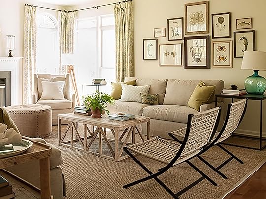 image source
Why it isn’t working: Let’s look at another example. I love a neutral room, but they are really easy to get wrong (because they are so hard!). Here, the amount of tan shades simply turns into one giant mushy beige room. You don’t necessarily want high contrast, but you do want variety. This is a study in making sure not everything in your room is the same hue. And although some color in a neutral room can be good, the teal lamp feels like an afterthought.
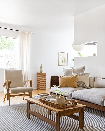 photo by tessa neustadt | from: Mel’s Home Tour
Why it works: Any time I think about a neutral room, I come back to this. This was before my time here at EHD but man do I wish I could experience this space IRL. But I digress. If you read Arlyn’s How Not To Design A Boring Neutral Room, you may remember that it is necessary to have varied wood tones which Mel does well here. A neutral color palette needs to be coupled with complexities via textures and tones so that color doesn’t need to be the main event, but the room is still not boring. The rug with its off-white and darker gray adds a bit of punch and visual interest while the white curtains set themselves apart from the linen, flaxy seating.
2. Lacking Color (and Texture) Variation:
Honestly, the lack of color variation is probably one of the biggest mistakes people make when putting together a palette. We already talked about it a bit up in the “boring neutrals” section, but let’s see what we mean when it comes to specific colors…
 image source
Why it isn’t working: That is just so. much. light. blue. If it isn’t beige or gray, it’s the same tone of blue. I understand the intent here, though because light blue can feel calming and seemingly safe in design. BUT, every color has its limit and I think we reached ours here. This room is dying for some darker blues and grays to really balance the palette. A good rule of thumb, if you want to go mostly neutral but sprinkle in one color, is to make sure you’re bringing in a sampling of hues of said color. It’s like a long paint chip from the hardware store, right? The lightest tone on top down to the darkest hue on the bottom…use them all. You can even pull in other shades of your color of choice, but it’s best to bring in at least one more color so your room doesn’t feel one-note.
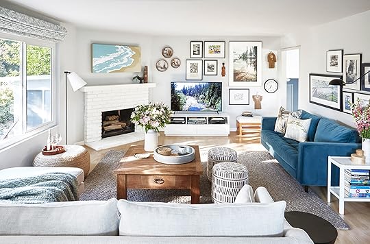 photo by zeke ruelas | from: Combining Furniture Styles In The Casa Soria Living Room
Why it works: Just like room above, blue still feels like the star here, thanks to the art and wall color, but the wood finishes create a calm and organic feel and you’ll notice Orlando didn’t run with using that peacock blue of the sofa on EVERYTHING. The throw is a softer blue, the art is a brighter aqua, the neutrals that complete the palette are varied, from charcoal to gray to neutral woods and seagrass. Speaking of, the textures are also varied, bringing in more visual interest so the colors don’t have to be the main focus without feeling like a “beige” room.
 image source
Why it isn’t working: This green and gray combo is a GREAT example of something we see done often: take your one color and match it in EVERYTHING you put in your room. Really look at that room. Does it feel a bit flat? Does it invite you in and make your eye want to wonder? Honestly, probably not, because a space full of the same shade of everything is just not visually compelling enough.
 image source
Why it isn’t working: This looks like it may have been a staged room back in the early 2000s so we’ll give it a pass, but let this be a lesson for us all: too much matching does no one any good. Instead, give your eyes a treat and add variation to your color palette. Instead of six framed pieces of art containing the same color green, go for one statement piece that incorporates other shades and colors, and sprinkle those colors throughout.
 image source
Why it works: Two words: textures and variation. I repeat: TEXTURES AND VARIATION. I get it if you don’t want a room with colors EVERYWHERE and just want to rock the mostly-one-color palette, but there are ways to make it interesting, I promise. Here, the tonal grays feel purposeful, and the couch gets to be the real wow factor. The rug appears to be a slightly different shade of green which brings in that variety the other previous rooms craved so badly.
 image source
Why it works: I couldn’t possibly move on with my life without showing you how bright neon green can actually work. Of course, not many would lean toward that specific shade, but I can’t deny that it is working here. With a primarily green room, the secondary green hues come naturally and within a green palette, it always feels cohesive to bring in wood tones and textures, to create that good “nature” effect. The worn leather chair adds warmth, and the softer lighter greens and olives cut through the sharpness of the chartreuse.
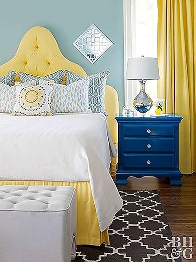 image source
Why it isn’t working: Kudos to anyone bold enough to go hard with a sunshine yellow. Even in a kids room or a nursery, it is a tough color to get right. Too buttery and it can lean a bit depressing and “retirement nursing facility”…too bright and it’s frankly just hard to live with. Here, paired with dark and light blues, it comes across a bit old fashion which could be, in part, my own biases. However, with a bright yellow like that, it is easy to over do it. The room could do without the matching yellow curtain and instead go with a neutral accent or even just another shade of yellow, and I’d love to see a painting (or rug) to pull the rest of the colors together.
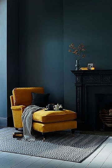 image source
Why it works: That mustard yellow is bold and so is that dark teal wall, so why does this feel so right? Because despite the intensity of both, the room is minimal throughout with just enough…say it with me…variety. No two surfaces are the same color yet still coordinate in that cool tonal way we love so much here at EHD. What I mean is, the blues here are close together on the color wheel which lets the one dramatic yellow moment shine. Sometimes all you need is variety in ONE of the color picks to get that ineffable sense of “this is right.” Every time I look at this, I fall in love with the colors all over again. 100% would have a cocktail on that chaise whilst listening to jazz.
3. Bright & Bold Overload:
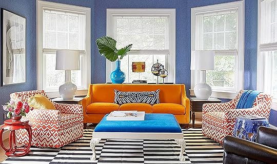 image source
Why it isn’t working: To be honest, this room is not not working, it’s just a lot of color, which if that makes your heart sing, scroll along. But I wanted to discuss something here. Everything here is a “moment” and what I’ve learned so far this year at EHD is a room works best when you “pick your moment.” Here, the wall, sofa, chairs, ottoman, and accents are all calling out for your attention. There doesn’t seem to be a “grounding” piece where the palette is being pulled from (more on that in a bit), so everything stands on its own without a touchstone, which can leave a space feeling busy and overwhelming.
image source via jungalow | design by Justina BlakeneyWhy it works: Each color present here has an anchor, which really (if you haven’t already guessed) is THE rule for choosing your color palette by the way (keep reading ’til the end for the rest of the rules). The bold orange couch anchors the orange accents in the pillows and on the shelves. The blue carpet ties in the patterned blue coffee table. The plants allow for some pops of green and since the wall color is neutral, there is room to play with the more bright and bolds on the color wheel. If I were to take a guess, maybe Justina had those two embroidered pillows to start with, and pulled out three key colors (orange, blue, yellow), then brought it back down to earth with a peppering of white, black and wood tones.
 image via Jess’ Living Room Reveal
Why it works: For a quieter, minimal yet bright colored space, take a page out of Senior Market Editor, Jess’ playbook. She’s playing with oranges, pinks, reds, and of course that powerful velvet blue, and it all makes sense and is not overwhelming but is still bright and fun.
Well, as much fun as that was, I couldn’t leave you sans a concise step-by-step to color palette-ing, because what kind of EHD woman would I be if I did? We’ve talked about these before but for your convenience, I polled the office and put together EHD approved step by steps:
How To Find And Execute Your Perfect Color Palette:
Step 1: If you are completely starting from scratch, pin or bookmark inspiration until your head spins. Then, take notice of your research. What are your consistencies? What colors are you drawn to? You might be surprised by what you find!
Step 2: Once you see your color preferences, imagine how you want the room to feel, and further narrow down your search from there. (i.e. think about your uses of the room, and how you want to spend your time there, then read this post on color psychology.) 


Emily Henderson's Blog

- Emily Henderson's profile
- 10 followers

