
The Messy Process – How I Chose ALL The Lights For The Mountain House “At Once”

This post about the mountain house lighting is going to leave you with three feelings –
1. ‘Yay I got a sneak peek with lots of inside information …?’… then
2. Wow. Emily’s design process is very messy, even amateur… ending with the question…
3. Is this house even going to look good?
When I came up with the original ‘how to choose a lighting plan for the whole house’ concept last week, I assumed that all of the lighting would look good presented TOGETHER on one board, and we could show you how we seamlessly curated them all, using analogies like ‘think ‘cousins’ and ‘siblings’ but never twins’. And while it looks so amazing together in person (barring 2 that are awesome but might be changed out at some point) it actually doesn’t look that great on a board together. HOW?
Well, like anything tactile that’s because sharing 3-dimensional design on a computer screen lacks, well one whole dimension first of all. But it also lacks texture, and in this case, we are talking lighting so it’s a lot about experiencing the room with the actual light.
But before I show you the board with all the final choices, you need to see the process, my process. It’s messy, as is any creative process (and if it’s not messy, then I have to tell you it might not be that creative). But when I’ve shown it to my friends or any new employees they find it A. alarmingly amateur and B. super easy and helpful.
Again, the program and skills you have will dictate how good this looks, but I use Keynote on Mac and have very poor Adobe skills so this works for me. The reason I use Keynote? Because it’s so easy a toddler could use it. Like even my toddler who likely inherited my alarming lack of Adobe skills. You drag and drop. Hell, my kids can do that ALL DAY LONG. In fact, (may I rant? oh dear I do think I’ve been watching too much Outlander these days) my whole team used to make fun of me about my Keynote enthusiasm. FOR YEARS. But the truth is, I’m bloody fast so I need a fast program. I need to be able to switch out things super easily without turning ‘on’ and ‘off’ different layers and trying to remember which layer does what (surely there is a Photoshop joke in there somewhere). Well, one day, during the Portland project when Brady was doing a great job on Photoshop but it felt too precious for the speed in which he needed to work I suggested sheepishly that he try Keynote. He went to school for architecture – he does NOT do mood boards on Keynote, so he continued his resistance, but I was his boss so he tried it and then a week later, gone missing, we found him holding a ‘Keynote and Beyonce for president’ sign on the corner of Sunset and Hollywood. It’s just so fast and you can switch things out, move them, resize and add text so quickly. She ain’t pretty but she works well.
So here is my process:
Step 1: You scour the internet’s lighting resources for probably 65-70 hours over the course of 3 months. This is often performed best with a glass of wine while watching Younger, Sex in the City or a Real Housewives – something that requires minimal attention and makes you feel like you are hanging out with your best friends. It could even be actual Friends. The process is flexible as long as there is on-screen kissing involved.
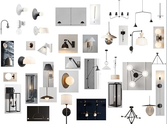
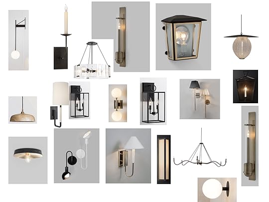
Step 2: You screengrab any photo of any light you might possibly like within your (4) styles and drag it onto a keynote page. Since our style was/is ‘modern mountain, contemporary California, refined, rustic Scandinavian chalet cabin’ there was a vibe, but it did span both handmade pottery and linear modernist contemporary lights. So I screengrabbed them all.
Step 3: VERY IMPORTANT – You also PIN all of these onto a Pinterest board from their original store/source or you will have literally no idea where you screengrabbed it from and you will eventually take your wine glass, break it and shove the small glass shards into your eyes wishing to stop your maddening world wide web search. A wise man once said, “Better to never see at all than to look for one lamp for the rest of your life.”
Step 4: You size it down so you can see everything. You literally take the little corner thing and drag is so the picture gets smaller. Then you add page after page… I had like 15 pages of just lights.
Step 5: You play around. This ‘playing’ part can last months. To your partner, whom you might ask opinions of, it can often feel more like torture, but to you/us, it’s the fun part. However, this part can also be paralyzing. You like so many. You don’t want to be basic. You don’t want it dated, nor do you want it too traditional. You don’t want what everyone has seen a million times, but you don’t really feel like taking huge risks, especially when they can be expensive.
Step 6: Finally, you ORGANIZE. A good idea for “playing” is to organize it either by style, type (sconce/pendant) or by room. For the blog, we organized it by style to best show you what styles we were considering. Then we started eliminating and “promoting” the losers and winners. It was like fantasy football or March Madness, for sconces. I don’t ever delete, I would instead drag the rejected off the page (hidden outside of the frame, but retrievable). Then yes, I would start taking favorites and put them on a few new pages. Then even if I loved one, if it didn’t seem like it was playing well with others I would remove.
This is the part that is tricky because I think that if you love one and it is in your style then it’s ok if it doesn’t look great with a sconce 3 rooms away – you’ll never see them together. I wish I had not eliminated some of the more raw pottery pendants or wood sconces that I loved that sure, but wouldn’t have worked with much of the more linear modern pieces. However, in their own rooms could have been beautiful and added so much warmth. No real regrets here, but just a warning that if you love something don’t worry too much if it doesn’t look great next to another that you also think works.
Lighting Options 1:

Lighting Options 2:
Lighting Options 3:

Lighting Options 4:

Admittedly I’m one of the most open-minded people in every subject–yes, from politics to lamp styles–making my decision-making process often tortuous. It’s not that I’m indecisive, I just really see every side and can easily see the benefits of choosing something budget vs. custom, hand-made vs. mass manufactured, minimalist vs. decorative, stylish vs. sleek, etc. And that doesn’t even cover function. I’m by nature eclectic and like/need the occasional surprise and unpredictability of something special that doesn’t quite fit.
So then I started breaking it down by room.
I started adding the lighting to boards with some of the hopeful other design elements. We didn’t have any renderings at this point so I was actually just screengrabbing elements that kinda looked like what we might choose to see how the room would turn out. I wrote text on them like ‘I LIKE’ or even ‘YES, DON’T CHANGE’. So bossy. Funny enough I often did change and former Emily did not sue. Litigious we are not. So below you’ll see a bunch of those notes, along with spelling and grammatical errors 


Emily Henderson's Blog

- Emily Henderson's profile
- 10 followers

