Creating Marketing Materials
I read an interesting newsletter article this week on creating marketing materials. It was specifically geared toward materials for that venue, but it got me to thinking. And creating.
Starting next Wednesday, the SCIU books are on sale. Taking ideas from the article, I came up with this:
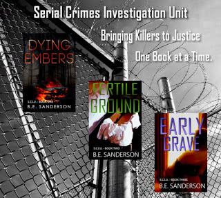 I think it still needs some tweaking. The white 'Bringing Killers to Justice One Book at a Time' on the gray background might have been on the no-no list. When I made it, it looked pretty good, but seeing it now, it's kind of hard to read at this size. Might need to outline those words like I did with the SCIU words.
Still, I think it carries the message I wanted and it's not too busy (which was another of the marketing no-nos). You can tell that's a prison fence, right? Yeah, not all the villains in the series make it to behind the fence, but I was trying to find one image to convey a theme for all three books and nothing says 'justice' like a prison.
I found the fence picture at Morguefile. Then grayed out the image because a pretty blue sky wasn't right and the colors would've distracted from the covers. I think. And I tweaked the brightness and contrast to come up with a sufficiently gloomy feel.
Then I added the covers and wording, moving things around and trying different fonts and tweaking everything until I came up with what you see above.
Anyway, creating marketing materials is a learning curve. I hope this image works. The proof is in the pudding.
So, yeah, the article said to make the image clear as to its purpose. Prison fence... Got it. And to not make it too busy so it doesn't distract from its purpose. Three covers, minimal wording... Check. And to make it easily read. Umm, I'll work on that. Clear, concise, intent on its purpose... check, check, check?
Now, the question for you all is: If you saw this, would you be inclined to explore the series further with the intent to buy? Because that's really what all of this is about. If you can't achieve that with your marketing materials, you're spinning your wheels. And lord knows, none of us has time for that.


No comments have been added yet.