
Arlyn’s Moody Dining Room Reveal Is All About the Insane Power of Paint

Welcome back to Day 3 of Arlyn Takes Over the Blog With Her MOTO. Last day, promise. You can have Emily back right after I’m done parading my dining room around your eyeballs. Thanks for hanging in there, but I left the best for last. For anyone just joining, there’s been an intro post and a living room reveal so far, and today is my dining room, a.k.a. my favorite room in my whole home.
You got a sneak peek yesterday of the above, but now it’s time to turn the corner and show you the rest…
But first, let’s acknowledge the “before”:


Cute, but the furniture was too small and the whole thing fell a little flat. Sure, there wasn’t much in here (this was right after we moved in), and I could have jazzed up what I already had, but I had other plans…

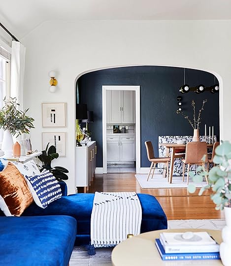
As I mentioned in the intro post, this room went through quite the design transformation. My moodboards started out as one thing (light walls, dark furniture) and then I flipped everything. After I went with a white color in my living room, I knew I wanted this to be the drama moment in the front of the apartment. So often people say their powder room is the “jewel box” of the home, but well, I don’t have a powder room, so this is my jewel box.
The wall color—Inchyra Blue by Farrow & Ball—absolutely makes this room IMHO. I wasn’t sure if my landlord would go for it, but I had already mentally built the space around it, so I sent off an email with a hope and a prayer (and a promise to paint it back) and all went well. Phew. It reads a little more teal in these photos because of the light, but it’s so wonderfully chalky and this very happy place between blue and green. It has a certain je ne sais quoi. The decision to paint the ceiling was a no-brainer. The curve of the cove ceiling would have made for an awkward transition if I left the top white/beige, so I went all in and boy am I happy I did. It feels like the room is hugging you. It’s good for the soul, the chicken soup of rooms.
With regards to the furniture, my approach was “design a living space, then make sure there’s a table and chairs” so I started with the dining bench first and foremost because every living space needs a sofa(ish) piece. (FYI, the idea to design it like a living space came from knowing I would do far more than just dine in here…I sit in here and work sometimes, I perch on the banquette and chat with Charles if he’s in the kitchen or vice versa…I really wanted this to be the “salon” of the apartment, if that makes sense.)
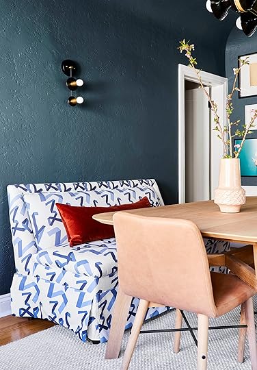
I honestly can’t remember how I found this, but it’s a new piece designed by Angela Chrusciaki Blehm for Chairish. Maybe it was Instagram, maybe it was an email, maybe it was directly on the retailer’s site, but either way, it was one of those moments where things clicked. I know it’s not for everyone, but the whimsical ribbon pattern was just wild enough to break up the seriousness of what this room could have been. The color is white and slate-y blue (sometimes the light makes it feel a little more cobalt), which felt like a good place between the wall color and the sofa in the living room. Emily called it “editorial” and yeah…let’s go with it!
To balance the dark, moody paint color, I opted for a light and subtle table and chairs and Article had just released their new Ventu line that fit exactly the length I needed. It also comes as an 8-seater, but 6 was just right in here. While I don’t typically go for the whole matching dining set thing, there was enough going on in here that the tone-on-tone of the light leather chairs and blonde oak worked to break things up a bit.
As for why I chose to put nothing above the banquette, well…maybe I’ll fill that wall one day, maybe I won’t. I like to leave things open so I can grow into a space because design is never really finished, is it? If every single nook and spot is taken up, where will all my future treasures go? Besides, with the gallery wall on one end and windows on the other, I wanted a place to really just see the paint. Negative space is just as powerful as filling a space.

Because I didn’t really need any more pattern or color, I kept the rug (from Lulu and Georgia) simple but textural. The weaving alternates between white and gray, so the eye still registers it as “interesting” without being overwhelming. And because it’s made of wool, it’s pretty stain resistant naturally (just needs a little blotting and good as new).
Okay, let’s discuss one of my biggest headaches in this room: the light fixtures. I said this Tuesday, but this room is tricky because the lighting is centered on the room’s footprint, while everything else is a bit askew, centered to the wall between the kitchen opening and hallway door. That meant I needed to either be okay with a pendant/chandelier falling SUPER to the left of the table or find another solution. About a week or two before this shoot, as I entered straight-up panic mode, I was on Schoolhouse’s website and found this beauty. It was a God send, no joke. If I connected one canopy to the current junction box, and installed the other to the ceiling, it would miraculously be centered on the table. I have to imagine this is why they make these types of light fixtures. To help desperate people like me who can’t/dont want to move junction boxes. THANK YOU SCHOOLHOUSE FOR COMING TO THE RESCUE. It’s made of ceramic “bells”, brass plates and pretty white oak connecting pieces. This fixture is insanely special in person, and I’m very much in love with it.

Before moving over to the gallery wall, here is the IKEA Besta unit I teased about. I worked with Semihandmade and Park Studio to give this baby the makeover of her life. For anyone who doesn’t know, Semihandmade makes fantastic custom cabinet doors to retrofit onto IKEA furniture and kitchen cabinets, and here, I went with the beaded front in desert gray from Sarah Sherman Samuel’s line with the brand paired with the Mackinaw handles in large from Park Studio. Man do these elevate a big box piece into something very special. I’d love to add a custom-cut wood top one day, but I’m happy with it as-is.
This holds all our board games, some books, some tools, serving pieces like platters and cheeseboards, and all my small appliances. It used to be my media console, but it works so well in here to keep everything within reach when I need it.
A few other talking points because it’s impossible to get me to stop: those lamps…I found them almost nine years ago when I first moved to South Florida from Orlando (my home town). I was out to brunch with new friends/coworkers and we decided to stroll through an antique market happening on Lincoln Road in South Beach. I spotted these, fought about them with a friend who claimed to see them first (she didn’t), I won, ran to an ATM to take money out of my savings (don’t do this, very irresponsible), and then…they sat in random corners of several apartments before they made it onto this console. They finally have their time to shine. The circa 1960s Murano glass and bulbous shape is modernized with a black shade (hot tip, for you…black shades freshen up older silhouettes).
 photography by charles dundas-shaw
The silver pineapple—an ice bucket!—is another vintage piece from the ’60s. I found it on a work trip to Belgium a few years back when I was researching a story about antique shopping in Europe (oh, just some work dreams come to life). I was enjoying a cherry tart in an antique dealer’s ridiculously charming kitchen complete with roaring wood-burning fireplace when I spotted it and bought it on the spot. I left behind a pair of pants to make sure it fit in my carry-on. Sacrifices. Worth it.

Gallery wall time! Hats off to Jess who came over the night before my shoot and stayed up with me until almost 2 am to hang everything (I gave my neighbors the heads up after profusely apologizing in advance for the banging). I did not ask her to stay that late, she’s just a literal angel (who also has mad gallery wall skills…her living room proves it). Going top to bottom and left to right really visually enlarges this room and makes the ceilings feel SO tall. Anything that draws the eyes up will do this.
My favorite piece on this whole wall happens to be my favorite person in the whole world. Up there in the top right corner is a photo I took of my Charles (husband) that I had Framebridge print and frame. You can’t see it here, but in the opposite corner is a photo he took of me, so our images are hugging this wall of art. The line drawings are from Wit & Delight’s shop and such a fun graphic punch. I love so much of the art on their site, but I only have so much wall space.
The big black and white piece to the right of the sconce is a macro photo of pencil shavings Charles and I took and had printed years ago; it speaks to both our passions: writing for me, sketching (and photography) for him. Right underneath that is a piece that consists of little compliment notes from all my amazing coworkers. It’s a tradition we started in the office for birthdays, and it makes me very, very happy. Oh, and the stickman drawing is Orlando’s! My first weekend in LA after moving was his book signing at West Elm (where little did I know Grace was at, and I met Michael before we ever dreamed of him working here). He gave out these to the first 200 people; this is #170, Grace evidently has #49…typical Grace. 


Emily Henderson's Blog

- Emily Henderson's profile
- 10 followers

