5 Tips for Click-Worthy Pinterest Graphics in 2019
March 29, 2019
Nicole Frost, writer at Advertisemint, facebook advertising agency

Pinterest is currently one of the internet’s most powerful marketing tools, and it’s a great resource to attract potential customers to your website. As a primarily visual platform, the image you use is important in getting clicks. Here are a few ways to make your Pinterest images stand out.
1. Make Text Legible with a High-Contrast Background
How you write your image descriptions and alt-text is important for SEO. But, the text you use on the image itself is what will make someone either pin your post or keep scrolling. Use text that’s attractive and easy to read to help viewers get a quick understanding of your content. Large text in a bold, clear font draws attention. Keep your captions from getting lost by using contrasting design techniques like banners and color blocking.
2. Use Vertical Images
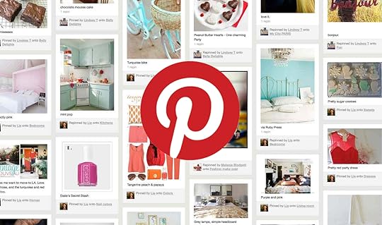
Every social website works best with certain image dimensions, and Pinterest favors long vertical images over horizontal or square ones. They take up more real estate on the user’s feed, and bigger is better when it comes to visual platforms.
3. Get Creative with Colors
 Keila Hötzel / Unsplash
Pinterest is one site where a minimalist approach can be easily overshadowed. Loud and bright is the way to go, with warm colors, like coral and yellow, dominating over more subdued tones, like gray or navy. Pinterest’s user base is primarily comprised of women, so it helps to keep this in mind when you’re selecting color palettes. Additionally, don’t be afraid to use clashing colors. This site is all about being the first to grab someone’s attention, so get creative with your color combinations.
4. Stick to a Cohesive Theme
Although the best way to see what works on Pinterest is to try different designs and styles, all of your pins should follow consistent branding. This will help you increase brand awareness and maintain a fluid look and feel on your boards.
5. Don’t Mimic Your Competition

It can be tempting to use similar pins as a template for your own, but standing apart from the rest is the best way to attract users to your content. Take a look at what people in your niche are posting, and try to create pins with different features. If everyone is using script text, try block letters or a bold serif. If your search populates a feed full of cool and dark images, keep yours light and bright. You don’t want your pins to get lost in a sea of similar posts.
Pinterest can be an invaluable asset for increasing website traffic and growth. Creating images that captivate your target audience while clearly conveying your message and branding is the best way to make the most of out this growing and powerful website.
Written by Nicole Frost, writer at
AdvertiseMint, best facebook advertising agency
The post 5 Tips for Click-Worthy Pinterest Graphics in 2019 appeared first on AdvertiseMint.