
5 Tips From a Graphic Designer on Creating an Impactful Book Cover
During the second month of our “Now What?” Months, we’re focusing more on publishing in all its myriad forms. Today, graphic designer Charlene Maguire shares some pro tips on how to choose a cover that really pops for your novel
:
“Why is a book cover design so important?” you might ask. Well, we all judge a book by its cover. A book cover has a visual language all its own through the use of typography, imagery, color, and emotional impact.
Your book is a little package of experiences, put together for your reader to enjoy. This package needs a sign outside to tell people what is potentially inside for them… a mystery to solve? A romance to swoon over? A drama, biography, or travel adventure? A fantastic cover speaks to the fans of a genre and tells them something about what they’re going to get.
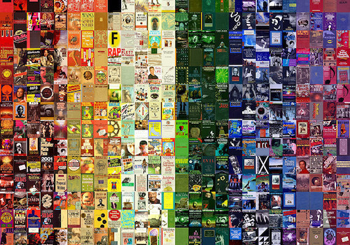
Your cover is your book’s first impression to your potential reader. In today’s crowded marketplace of limited attention spans, a person will decide if they are interested in your book in a matter of seconds.
1. Do your homework.You have to do some research. This is the key to understanding both what you might want for your cover as well as what appeals to readers. Go browse in a bookstore and scroll online. Choose some covers that inspire you.
Pro Tip: When browsing online, a cover has to be impactful both when you’re looking at it full size and as a small thumbnail. Online retailers will usually display your cover at varying image sizes, so know that it has to be clear and readable at different pixel resolutions.
2. Typefaces have personalities.Choosing typefaces is an art all its own. Pay attention to those covers that inspired you from browsing bookstores. What kind of feeling do you get from looking at the typefaces used for the title and author?
Pro Tip: Whatever is decided on for typefaces, it needs to be readable!
3. Color is important.The dominant colors in a cover can influence mood and play a large role in creating the contrast necessary to draw attention to your book. For a thriller/crime novel, Dark colors like black/navy blue give a sense of suspense and seriousness. For a heartfelt memoir, pale or pastel colors will convey a softer, more delicate feel. Is there a strong hero in your story? Bright contrasting colors will create a powerful stance.
Pro Tip: Complementary colors are those found opposite one another on the color wheel, and create a strong energy when used together. Analogous colors are those found next to one another on the color wheel, and give a more harmonic feeling when used together.
4. Emotional impact.We’ve talked about typefaces and color. When using imagery (photography or illustration) for a cover, you want it to speak simply and clearly. An image is a big part of your visual story.
Pro Tip: Characters, objects, and scenes in the book do not need to look *exactly* as they are described for a cover. Sometimes that can work, but most of the time a hint of something close that draws your eye in is best.
5. Your cover is not about you.Your cover is for your readers. What is the driving message of your book? what do you want people to know that will pique their interest? Put yourself in your readers shoes. Start the visual story there.
Pro Tip: When choosing to work with a designer for your cover, all points mentioned here reflect questions that will be asked by a designer. Send us what your story is about, examples of covers, and other preferences and specifications. From there a designer will use their creative expertise to give your book the best cover possible.

Charlene Maguire is an award winning artist, designer, and author. When she’s not creating stunning graphics for others with her 20+ years experience in the business, she’s working on her own product creations. Her oracle card deck “The Language of Heart Alchemy” was self-published in 2016, and she is currently constructing two other card decks. The writing bug has bit her hard as well, and a first novel is being written as we speak. Find her online at www.kissthesuncreative.com
Top photo licensed under Creative Commons from David Marriott, Jr. on Flickr.


Chris Baty's Blog

- Chris Baty's profile
- 63 followers

