
14 Rules for How We Style the Perfect Bedroom (+ 3 New Reveals)

We LOVE room reveals. Who doesn’t, right?! In fact, we love them so much we’re doing THREE today in one blog post. It’s a little bit of a different approach that we’ve taken with other Portland posts, but work with us. Like we said, we love us a reveal, but what we love even more is helping to empower you to take what we do and be able to translate that into your homes. For real. So in nailing down how to present the three guest bedrooms in the Portland project, we thought it best to not just be like “ohh pretty pictures, bye” but rather to get down to the nitty gritty—”back to basics” so to speak—of how to design and style a bedroom.
It’s a design show (you might remember?) inside a blog post, walking you through all the elements to keep in mind and why each of these individual rooms works. Hopefully, you’ll be able to channel your inner EHD and style a room (a bedroom for today’s purposes) hard, fast and effortlessly with solid styling tips.
Now, something to keep in mind is that these rooms were “styled to sell,” so, why although super beautiful, they all have a very similar look and feel. This just goes to show you that there are about 1,939,834,783,901 ways to style a room with one color palette and general style in mind. Let’s get into it.
Bed Styling
You need to start with the bed (duh) and color palette. Unless you want things to get real crazy real fast, keep that palette relatively neutral and cohesive. In true EHD fashion, blues, whites and grays were the main palettes for these rooms, but regardless of which hues you go with, there are some “rules” to keep in mind to make your bed look GOOD no matter what.

Mix solids with patterns/texture: This is all about visual balance and interest. Though still great (minimalism is alive and well), plain, simple bedding alone isn’t exactly aesthetically stimulating. Mix in the pattern people. A good rule of thumb is that if your bedspread is solid, bring in a patterned blanket and/or pillow and vice versa (i.e. if your duvet is patterned, make sure to have a few solid elements so things don’t look chaotic). And because we get that pattern isn’t for everyone, the same rule applies for texture…make sure to use varied textures even if all in the same color palette.
Mix up the scale of the patterns: Has anyone ever told you to either pick your eyes or your lips when it comes to doing your makeup? Well, the same goes for pattern scale. No one wants their pattern combos to look like it has a dark smokey eye with a bold red lip. It’s just too much to take in. So don’t have all your patterns be small-scale or all large-scale. Using both will create that visual tension that we are all striving for.
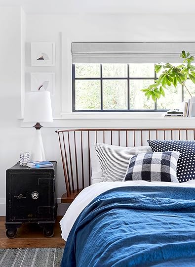
Pillow configurations: We styled a different pillow configuration for each bed and they all look fun yet put together. The main rule is to mix up the pillow sizes if you are using more than one (remember my new-found love of the oversized lumbar pillow?) It’s all about creating that, say it with us, VISUAL INTEREST.

How and why these beds work:
1. The bright color of the blue duvet gives the bed a bold energy while the pillows (in three different sizes) contrast the solid color with three different fun patterns. Notice that the patterns are also in three different scales. The reason they don’t look like a clueless person put them together is because they are all in a cohesive color palette.
2. Bed two (the wild child of the three with its bold quilt and FOUR throw pillows) shows that some balanced boldness goes a long way. Since the quilt is loud in pattern, the majority of the pillows are quietly patterned. Now, this bed would have still been very pretty without that jolt of mustard yellow and retro round pillow, but it’s much more fun with them. Don’t you agree?? Oh and also note the pillow sizing. Perfectly descending.
3. This bed is where texture took the lead. All white bedding doesn’t have to be boring. That white pom pom throw blanket gives the bedding dimension and makes you want to jump in and get cozy quick. For the pillows, we wanted to keep this one simple. We only used two decorative pillows but with a large size difference to create a bit of drama. The tassels on the front pillow add texture and playfulness while the velvet lumbar pillow brings just the right amount of luxury. HOT TIP: Velvet will always make a space feel more luxurious. With that said, can someone pass me my champagne?? I am simply parched.
SIIIIP (said in Orlando’s Instagram story voice)
Shall we move to the side and talk nightstand styling? Okay great.
The Nightstand
Let’s discuss how to choose the perfect nightstand for your bed before anything else. As you will see from our three bedrooms, the nightstands have an opposite visual weight from the bed. What we mean is if you have a chunkier upholstered bed then go for a more delicate looking nightstand and if you have a more delicate bed frame then go for a chunky nightstand. Also, consider the materials. Mix it up for a more interesting and “designed” looking pairing. But enough about the nightstand because we are here to talk about what to put on top. Here are the guidelines we use…

Scale: We talk about scale for everything because it’s that important. You want the pieces you put on your nightstand to vary in size. This helps the eye move around (plus just comes off more interesting, full stop).
Levels: Scale and levels go hand in hand. If all your pieces are the same height (or size) A. you won’t be able to see what you have easily and B. it’s not going to look interesting (like we said about scale). Your eye wants variety. Eye candy is a real thing people.
Shape: Mix up the shapes, too. Pair a sculptural lamp with a round dish and finish it off with a square frame. They will look eclectic and collected in the best way.
Pattern: You want to be careful and not go all out in the pattern department on the nightstand decor. Save that for the bedding, rug, art…you get the point. The nightstand should be your simple happy place where just a hint of pattern should hang out. A little goes a long way and will bring in just the right amount of fun. Plus, a nightstand first and foremost is functional (a place to leave a book, water glass, and eyeglasses for instance, so keep things simple).

How and why these work:
1. This nightstand is the perfect example of proper scale. The lamp and vase have almost identical shapes but because they are VERY different sizes (and colors) it totally works. Now, this combo doesn’t have an obvious pattern but the flowers fill that category. FYI flowers or greenery are always a good call. 


Emily Henderson's Blog

- Emily Henderson's profile
- 10 followers

