How to survey your readers
This is a guest post by author Dave Cornford.
 Like many Taleist followers, I've taken the giant leap and recently self-published my first book. Cracks in the Ceiling is a collection of contemporary short stories about ordinary people, all set in the wake of the global financial meltdown of 2008.
Part of my professional background is in consumer research, so I was thinking about how a survey might be part of my feedback mix. Of course this had to be done without the nice research budgets I used to have at my disposal when designing new financial products.
Tips for surveying readers
Designing surveys is a classical mixture of science and art. Getting your objectives and your questions right is essential to getting good results.
Some tips
Be clear about what you want to find out and why. You might want to understand what readers in your genre like, or whether beta readers like what they've read so far. These are very different things and would need to be tackled separately.
Do you want feedback in "numbers" ("25% liked this") or "feelings" ("I liked this because")?
Questions need to be simple and unambiguous. They will need as many rewrites as your novel – if not more.
Who is going to receive and respond to your survey? What will they get in return? Response rates to randomly sent surveys are low, and getting access to "survey-ready" groups costs real money.
These few points are nowhere near Survey 101 but hopefully give you an idea how well thought out any survey needs to be. For one of my surveys I used Survey Monkey, a free tool, and there are lots of tips, guides and survey templates on their site.
I used surveys twice in the development of the book. One was successful, one was not. Here's what happened.
First Survey: How's it going?
Once my working draft reached about two-thirds of my target, I desperately wanted some feedback. If some of my stories were not up to scratch, maybe I was only one-third of the way through the project in terms of real quality.
Some friends and family had read individual stories and given some feedback, but I also thought the anonymity would help readers to be honest. The short story structure of the work also suited itself to asking some particular questions that were of interest.
After about a dozen willing readers had a full draft for a week, I sent out the survey by email – here's the link if you want to see how it looked.
The questions I asked were as follows:
Which is the best story?
Which story would you leave out?
Which of the stories could be developed further (into a longer work)?
Specific story by story comments (optional)
How would you describe the collection to someone who hasn't read it?
What would you call the collection based on what you've read?
How much longer does the work need to be to be published ?
Overall rating?
With only a potential response of 12, I was never going to get statistically "valid" results, but you can see what I was aiming to get an impression of. If everyone thought the same story was a dud, then it needed ditching or re-writing. If everyone thought a different story as "best", maybe that was good sign of broad appeal.
In the end, only two readers completed the survey, and there were only so many reminders I could subject the rest to. So, there was no real insight gained from the survey, beyond what I had learned talking to the beta readers.
Undaunted, I launched in, got up to my target word count of 45,000, and sent it to the editor, who soon answered many of my questions – without the need for anonymity!
Second Survey: Which Cover?
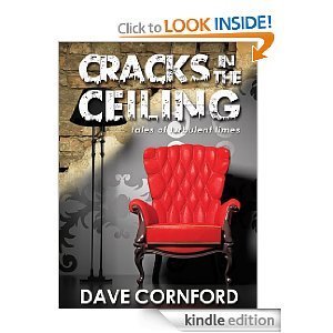
The winning cover design
I decided to use the crowd-sourcing site DesignCrowd for the cover. You describe the book and what you want, put up a stake, and designers submit their ideas. You judge the winner and the winning designer gets paid after the design is refined a couple of times.
DesignCrowd has a built-in survey tool – chose the designs you want feedback on (I only chose 2, but you could use more), email a link to the people, and they vote and comment. You can see the survey here.
This time, nearly every one of the 15 people whom I asked to comment did. And not only did they give each design a star rating, nearly everyone commented on why they liked or disliked each design.
It would have been nice if everyone had voted for one design – but they were evenly split between the two designs. What was most helpful was the comments, as they gave me an insight into the impressions the two very different covers gave to readers.
One reviewer gave the winning cover one star and described it as a cross between Rocky Horror and Agatha Christie. Better than it being a cross between Scooby Doo and Barbara Cartland, I suppose. Another couple of comments said effectively, "This says take a seat and read me." This is exactly how I responded to the design when I first saw it.
The other design also got some low ratings ("Too wishy washy"), while other people liked the "clear, crisp" or "minimalist" look and rated it highly.
Interestingly, not all reviewers were able to place themselves into the "buying environment" of the online Amazon store, compared to picking up a physical book – I should have emphasised this more in the instructions.
Tip
I cut out little versions of the covers and stuck them on my monitor over an Amazon screen, to see how they compared if the book was ever included in a "Customers who bought this item book also bought."
In this context, "the red chair" was the clear winner as an attention grabber, and became the final choice.
Conclusion
My reviewers didn't answer the question for me but were a huge help in exploring the strengths and risks of the two final designs. If I go down the CreateSpace route in the future, I've got a front/spine/back design ready to go – I stipulated it as one of the deliverables in the design brief.
For now, Cracks in the Ceiling is for sale on Amazon, and I've got my first few customer reviews. I'm doing research on a few options for my next work, with two different ideas for novellas as well as another short story collection vying for my attention when I get back to writing in earnest in a week or so.
[image error]Dave Cornford has long balanced a career as a senior marketing executive in the financial services sector with creative pursuits in writing, community theatre, film making and gastronomy.
He is currently writing full time, when not being distracted by his Facebook follies: What I Don't Want to See on a Sushi Roll, kitschitecture (n when budget exceeds good taste in domestic architecture) and Nanna's Travel Tips.
He lives in Sydney with his wife and three children.
Dave Cornford is blogging at davecornford.com, and is on Facebook and Twitter.
Steven says…
I was one of Dave's beta readers and received both surveys. I can say for myself that it was easier to answer the cover survey than the writing survey because I felt more comfortable talking about artwork by someone I didn't know than writing by someone I did.
I loved Dave's idea of cutting out images to see how his potential covers would look on the Amazon. That's thinking like a publisher, which is what you need to start doing after the writing is done.
If you've had any experience surveying your readers, I'd love to hear what they were and if you have any tips.
Dave formatted his book for the Kindle using my guide to Kindle formatting.