
Color Management for Fine Artists: A Quick Primer
Color management when making art prints is ensuring that the color you see on your computer screen is true to the color that prints out on the paper. The tint and brightness of your computer’s backlight will influence the color you see as well as the color calibration of your screen, the inks and paper you use for printing, and your printer settings.
The basic goal of color management is to obtain a good match across devices.
Why Do Fine Artists Need To Know About Color Management?
If you are using computers for any part of your art process, you need to know about color management. This is important for obvious reasons if you are creating your art digitally, but even a painter working in analog materials will need to scan their work to either display it for sale on the internet, or to create prints whether they print them on their own or send them to a print shop. If a screen is a part of your workflow at any stage of the process, you’ll need to understand at least the basics of color management.
Color management is a deep rabbit hole, but there are a lot of resources online (see below) and your local print shop will likely be happy to go down that rabbit hole with you. Members of the Association can take a brief trip down that rabbit hole in our conversation with Jeremy of the Los Angeles print shop POV Evolving.
The Basics of Color Management
Screen Calibration- Screen calibration is a process that calibrates your monitor closely with the colors you see in real life. This is a process that must be done periodically, and requires special equipment- often a colorimeter* or a spectrophotometer. If you are running a serious business creating your own prints at home, you may want to invest in the equipment necessary to calibrate your screen.
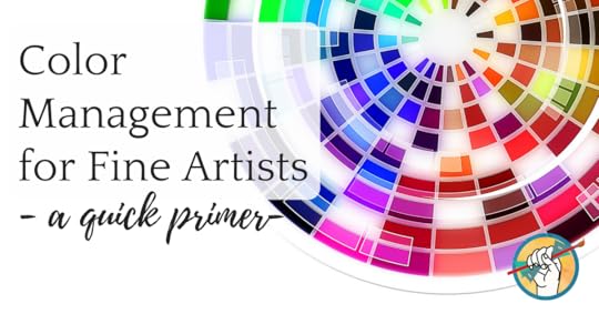
Color models- Sometimes called color spaces, these are the mathematical models used to describe color. You know them as CMYK, RGB, sRGB, HSB, and others. The colors available on a given printer are known as the “gamut”, and you’ll need to know how the color model you’re working in will translate to the printer gamut. Otherwise, you’ll see a noticeable difference in how your work prints versus what you see on the screen and on the original, if applicable.
More Information on Color Management
For a much more in-depth explanation of color management and how to calibrate your screen, choose the correct color model, and translate from one color model to another across devices, check out these resources:
A Practical Guide and Tutorial to Color Management for Photographers
Free Wacom downloads on color management
Color Management: A Comprehensive Guide for Graphic Designers by John T. Drew*
*Affiliate link
The post Color Management for Fine Artists: A Quick Primer appeared first on Online Marketing for Artists.


The Abundant Artist Goodreads blog

- Cory Huff's profile
- 31 followers

