The Scales Fall From My Eyes
I’ve watched Marc Taro Holmes smoosh color onto paper, shifting colors as he “built washes.” I’ve heard Shari Blaukopf talk about creating mosaics of shifting colors on a surface. And I’ve stared at hundreds of Liz Steel sketches (relevance later). Apparently, I’ve got a pretty thick head because in spite of all this exposure to the concept, I didn’t get it.
No, it took a single comment in Liz Steel’s watercolour course (highly recommended) to get me to rethink watercolors. I know little of watercolor use but the first thing shown in every watercolor book I’ve read is how to do a flat wash. That’s how I’ve been applying watercolor…in flat, boring washes. Apparently I learned that lesson well. But in a single statement, as Liz was discussing mixing on paper vs mixing on the palette, Liz said (paraphrasing), “I rarely use flat washes; I prefer adding texture in my washes.” This simple statement somehow connected both of my neurons together and there was a flash of light, at least that’s how I remember it.
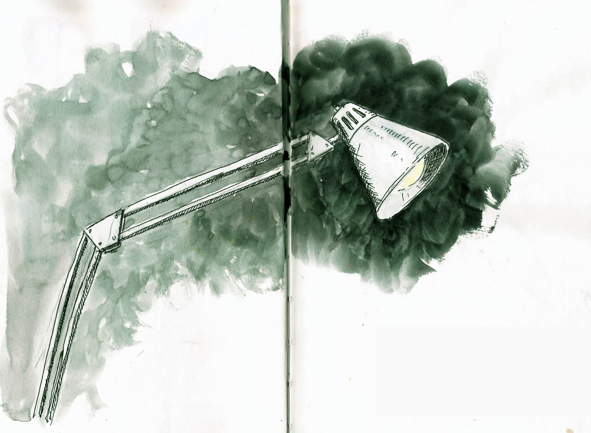
So, I started looking more closely and practicing the addition of variability into washes. I still struggle with its application but I was pretty happy with this sketch. It was an experiment to see if I could put a very textured, high contrast “wash” behind the focal point and sort of gradate both the texture and the color (lightening it) as I moved away from that focal point. My table light was just an excuse for a background.
Stillman & Birn Alpha (5.5×8.5), Platinum 3776, DeAtramentis Document Black