
Cigarettes That Are Visually Offputting (research study)
A number of countries have passed laws which require cigarette manufacturers to show ‘denormalising’ images on their packaging. To take things a step further, why not make the cigarettes themselves more unappealing? This was the question tackled by a joint Australian – New Zealand research team in 2015.
A set of potentially unpleasant cigarette designs were experimentally tested – of which the most effectively off-putting was found to be this one :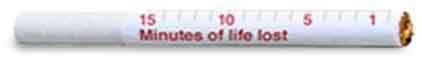
“The stick featuring the ‘minutes of life lost’ graphic was markedly less appealing and less likely to be chosen than all other sticks tested. “
See: ‘Dissuasive cigarette sticks: the next step in standardised (‘plain’) packaging?’ in Tobacco Control, Volume 25, Issue 6.
Bonus Assignment [optional] What other graphic graphic devices on cigarettes might help dissuade smokers from lighting up?
Also see : ‘How much life does a sausage cost you’ – from the BBC’s Tomorrows World.
And : News of a new study from The Lancet – “each unit [of alcohol] above guidelines is taking, on average, about 15 minutes of life, about the same as a cigarette.”


Marc Abrahams's Blog

- Marc Abrahams's profile
- 14 followers

