I Keep Making Mistakes.
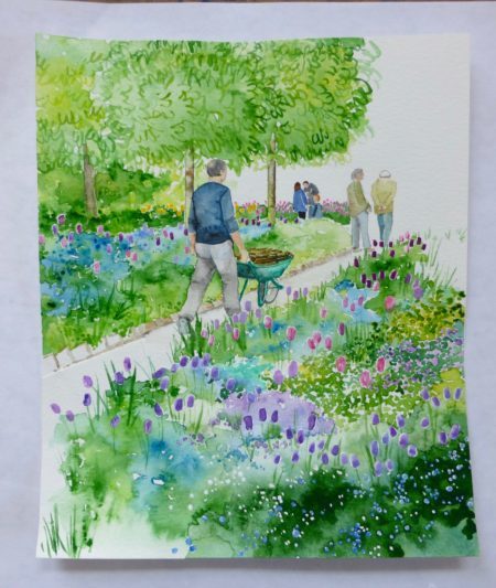
I keep making mistakes. In this instance (see below), I made the mistake of painting this little scene too little:
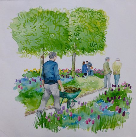
This little scene is from the famous garden of the famous impressionist painter Claude Monet, and I painted it for a little book that I am working on about Claude Monet’s garden. The format of the book has changed since I first conceived to it and now I needed this little scene to grow up, from a little half-page doodle into a full-page picture. I’ve been working on this book idea [off and on] for nearly two years and I am thoroughly sick of it, so I had no intention of going back into it to re-paint any part of this odious garden.
Ha ha, just kidding, in case my future publisher is reading this, I love Monet’s garden and I’m dedicated to capturing its unique forms and inspirational spirit that has charmed and beguiled millions of visitors yadda yadda yadda….
Oh, what to do, what to do? I don’t want to re-paint it, but I need to re-paint it, but I really, really don’t want to.
Time for a rescue!
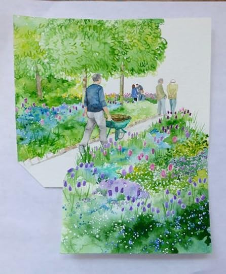
What you see is what happened after I cut out the bottom bit from a previously-painted picture (a picture that went wrong on the top — never throw anything away!) and glued it on top of the current Work-in-Rescue. Then I painted some background foliage into the upper corner of the pic in order to balance the composition of the scene. As you can suss, the old watercolor was small to completely rescue this picture, so I have to now rescue the rescue. I have to paint something that I can glue into that lower left-hand corner:
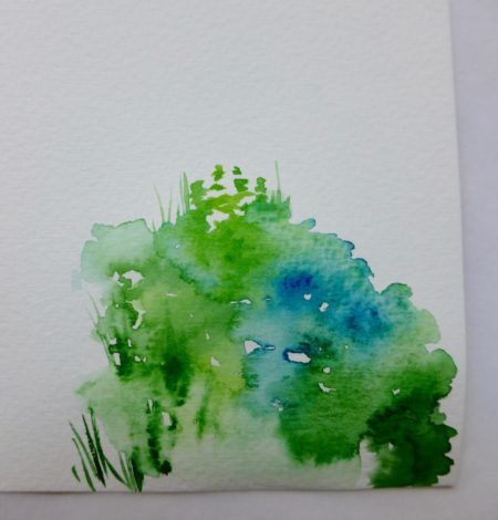
The first try was awesome. I love the bleeds that I got there, in the greens and blues.
All I have to do is cut out the part that I need and glue in into place:
I misjudged how big I had to make the rescue-to-the-rescue bit when I cut it out, so I had to add one itty bitty piece of shim when I glued it into place (see above) but it looks to me as if I am going to get away with this rescue.
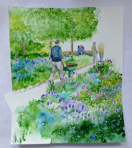
Next, all I had to do was paint in some tulips and make a few more green blobs and integrate the new rescue into the old rescue and voila:
DONE.
That was fun! But it’s certainly not museum-quality,not like this watercolor (below)– titled Landscape — from the famous Museum of Modern Art in New York:
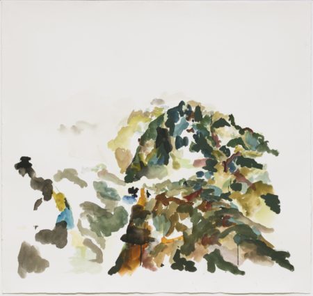
Yeah, that (above) is what watercolor looks like when it’s fine art.
Which reminds me:
Last week I asked you, my Dear Readers, your thoughts on how much you have changed since you were 18. Here’s why:
Two weeks ago I happened to read a news item about an artist, who died in 2016, whose family was suing that artist’s estranged husband for his mishandling of her estate — her “estate” being some quantity of art work done by her, that has been kept in inadequate storage by the estranged husband…the family contends that the estranged husband has damaged the art works, valued at half a million dollars. It was a juicy story that the London Daily Mail picked up from the New York Post.
The name of the artist rang a little bell. I googled her.
Sure enough, I knew her: back in 1976 she and I had been in the same Foundation Course (first year) at a well-known east coast art college. I was 22, older than most of the students who were fresh out of high school; she was 18, fresh out of high school.
I left school, and art, after that first year. My young classmate, on the other hand, stuck with it. She graduated, and then went on to get an MFA. She continued to stick with it until she was 37, when she finally caught the attention of the art world and began to win prestigious awards and sell her stuff to museums and collectors and have solo shows in galleries around the world.
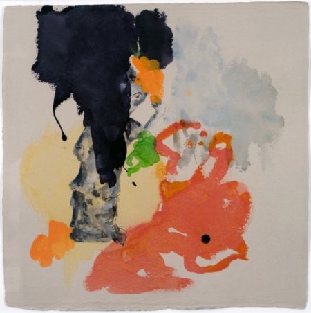
That’s her watercolor — Landscape — above. Here’s another of her highly regarded watercolors (titled Untitled):
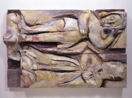
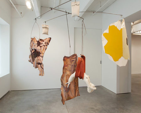
But watercolor is not actually the thing she does best — she’s a renowned sculptor:
Sorry about her dying so young, but the more I read all her accolades from the New Yorker and the New York Times and ARTNews etc . . .
. . . the less I could hardly believe what I was reading because the thing is, when I knew this girl, she was the last person I would have picked out as talented.
I am not mentioning her name because, well, I only knew her (and didn’t like her, or her sloppy use of materials, her lack of design skill, or her memorable dopiness) when she was 18, and it’s unfair to hold her accountable after 42 years. Maybe people change from the people they are at 18. Maybe she became brilliant. Maybe she became talented. A lot of critics and art collectors seem to think so. . . and some have even extolled her persistent lack of technical skills and general dopiness: Sometimes she emulates traditional media (here and there her painted wood might pass for ceramic); mostly she’s content to look funkily modern. The result is a vital ensemble in which designed inauthenticity produces something original and expressive.
That review (quoted above) was written by a guy who has won a Pulitzer for criticism. So I guess it’s me, I’m the dope who doesn’t understand what “designed inauthenticity” is, or why badly worked materials is so funkily modern. Obviously, I’m the moron who does not understand how to make art.
But I have to say that her work depresses me. It looks so inadequate to me, and so very dumb. It depresses me that this is what we are supposed to look at these days.
But I know that that is the same thing that art critics said about the impressionists, when Claude Monet and his buddies began to exhibit their work in 1874. Art critics hated the impressionists at first and even as late as 1904, when Monet was getting rich and famous, one journalist could still complain about his style: A house should look like a house, not like a scrambled egg going up a stepladder.
I think that egg is sunny-side up.
I don’t want to be the idiot complaining about scrambled eggs so I have been looking at more of this artist’s later work, trying to train my eye and get with the 21st century:
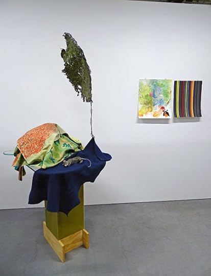
Here’s a detail of the above sculpture (maybe it’s an an installation; installation seems to be as hot a thing in the art world today as it was in art school back in the 1970s):
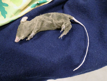
OK. THAT’S cute. I don’t get the fabric heap or the finger paintings taped to the wall, but the dead rat is cute.
 Well, we did it. WE GOT THROUGH JANUARY!
If you did January dry, like I did, then you know how slap-damn-scrambled-egg happy you are that Dry January is over over over over over over over, as happy as a Long Island cat taking a dirt bath in his favorite patch of crud:


Speaking of crud, this is what Paris looks like these days:

The Paris Police sent a drone flying over the Seine and this is a screen grab of the Square du Vert-Galant, which I featured in my book Gardens of Awe and Folly. When it’s not under water, it’s a charming little garden on the last bit of low-lying land left on the Ile de la Cite.

Here’s a better look at my bijoux chateau (lower left corner) that I wrote about as my dream Paris pied-à-terre (pages 14, 15, and 16 for those of you reading along). Alors, all my dream antiques and dreamy objets d’art that I have dreamed about decorating my dream bijoux chateau with are drenched with la grand boue.
Great! Now I get to re-decorate!
I’d say that’s worth popping a cork for.
As if I need an excuse. Happy February, everyone!