
DC Comics the New 52 – Part 3
The first two of the New 52 I reviewed, Red Hood and the Outlaws #1 and Catwoman #1 were suggested by JayJay, because they were generating the most discussion online.
I tried to confine my analysis to Comics 101 basics, how the efforts compared to DC's stated goals and how well each succeeded at what, in particular, they seemed to be trying to do. A lot of the discussion about those books both here and elsewhere online seems to be about the depiction and behavior of the female characters. I didn't weigh in there. To me, that's an evaluation each reader has to make for him or herself, not one I am more qualified than any other individual to pontificate about. One person's Good Girl Art is another person's "demeaning to women." Etc.
The publisher has the right to publish any non-actionable material it wishes. Then we get to pick. The DC brass apparently thought the content of the two books I reviewed served their goals or would appeal to a large enough segment of the market to be worth doing. Whatever.
For many reasons having nothing to do with the controversies over the depiction and behavior of the female characters, I found a lot wrong with Red Hood and Catwoman.
But, let it be known, personally, I didn't like the way the female characters were portrayed. It's not that I think that there is anything, any situation or any type of character, male or female, that cannot be done if it is done with rare excellence and surpassing skill. The problem is that, too often, comic book writers and artists who belong in creator kindergarten think they're already Ph.D's.
Anyway….
My thanks to those of you who suggested better New 52 efforts to check out. That narrowed the search a lot. Some of the ones I didn't pick had merit, but I went with one of the characters I loved when I was a kid.
 Batman #1
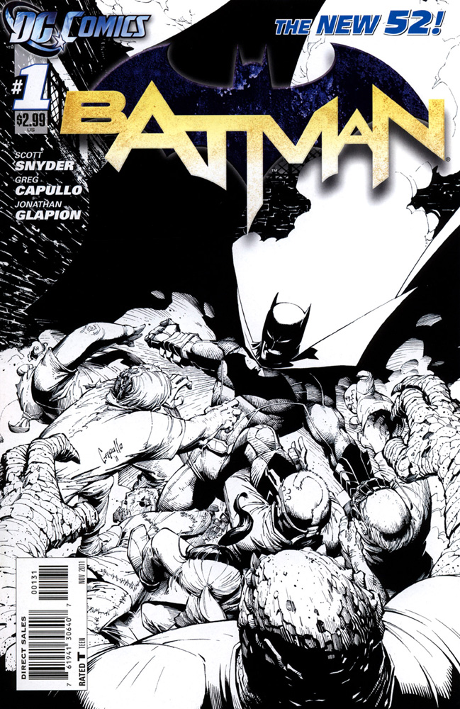
The cover:
First Version: The logo is too clever by half. The texture on the stylized Batman symbol serves no purpose. What's it there for? It's distracting and adds nothing. I believe that it's Photoshop masturbation. The good news is that you can do wonderful things with images these days. The bad news is that artists do things because they can, and for no other reason.
The Batman symbol is all but lost against the battleship camouflage background anyway. The halo around it helps a little. Not enough.
Even though the background varies in value, the yellow-white letters spelling out Batman pop, because they're very light and bright and the background, including the Batman symbol, is dark enough. The problem is that the letters themselves are harder to read than they have to be. Yes, you can pretty quickly understand what they're spelling out here, but what's going to happen when some element overlaps the logo?
As for the image, it too, is a little harder to "read" than it has to be. Okay, I see Batman, and he's surrounded by figures. But, honestly, it took a few seconds of staring to realize that Batman is being swarmed by these figures. It was when I focused on the figure on the left who's lunging at Batman—the one bearing Greg Capullo's signature—and also noticed the figure below him holding onto Batman's leg that I grokked.
Bad choice for a place to sign, Greg. Intrusive. Distracting.
We see mainly the tops of the heads of four of the figures, including the scaly guy foreground. My God, I just sorted out that one of the odd shapes I see is actually Batman's left leg. He's shoving away the guy with the question mark hairdo with his foot.
P.S., it took me a few seconds to realize that was a question mark. Aha! So, comics-savvy me has a sudden revelation…! He must be the Riddler! I start trying to pick out details amid the tangle of gray shapes that might give me a clue who the others are.
Suddenly, it hits me—that big, black shape that stretches up to the top of the cover is Batman's cape! I guess it has holes in it…or is that dirt and smoke in front of the part close to his body, or…?
I have a couple of words for you Greg Capullo: Silhouette and dynamics. Also, the term Tipped Line of Balance. Give your characters discoverable indications of movement. Demonstrate the vector of the action. Like you did with the guy you signed.
Make it read. Make it work. Clear at a glance, unless there is a storytelling reason to be mysterious or obscure.
I met you at a con in Toronto, right? Long ago. Looks like you're doing all right for yourself. Good for you.
This is a very gray cover. I wonder what the fascination these days with gray comes from. I suppose, however, if you're going to have a gray cover, Batman is the right book.
This cover isn't terrible. Pretty good, actually. It's just not all that it could be.
 Second version: Told you so. The logo is really hard to read, now. It's not as if it's a long established logo like Cosmopolitan, for instance, or GQ. See just a bit of those familiar logos and your brain fills in the rest automatically. This is a new logo.
Fortunately, we have a big, prominent figure of Batman front and center, which serves as a clue.
A big, misshapen figure. The arms don't look like they belong to, or are attached to the body. Batman is a handsome guy. This fellow isn't. The whole cover is jumbled, cluttered, confusing and unappealing. The obligatory variant. If you're going to prey upon those of us who like to have the complete set, DC, can't you at least make each variant good?
 Third version: I actually like it better without color, though most of the same comments as before still apply.
The interior:
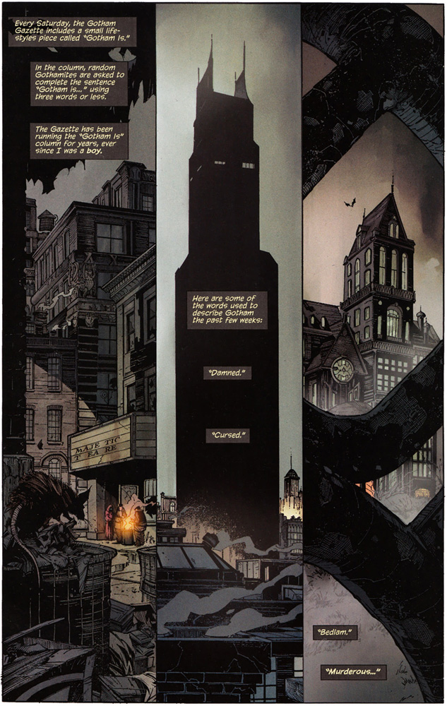 Splash page: Three moody shots featuring architecture, for the most part.
One thing the Batman filmmakers got right is that Gotham City is a co-star. Writer Scott Snyder and penciler Greg Capullo got it right, too.
The art and the copy are intriguing. Nice work, guys.
The page two-three spread is good. Striking. A throng of weird, nasty-looking types is obviously confronting Batman. If I don't think about it, and turn the page, it's cool.
But this is me we're dealing with….
The worm's eye POV is groovy. But it's framed, in part, by a black shape that gives me pause. The black shape—whoops, there's a little hint of gray (what else?) at the top—trails, it seems, onto the floor, so it's not the eyehole of a mask. Besides, if Batman were lying on the floor, why would the throng confronting him be looking up…? And left! Eureka! Batman is standing mostly off panel to the left, and the black thing…must be his cape!
God, I hope he doesn't trip on the damn thing.
There's an inset. Usually I don't like insets because usually they're idiotically placed. This one isn't covering anything important. It still confuses me a little. The pointy bit on top I read right away as Batman's nose, but I had trouble sorting out the mouth below it. I think the colorist did too.
 Turn the page….
And there's Batman. Stylized, wearing a slightly different costume than I'm used to—but the movies and comics have mucked with the costume frequently, so what else is new. Besides, cape, cowl, bat symbol, gray and/or black…. It's Batman, all right.
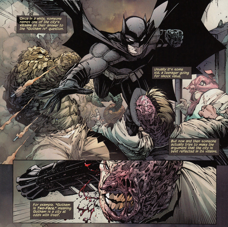 A very good fight scene starts, during which, succinctly, elegantly, Snyder gives us a heads up about who these weird bad guys are. It's all we need to operate. Sweet.
Though he isn't named, I recognize Clayface, which makes me feel very smart and in the know. New Reader me wouldn't have known, but the fact that he's a gloppy, monstrous guy who seems to be made of mud would have been sufficient for me to accept that Batman can kick a hole in him, no worries.
The point is, I get the drift. A bunch of weird-to-bizarre criminals who are familiar to Batman are attacking him. If Batman is comfortable with that reality, so am I.
Page six starts with…what? I have no idea what I'm looking at in panel one.
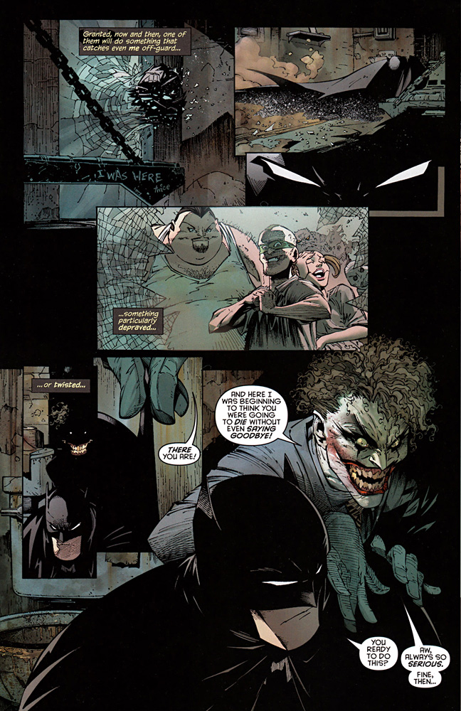 Panel two, that seems to be Batman in a new locale. New Reader me had no clue where the last locale was, though savvy-me whispered "Arkham Asylum" in my own mind's ear.
I suss out that Batman was knocked or thrown through a window. Maybe. It could be that this is still an interior location. I don't know. What are those things with the chains? Prison bunks? Can this be a prison cell? It had a breakable glass window big enough for a man to be thrown through, though. Oh, I don't know.
Savvy me registers that there is a panel three, and that it's a close up of Batman's eyes. New Reader me misses it and doesn't miss it. It's just meaningless shapes….
Panel four, here come the bad guys.
Panel five, I don't know. Black page background, no gutters, black shapes running into each other…. I don't know what I'm looking at.
Don't you artists realize that when the shapes run together like that we, the readers, who don't have you around to explain it, first see all the shapes that run together as one big shape. Then we realize that can't be right. Then, thirty seconds into it, if we haven't thrown the damn book away, we finally grok that part of the big black shape is someone sneaking up on Batman, part of it is a cropped close up of Batman's head with a fingers pulling on one of his Bat-ears, and…wait! There are some squiggles back in the sneaking up part that could be the hair of the sneaker-upper!
Then, last panel on the page, which both underlies and overlaps its predecessors, which doesn't help, we get a look at the sneaker-upper. Due to the untimely death of Heath Ledger more New Reader/civilians have a shot at knowing it's the Joker than would otherwise.
Good. Otherwise, figuring out this page was hard work.
And so it goes. I'm going to stop criticizing the artistic idiocies, sorry, Greg, or you guys are going to think I don't like this book.
No, I love it.
So much of the art is so good that I spent the 30 seconds sorting out the big, black shape and didn't mind too much.
 The artistic madness continues in spots here and there. But by and large, Greg delivers the story effectively and with excellence. Even when it's tricky, like when the E.M.P. mask is explained, or the remote computer connection to the Batcave is demonstrated.
 And the writing? Snyder is good. His writing is clear, clean and compact. He's clever, in the best sense. Everything is explained elegantly in an unburdensome way. There is drama, intrigue, suspense. The action is well written.
Best of all, I recognize these people. Snyder seamlessly blends whatever new there is in the New 52 iteration of Batman with enough of what I already know and cherish. It's all good.
 My theory of how to reinvent a character is this: Ask 1,000 people to tell you what they know about the character. If nearly all of them say, as they might in this case, Batcave, Batmobile, Robin, that butler guy…then make awful damn sure that you keep the Batcave, the Batmobile, Robin and Jarvis. Oops. Alfred.
Anything not mentioned by a substantial majority is fair game to muck around with. Ignore that weird guy who mentioned Bat-Mite.
After a while, once you get the hang of it, you don't need to ask anyone anymore.
Snyder rocks the house.
My only complaint is that this issue is just the first act. I wish there were more of the story. Not that I wish what is presented here was different. I wish the book was longer.
Clearly, Snyder knows the fundamental continued story techniques, which I will explain here soon, or he is welcome to.
I'm impressed.
So, two thumbs up with one small admonishment to you, Greg. When you finally home in all of your devastating firepower on the target, which is telling the story and telling it well, and stop occasionally succumbing to windage and firing useless rounds into artsy-fartsy land, you will be king.
Not the King. Only one of him. But king, indeed.
NEXT: New 52 General Conclusions and the Secret Origin of the Official Handbook of the Marvel Universe


No comments have been added yet.
Jim Shooter's Blog

- Jim Shooter's profile
- 85 followers
Jim Shooter isn't a Goodreads Author
(yet),
but they
do have a blog,
so here are some recent posts imported from
their feed.

