
From Cover To Cover.This is basically a quick shout out to the...
From Cover To Cover.
This is basically a quick shout out to the evolution of the PULSE series’s cover art.
When I first published this bad boy, I had more or less slapped some words down on a page and hit the publish button on Amazon.
Pro tip: it says ‘Failed. Cover file not found.”
After consulting with the Oracle (Google), I found a whole bunch of different ways to get yourself a cover. You could find an artist to draw you something original, hire a designer, use a self-serve art tool or use one of the many pre-made covers available on the web.
That’s where this came from. The original Book 1 cover. Look at that bad boy. Beautiful outer space. Gorgeous planetscape. Love it.
But here’s the thing. When you choose a pre-made cover, you’re committing to forcing the image’s narrative to fit your story. In my case, I was like, “Err… yeah, it’s a planet. Maybe Earth Sure. Or… maybe Raxis. Hey, let the reader decide.”
But let’s be honest. This cover, wonderful though it may be, has nothing to do with the book.
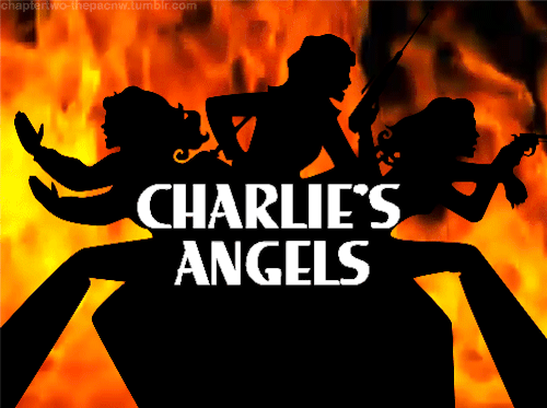
Then in came the publisher, wielding professional cover artists and brandishing years of expertise. I wish I could show you some of the design pitches. Horridly sculpted not-quite-human figures wearing skin-tight leather boots, standing in formation like the Charlie’s Angels logo. Veto. Veto. Veto.
And that’s all I could do. Veto. Creative power was no longer mine. I was merely the manuscript provider. Which would have been fine if my confidence in the designs handled dwindled to non-existence. After deciding that I couldn’t deal with any of the characters being misrepresented, I asked for them to be left out entirely.
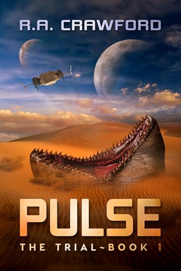
This was the second cover for The Trial. Now, a know a lot of people liked this cover. It makes a splash. It draws you in. “It reminds me of Dune,” was the most common feedback I received. High praise indeed. Only one issue. It’s not f**ing Dune man. Seriously. It draws a reader with expectations that won’t be met by the content. And puts off readers who might otherwise find something to like.
Many of my best reviews compare The Trial to the likes of ‘The Maze Runner’ and ‘The Hunger Games.’ Not a Dune in sight.
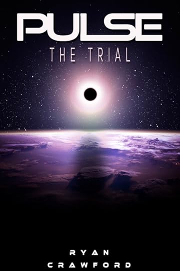
So when the time came to wrestle the rights of PULSE back into my hands, I embraced full cover design alongside them. So, courtesy of Agata from www.Bukovero.com, here is the new face of The Trial.
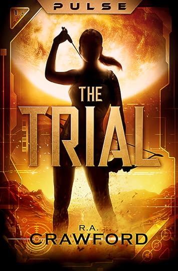
That sh*t be poppin yo. A mixture of original art, stock images, and smart design - this is a cover I’m finally proud to share.
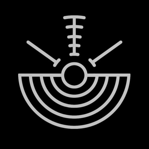
And it wasn’t just the end result, the process itself was a huge weight off my shoulders. Agata wanted to know EVERYTHING about the book. The story, the characters, the setting, the technology, the history. She took it all in. She even incorporated the logo that Holly designed for me months ago.
Then BOOM. She outdid herself with the second book cover.
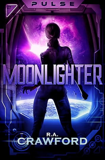
It’s EVEN better. Not only did she do a brilliant job, but she made it look and feel like a series. She added continuity and narrative before the book has even been opened. And she held my hand like a lost baby throughout the process, constantly asking for feedback and checking in as she speedily delivered in just a couple of weeks and for a more than reasonable price.
So if you’re an aspiring author, looking to give your books that shot of adrenaline and dash of dynamism, I suggest heading on over to her website and perusing her services.
You won’t regret it.
PULSE certainly doesn’t.


Laugh In The Face Of Dadversity

- R.A. Crawford's profile
- 40 followers

