
Main aesthetics
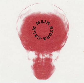
Hydra-Calm (1992).
It's always good to find a group of musicians who not only make the kind of sounds you like but also package their work effectively. Having read the Quietus interview with Robert Hampson last week I was going back through the catalogue of Hampson's 90s group Main and thinking again how well the design of their digipak singles and albums complemented their music. Main evolved out of an earlier rock outfit, Loop, and the earliest Main productions still bear some trace of the trancey Loop approach to rock structures. The first Main album, Hydra-Calm, was released on Situation Two, and comes packaged like the first album from Faust, with an X-ray of a skull on a transparent sheet replacing the X-ray fist of the German group.
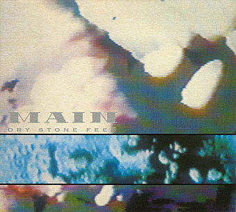
Dry Stone Feed (1993).
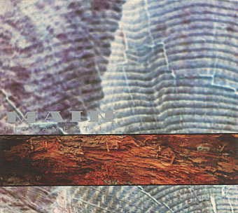
With a move to the Beggars Banquet label a year later, a different design approach was adopted which set the template for nearly all the Main releases during the 1990s. An outfit (or person) named Avida is credited with Main's design, with the name being adjusted on various releases to Avida Design, Avida Formations, Avida Hydroforms and Avida Iceforms. The decision to dwell on varieties of texture matches the evolution of the group's music from arrangements of guitar, bass and drums to abstract and increasingly minimal fields of sound; in this respect, Deliquescence was a perfect title. Hampson and co. created their sound fields by subjecting guitar noise to unspecified sampling and effects processes. When Simon Reynolds invented the term "Post-rock" to describe some of the musical developments happening in the 1990s, Main always seemed to be exemplars of the term, they really did go from being a bona fide rock band to a group pushing sound far beyond anything to do with rock music at all.
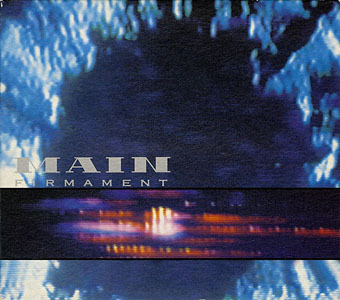
Firmament (1993).
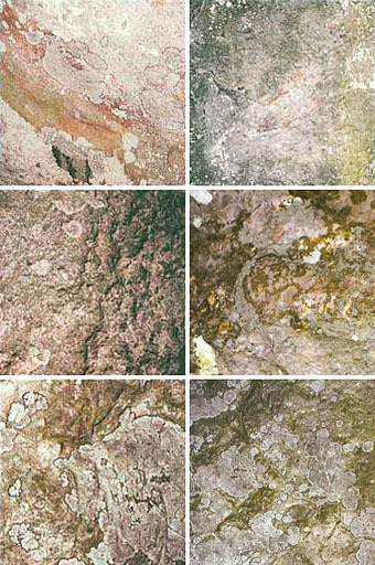
The photos used by Avida Design start out as shots of TV screens or computer monitors then range through the natural world with close-ups of rock formations, lichen, wood grain and underwater ice. The typography is nearly always a copperplate font printed in metallic silver ink. The most satisfying release for me was the Hz set of six CD-singles released from mid-1995 to 1996, the last of which came with a box to place the singles in and a booklet containing symbols which relate to each disc. Hz is the peak of their output, and although it was later released as a double-disc set I prefer the box.
Anyone looking for these releases today can find copies for sale at Discogs.com. Robert Hampson is still active, his site is here. A few more Main covers follow.
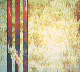
Motion Pool (1994).
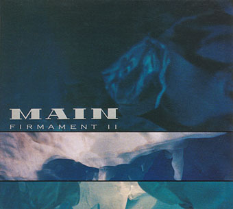
Firmament II (1994).
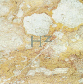
Hz (1995–6).
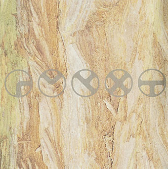
Hz booklet.
The Hz singles: Maser, Terminus, Haloform, Corona, Kaon, Neper.
Firmament III (1996).
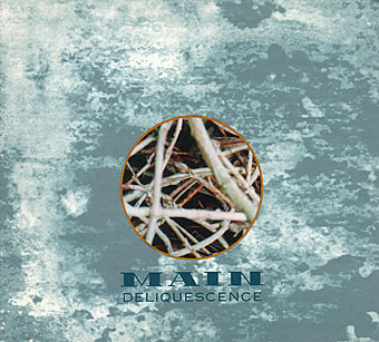
Deliquescence (1997).
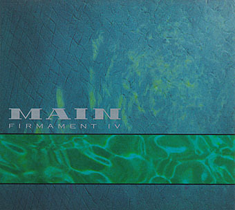
Firmament IV (1998).
Previously on { feuilleton }
• Main


John Coulthart's Blog

- John Coulthart's profile
- 31 followers

