
Pace Chart Tutorial || Step 3: Split gathering & goal time correlation
This is part of a multi-post tutorial on creating a pace chart for an ultra marathon. Start with the Introduction, or skip to a specific section:
Introduction
Step 1: Course data
Step 2: Goal-setting
Step 3: Split data
Before I jump into the third and final step in creating a pace chart for an ultra marathon, I thought it would be helpful to review the process so far.
Step 1: In a spreadsheet we created a list of key landmarks on the course, and added pertinent information like distances between these landmarks and where drop bags can be sent.
Step 2: We established a goal time for the race, using training data, past race performances, or the ITRA index.
In this final installment, I will explain how to:
Find splits between course landmarks, and then
Correlate these splits to your goal time.
Let’s get started.
Finding splits for ultra marathons
The ideal
Several ultra marathons have frequent timing stations (e.g. at every aid station), with race officials or automated timing systems recording the cumulative time and placement for each runner. A subset of these races will share the data, probably on their websites.
One example is Western States 100, which publishes splits from about twenty landmarks along the course. The page has a disclaimer (“unofficial times [that] may not be completely accurate”) but in this particular case I’d assume that the splits are generally trustworthy.
Data mining on Strava
If official/unofficial split times are unavailable, the backup option is to use Strava. More likely than not, this is what you will have to do. A few comments:
You need to find runners on Strava who ran the race previously (including yourself) and who uploaded their race data. Many ultra runners are on this platform and normally you can find a few for any moderately popular race that’s been around for a few years.
If you have your pick of the litter, select runners who executed smart races (i.e. conservative start, steady effort, relatively strong finish), regardless of whether they finished near your goal time or not — we can account for that later.
If Strava’s search tool were better, this process would be easier. For example, I’d like to search for “Bighorn 100” or “Andrew Miller Bighorn” and get relevant results. Instead, only names can be searched, which is a challenge for common names like “Nate Jones.” In those cases, try finding their Strava profile through their blog, or contact them directly for a link.
In longer races like 100-milers, GPS watches are vulnerable to dying unless measures are taken to extend the battery life of the watch, like changing the GPS interval to 5 seconds instead of 1 second. If you must, you can use data from a runner whose watch died 12 hours into a 20-hour race, but it’s best to find complete data profiles.
Using the topographic map and the time plot on the Strava activity page, manually record the splits for your selected runners. I select the first split available that is after my chosen landmark, e.g. aid station. The data available on Strava is insufficient to get an in/out time at aid stations.
Tip: As you scroll across the time chart, you can freeze your location with a left-click. This allows you to mouse over to another window/program without losing your place.
If you don’t know the location of the landmarks, you will have to find maps with their locations (or written descriptions). To start, check the race website. If the official maps are unsatisfactory, use CalTopo, which is a kick-ass mapping platform.
In some cases, there are telltale signs of the location of an aid station. For example, you might notice that the runner’s heart rate dropped significantly for a minute or two, or you might see some random directions in their GPS track (when they might have been searching for their drop bag or when they jumped into a portable toilet).

The San Juan Solstice has an aid station around Mi 32. Between the map and heart rate chart, it’s easy to see exactly where it is. On the map, the course makes an unnatural sharp turn, instead of cutting the corner. And on the HR chart, you can see a dip in my HR at around Mi 32.
Take the average of multiple runners
After recording the splits for your chosen runners, average their splits. This helps to negate individual experiences or strengths/weaknesses that you are unlikely to share. For example, a runner:
Stops for 5 minutes to empty their GI in a portable toilet;
Hauls on the downhills, but is a relatively weak climber; or,
Slows down while enduring a violent hour-long thunderstorm.
Correlating splits to a goal time
After averaging the splits of three runners, suppose that their averaging finishing time is 19:17. But your goal time is about an hour slower, in 20:15. How do you reconcile the difference?
The final step in creating a pace chart is to adjust the splits to reflect your goal time. I’ve had good success in doing it on a proportional basis. In the example above, a 20:15 finishing time is 5.0 percent slower than 19:17.
To create splits that will lead me to a 20:15 finish, I simply add 5.0 percent to the average splits of my chosen runners. For example, if on average they reached the first aid station in 40 minutes, I should plan to get there in 42 minutes (because 40 * 1.05 = 42.0).
Quick example
Last year I ran the San Juan Solstice, a fantastic 50-miler in southwest Colorado.
Here’s my list of landmarks, from Step 1:

List of aid stations with pertinent details on the SJC50 course.
I established a goal time of 9:15, based on a past result (from 2008) and on comparative results with Jason Schlarb — we both had competed in Run Rabbit Run the previous year.
Next, I found Strava data for Schlarb, Brendan Trimboli, Michael Barlow, and Ryan Smith. Of these four, Schlarb and Trimboli ran the smartest races, so I took an average of their splits. Barlow and Smith had solid finishing times but faded badly throughout the race. I didn’t use their data because I don’t like to race that way.

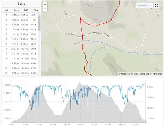
Actual splits for four different runners, extracted from Strava. I averaged the splits for Jason Schlarb and Trimboli because they ran smart races, and I didn’t use the other data.
When I took the average of Schlarb and Trimboli, the finishing time was 8:28. My goal time of 9:15 was 9.2 percent slower. So I added 9.2 percent to all of their splits, to create my own pace chart for a 9:15 finish. Here it is:

My complete pace chart for SJC50, which had me finishing in 9:15, 9.2 percent slower than the average finishing time of Schlarb and Trimboli.
Thanks for reading. I hope it didn’t make your head explode. If you have any questions about this tutorial, please leave a comment.
The post Pace Chart Tutorial || Step 3: Split gathering & goal time correlation appeared first on Andrew Skurka.


