
Ring Saga, Scene 1, Pages 13-14
 Another new page is up today after a frenzied but productive four day weekend. I'm back to work at the day job tomorrow, so I wanted to get a jump start on this week's section, and it came together fairly fast. That's not to give myself too much credit, however, since it is a pretty simple scene, and I had it well in envisioned long before I started. The part that took the most time was just waiting for the renders to get done. That took fifteen hours to complete.
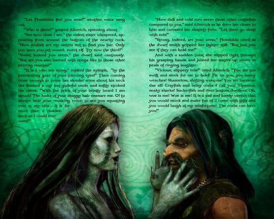
I did the usual dozen multipass renders at a pretty high resolution (3375x2000) to achieve as much detail as possible. The high resolution images I have posted up on the Fantasy Castle Books site are somewhat smaller than that (2000x1600 for the virgin art and 1280x1026 for the text layout), but large enough so you can see good detail. In print, of course, it will only be a 6x9" page, or 9x12" for the full layout, and smaller than that for the ebook, depending on your reader (although you'll be able to zoom in). But here for the first time you can really fully see the texture in the fishscale skin (and Flosshilda's is my favorite of the three), as well as the dirt and grunge on Alberich's clothes and skin. You can also clearly see the Viking torc he wears, and the ring on Flosshilda's finger.
Mainly this image was all about facial expressions. Faces are often really difficult to pin down, since every subtle shift somehow alters them in unexpected ways. The human face is made up of a myriad of tiny muscles, each of which add minute detail and meaning to a certain look. And it's almost impossible to define just what each movement does - why a lift of the brow makes one seem quizzical, or a twitch of the upper lip means something is funny. But these expressions came together almost exactly as I wanted right away, so it was only a matter of some fine-tuning to get the (hopefully) seduction look in Flosshilda's smile, and the wanton lust in Alberich's grin. Maybe I'm just seeing it because it's what I expect to see, so I can only hope you see it too.
The text again is pretty much straight out of my first draft, with only minor edits for space and pacing. I should say at this point that all of the text will ultimately be revised and edited once all the art layouts are finalized. There's not a lot of point in going over the text extensively right now, as I'm almost certain to want to change it later anyway. As a story progresses and characters evolve it often becomes necessary to go back and alter, add, or adjust what's gone before to make it more cohesive, or to set up minor subplots and twists that develop unexpectedly, and they tend to do. So while I'm fairly happy with the rough draft text (unusual in style though it is), if at times it seems redundant or stilted or just plain poorly written, bear with me as it will theoretically get fixed later. That is assuming, of course, my writing is any good in the first place. If not, I hope you like the pictures.


No comments have been added yet.


