Tutorial: Create a pace chart for an ultra marathon

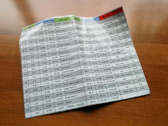
During every ultra marathon, I carry with me a homemade pace chart that looks something like this:

My pace chart, so that I know how far it is to future landmarks and how long it should take. I based my splits on last year’s winner, plus 5 percent after factoring in course changes.
My process and end-result continually evolve, due to past learnings and to the particularities of the next race. But I feel confident now in sharing a framework for creating a pace chart for an ultra marathon. I will do this over a series of digestible-length posts:
Introduction
Step 1: Course data
Step 2: Goal-setting
Step 3: Split data
Optional: Crew chart
Case study: Bighorn 100
Ultras versus road & track
In a traditional race on the road or a track (e.g. mile, 10k, marathon), normally there is little variability in pace, because the terrain, footing, weather, daylight, and elevation remain relatively constant. As an example, in April at the Boston Marathon, my fastest mile was 5:26 minutes/mile and slowest was 6:11, with an average of 5:48.
Moreover, traditional road races have predictable split locations, e.g. every 400 meters, or every mile.
In contrast, most ultra marathon courses have extreme variability: pavement, gravel, singletrack, and cross-country; dry, muddy, and river crossings; daylight and darkness; and flats, moderate grades, and heartbreaking steeps.
In addition to the variability in the course, another factor has a dramatic effect on pace: fatigue. With few exceptions, ultra runners lack sufficient endurance to maintain a consistent pace throughout the race. Instead, the winner is the speediest runner who slows down the least.
Due to the course variability and fatigue factor, paces vary wildly throughout an ultra. Last year at the San Juan Solstice 50M, for example, my fastest mile was 7:20 minutes/mile and slowest was 20:23, with an average of 11:20.
The mile-by-mile uniqueness of each ultra course makes impossible any reliable apples-to-apples comparisons between two races. For every race, a unique pace chart is needed.
Benefits of a pace chart
Creating a pace chart takes some time. But I think it’s worthwhile for anyone who wishes to maximize their performance, whether you’re at the front or the back.
1. Pacing
Most ultra runners start too fast and hemorrhage time later in the race. A pace chart acts as a governor in the early miles, which improves your odds of a strong finish, or perhaps just a finish.
A pace chart gives you the confidence to run your own pace without feeling pressured by the momentum of the field. Essentially, your pace chart will say, “You don’t suck. Everyone else is just too excited and running too fast. You’ll catch many of them later.”
2. Resupplying
A good pace chart will show the distance and estimated time to the next aid station, and the cumulative time to get to each major landmark on the course. This data informs decisions about how much food and water to leave with, and where to pick up new equipment like a headlamp, extra clothing, or fresh pair of shoes. By carrying a pace chart print-out, you don’t have to remember these numbers or rely on course signage.
3. Crewing
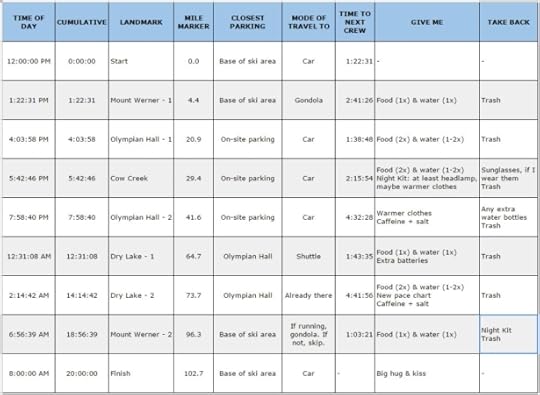
A pace chart can easily be adapted into a Crew Chart, which might look like this:

Crew chart from Run Rabbit Run, which was a huge help to Amanda.
It helps the crew determine when and where they should expect to meet their runner(s), and decide how much time they have between points if they are contemplating a middle-of-the-night snooze or a challenging drive between two points.
4. Familiarity
Even if I didn’t carry the pace chart with me, I feel that the process helps me to prepare for the race. It forces me to study the maps and course profile, consider the weather at various points along the trail, and identify prospective spots to make a move and pull away from the competition. Due to the pace chart, I am a more informed and confident racer.
Equipment
To maximize the value of a pace chart in an ultra marathon, I highly recommend a GPS sport watch like the Suunto Ambit3 Peak. A simple watch is usable, but a GPS watch will display current and average pace, lap and cumulative distances, elevation, vertical gain and loss, and current and average heart rate. This data is immensely beneficial.
Wearing the watch is not quite enough, though. Make sure to change your display settings so that relevant data is shown.
A framework, not step-by-step instructions
Creating a pace chart for an ultra marathon requires at least moderate analytical skills and spreadsheet know-how. I wish that I could offer a pace chart template that could be adapted to each race, but the uniqueness of each race and the limited availability of data are challenging obstacles.
If you undertake this process, please recognize this tutorial for what it is — a framework, not step-by-step instructions — and prepare to be creative with your approach. At the end of the day, you only need something that is functionally accurate. Ultimately, you will run your own race.
The post Tutorial: Create a pace chart for an ultra marathon appeared first on Andrew Skurka.


