
Ebook v TPB Covers
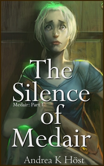
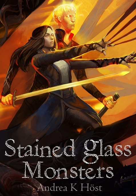
One of the things it took me a few months to realise is that my ebook covers don't have to be the same as my trade paperback book covers. Indeed, in some cases, it would be far better not, since one is designed to represent the book as a tiny thumbnail and the other is the place to indulge fancy games with fonts and rich, detailed images.
However, I wanted the covers to be visually linked, and have finally gotten around to playing with potential ebook cover versions for a couple which don't work well as tiny thumbnails.
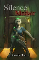
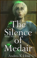
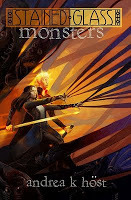
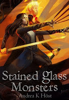
The second version of these are much more readable in thumbnail. I haven't decided whether to go ahead and change them, but it's definitely something I need to think about when preparing covers.
However, I wanted the covers to be visually linked, and have finally gotten around to playing with potential ebook cover versions for a couple which don't work well as tiny thumbnails.


The second version of these are much more readable in thumbnail. I haven't decided whether to go ahead and change them, but it's definitely something I need to think about when preparing covers.


No comments have been added yet.


