
Top 10 Tuesday: Judging a Book by its Cover
[image error]
Hello! Amazingly, here I am, on time for a top 10 Tuesday, and on the actual theme! It has to do with evaluating book covers, so this is exactly what I’m doing. And I am one of those readers that unabashedly judges by covers. (I know, not truly fair, but I am an aesthetic being.)
Today I present you with different types of covers, and whether they entice me to read the work behind it, and whether that worked out for me or not.
1. The Scorpio Races
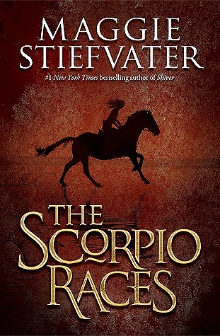
This cover sucked me in immediately, because I like horses, and I am not that good at riding myself, but I appreciate it. And when I saw that the apparent protagonist was a little slip of a thing, up on that big animal, totally in control and at ease, that made me think, “Cooooolllll.”
Were my first impressions right?: Yes, indeed! The Scorpio Races is one of my favorite stand-alone novels.
2. Rebel of the Sands
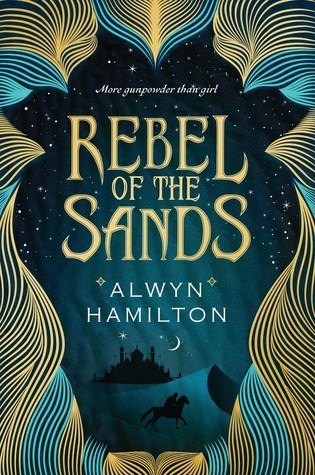
Just look at this. The color coordination is stunning, the font is lovely, the background of the desert at night hints at adventure in faraway lands. My brain saw it and went, “Cooollll.”
Here’s my final verdict: By page 50, I was having major issues with this story. The writing style felt incoherent at times, and reading about the incredibly sexist culture depicted (without the author indicating it was truly wrong and needed to be changed) grated on me. I did finish it, but barely, and was rather disappointed.
3. Discworld printings in the UK versus in the USA
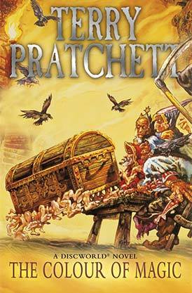
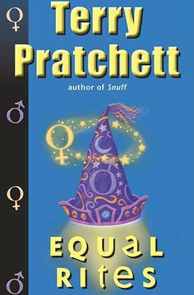
I love Terry Pratchett’s Discworld series. But the discrepancy in the covers between countries bothers me. The illustrations on the UK paperbacks make this series look a bit, well…silly, in my opinion, like it’s based on a cheesy cartoon for kids. Which creates a sad face on this moth, because the absolutely wonderful depth and poignancy and smart humor to this series is what makes it endlessly re-readable for me. Compare to the covers of the U.S. paperbacks, which are snappy and brief and colorful but not too much.
So which do I prefer?: Definitely the USA covers. Which means I have to put up with the printing errors in the text of several of the older editions. Sigh.
4. Neil Gaiman’s books create a quandary
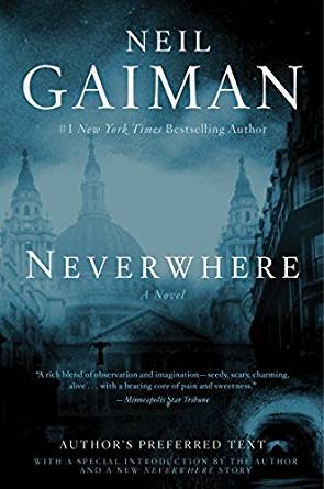
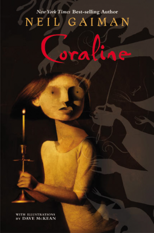
Neil Gaiman and I have an ongoing relationship that consists of the following — I find out he’s released a new title, I dash to the library to obtain it, then spend the next hour waffling over if I shall, in fact, read it depending on how scary the cover looks. Case in point: I had never seen any of the TV miniseries of Neverwhere, otherwise I would have been more aware of just how adult this book is. (And, yet, for the most part, I liked it, although it’s not my general type of thing.) On the other hand, I love the movie version of Coraline, but literally put off trying to read the novel for about 2 years because I almost had a heart attack every time I looked at the cover.
My final say: I’d read Neverwhere again, but with regards to Coraline, I’ll be sticking to the film.
5. The Trylle trilogy
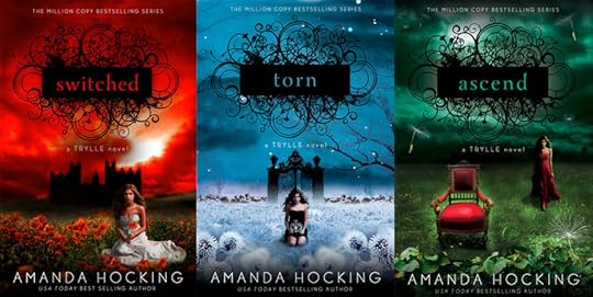
This series I picked up truly based on the covers. It’s a modern spin on the ancient myth of changelings, and that’s interesting. But overall, the style focuses more on the emo stuff, and there’s not as much action (particularly in book 2 and 3) as I would’ve preferred. And it’s labeled YA, but there’s a very graphic sex scene thrown in close to the end of book 2.
What did I think in the end?: It was pretty good, even if it did have its teen soap opera moments. Is it actually for teen readers, though? No.
6. When the Moon was Ours versus Outrun the Moon
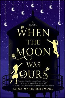
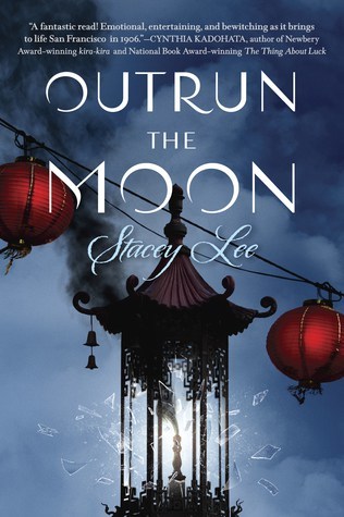
My issue with these two, very separate titles is this — they are so similar (and with similar covers!) that I accidentally ordered the wrong book! My plan was to read When the Moon was Ours, because I’d heard it was a new sort of fairytale re-telling. What I received was Outrun the Moon, which, it turns out, is a historical fiction about growing Asian-American culture. Not that I think this novel is rubbish, as I haven’t even read it — it was purely my own disappointment at it not being what I was expecting.
What’s my plan now?: After re-investigating When the Moon was Ours, it seems that, although the topic interests me, this particular tale may not be for me. I may actually go with Outrun the Moon, after all. I’ve been looking for a title or theme to get me interested in historical fiction again.
7. Warriors, then and now
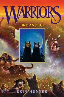
On the left is one of the original paperback covers for Warriors. On the right is one of the new covers designed for the reprints that are in the new box sets. And since I love Warriors beyond all reasoning, I won’t ever say the original covers are now invalid or don’t deserve to be associated with this remarkable series. But…look at the new one. Just look at it! I am in love.
8. A Darker Shade of Magic across the pond versus in my native country
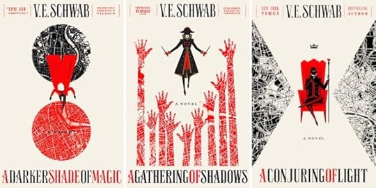
These are the covers for the famous/infamous V.E. Schwab trilogy in America. I don’t like them. They remind me a bit too much of the art deco movement, of which I am not a fan. And every time I hear more about how good this series is, I put off trying it (yet again) because the covers just make me feel so meh about it.
Here are the British covers:
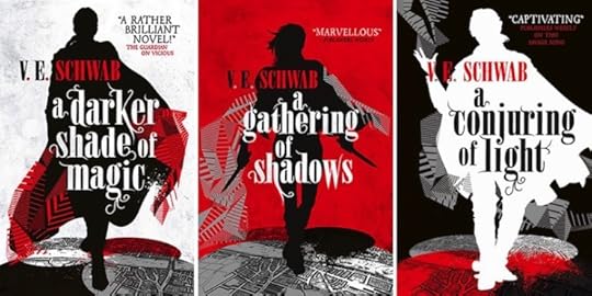
Why can’t I obtain a set of these? It would make my enthusiasm for trying this series ramp right up!
The last word: I’m seriously ready to find a way to order this version, impractical as it may be.
9. I’ll Give You The Sun
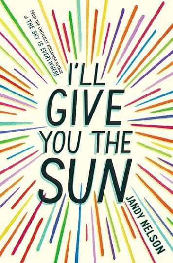
Was the publisher trying to mislead readers on purpose? Based on this cover alone, I immediately swanned over to this new release and began perusing its jacket. Is it a sci-fi romance? Some ambitious, smitten, sassy young lad decides he’ll actually obtain the sun to prove his love to the witty, bright, charming heroine? Nope. It’s a contemporary dealing with “heavy stuff,” and something to do with the breakdown of a sibling relationship. As an only child, I have a really hard time relating to sibling tales, and a hard time writing believable siblings. (Hopefully I have in Volume 1.)
My determination: I just don’t care for intensely-emo contemporaries. So I’ll be giving this one a pass.
10. Legend/Prodigy/Champion
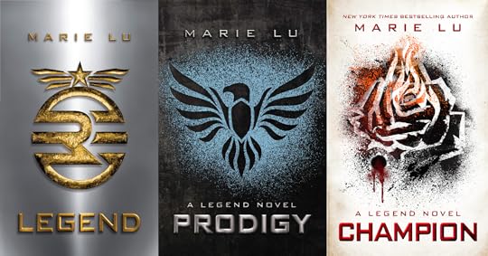
Dystopia is not on my list of “will be delving more into this soon.” I discovered that with The Hunger Games and Divergent. But there was something about Legend‘s covers that interested me. Probably the straightforward, symbolic designs, the different colors for each instalment, the idea of a changing theme throughout (hopefully indicating character growth).
The final answer: I enjoyed Day and June’s story. There were parts that I didn’t care for, but I wasn’t totally turned off, and there was enough to keep me going till the end. And I liked the ending, it felt right for the story, and still appreciated the connection the fans had made to the protagonists. Although I may not re-read it, I still recommend this series to others.


Daley Downing's Blog

- Daley Downing's profile
- 36 followers

