
TMNT/Usagi Cover Process
 Usagi Yojimbo and the Teenage Mutant Ninja Turtles are crossing over and teaming up!!! The stand-alone issue is written and drawn by Usagi creator Stan Sakai, and published by IDW.
I was lucky enough to be asked to do a variant cover for the occasion. This marks my 13th TMNT cover and my 4th time drawing Usagi for publication. And when Bobby Curnow (TMNT editor) asked if I could do a cover, I pushed a few days of Mouse Guard work to the side to be a part of this.
In this blogpost I'm going through the process for creating the cover art.
Roughs:
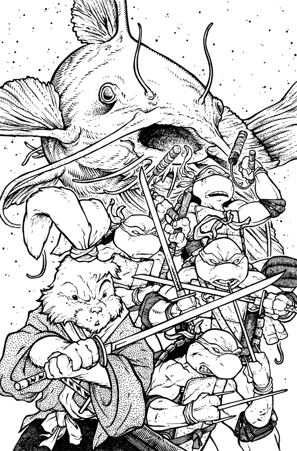
 I don't want to say much about the plot of the issue...but Usagi and the TMNT team up and there is a catfish in the tale too. For the cover, I wanted to show Usagi and the turtles piled in a classic team-up pose with the catfish ethereally looming behind & overhead. For the turtles...I'd done a TMNT rough for a possible licensed print from one of the well-known slikscreen print companies. For various reasons, it didn't come to fruition, but it meant I had a set of Leo, Raph, Mike, & Don unused...
 So I set to drawing Usagi first. Then I traced over my old versions of the TMNT to make new tighter pencils of them in an arrangement that would flank Usagi. Doing this allowed me to also make anatomical and detail corrections as well as mirror Donatello & Leonardo.
And then the big old catfish on another sheet of copy paper.
With these sketches/pencils done, I could scan them into Photoshop for....
 Layouts:
Now most artists wouldn't go so far as to color-flat the layout that they submit to their editor for approval (and in this case approvals went through Nickelodeon & IDW for TMNT and Stan & Dark Horse for Usagi), but I wanted to make sure the tone and palate as well as the subtle handling of the catfish would be handled.
I had a TMNT title-mastead & IDW logo from my TMNT covers to place as a reference point for what would most likely be covered up for the final publication.
 Inks:
Inks: Once the layout was approved by all (no changes, thankfully) I printed out the layout and taped it to the back of a sheet of Strathmore 300 series bristol board. On a light pad (I use a Huion brand large enough to fit most of a cover) I was able to see through the bristol to the layout print and then ink on the surface of the bristol without having to transfer the image or have any pencil lines to erase (and ultimately smear the not-quite-dry ink that I all-too-often do). I used Copic Multiliner pens to ink the cover. I tent to use the 0.7 & 0.3 nibs mainly.
 Flats:
Once the inks are completed, I scanned them into Photoshop and started flatting in colors...unfortunately it was easier to just re-color this instead of trying to re-register & correct the flats from the layout.
I am a fan of the all-red bandannas from the original Eastman & Laird comics, but to fit in with current IDW continuity, I was told by my editor to give them the multi-color treatment. The other colors were stock from the existing character designs & my original layout. To push back the catfish I added a color hold to it's inkwork as well as all those little dots (meant to give that etherial particles in the air/water catching the light feel).
Here again are the final colors. All of the rendering was done in Photoshop using the Dodge & Burn tools with a textured brush. This crossover issue will be available to pre-order soon with the book to be released in July.

2017 Appearances: C2E2: April 21-23Heroes Con: Jun. 16-18San Diego Comic Con: July 19-23Baltimore Comic Con: Sept. 22-24New York Comic Con: Oct. 5-8


No comments have been added yet.
David Petersen's Blog

- David Petersen's profile
- 339 followers
David Petersen isn't a Goodreads Author
(yet),
but they
do have a blog,
so here are some recent posts imported from
their feed.

