
Useful Chart Showing International Wireless Comparisons
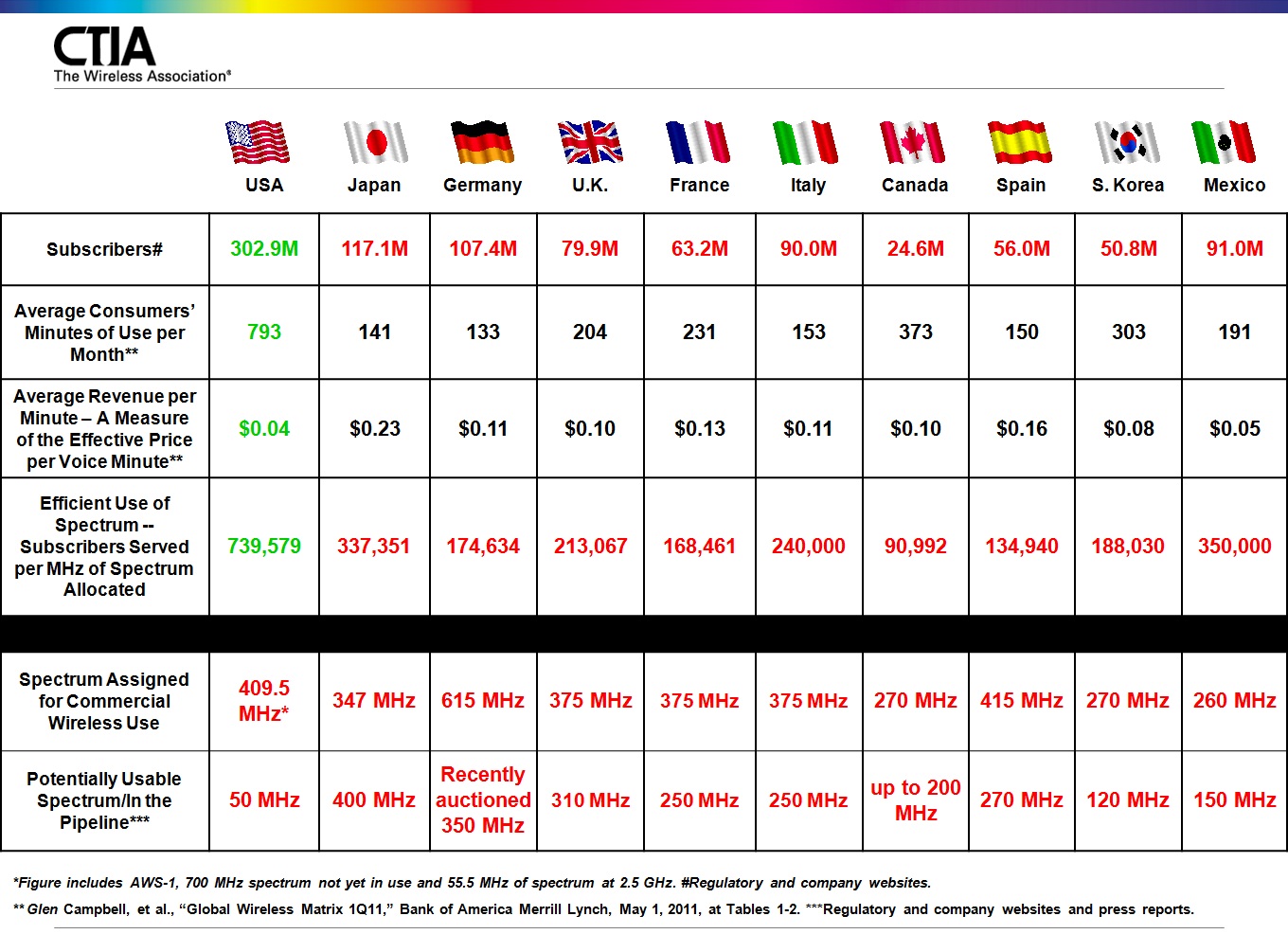
Here's a terrifically useful chart from CTIA that offers some international wireless use and spectrum availability comparisons. [Click on chart to expand.] The average minutes of use and average revenue per minute differences are fairly staggering. But the really important takeaway from this chart is the last line, which depicts how little spectrum is dripping out of the faucet right now. Having just 50 MHz of "potentially usable spectrum in the pipeline" is troubling and needs to be addressed by policymakers immediately. America's wireless demands continue to explode, but supply isn't keeping up.


No comments have been added yet.
Adam Thierer's Blog

- Adam Thierer's profile
- 1 follower
Adam Thierer isn't a Goodreads Author
(yet),
but they
do have a blog,
so here are some recent posts imported from
their feed.

