No More Times New Roman! Font Combinations for Book Design
I have seen way too many people involved in the indie publishing scene who say, "Don't get caught up in the whole font thing. Just use Times New Roman. It'll be fine." As a designer, I have to say that this borders on infuriating to me. Typography is important. It has a direct impact on how we perceive a written document, and our enjoyment of that document. Times New Roman was originally developed as a newspaper font, specifically to be economical, space-wise. In other words, to fit more content in less space. It then became popular among corporate documents. But optimal readability is not among Times New Roman's strong points.
If you plan to indie publish in print, then it's vital that you understand the basics of book design and layout (or that you hire someone who does). The typefaces you choose for your text and headings have a direct effect on the readability of your text (along with your margins, line spacing, and kerning). Bad typography makes your book look less professional, even if you readers don't directly realize what it is that's giving them a negative impression of your book.
Below are fourteen combinations, mostly made up of free fonts. Some are more suited to one type of book or another, and have been noted as such. Others are more universal, and can be used on virtually any kind of manuscript.
ChunkFive and Droid Serif
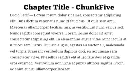
Chunk Five is available from The League of Moveable Type. Droid Serif can be downloaded from Font Squirrel. Both are modern typefaces, and well-suited to a variety of genres.
Dancing Script and Neuton
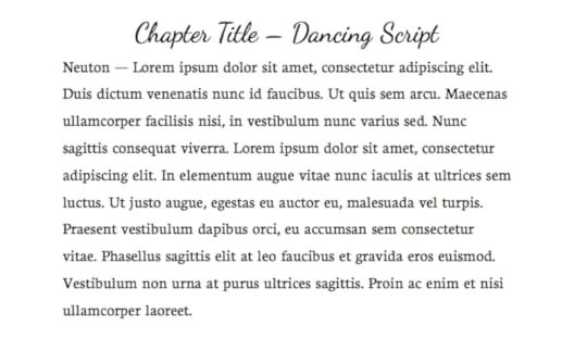
Neuton and Dancing Script are both available from Font Squirrel. Dancing Script is a very readable script font, making it ideal for chapter headings.
Didot and Optima
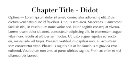
Didot and Optima are both very modern typefaces. Optima is one of the few sans serif typefaces well-suited for text in a printed book. There's a free version of Didot called Theano Didot available from Font Squirrel.
Gill Sans and Crimson
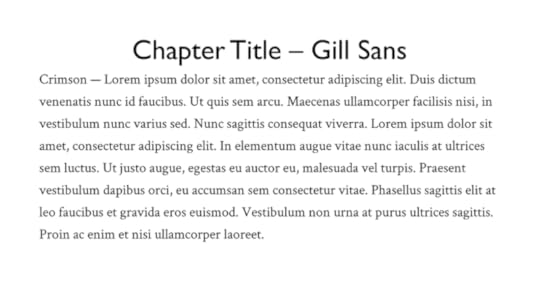
Gill Sans (which is included on many computers) and Crimson are both fairly traditional, classic typefaces, well-suited to a variety of genres.
Idolwild and Linux Libertine
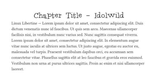
Idolwild is a much funkier typeface than many of the others here, and combined with Linux Libertine, would work well for a middle grade novel, or even a light fantasy novel.
Junction and Fanwood Text
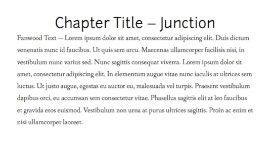
Junction and Fanwood Text are both available from The League of Moveable Type. They're versatile when used together, suitable for most genres.
Kingthings Exeter and Prociono
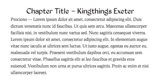
Kingthings Exeter and Prociono would be excellent for a historical novel.
The Last Font I'm Wasting on You and Garamond
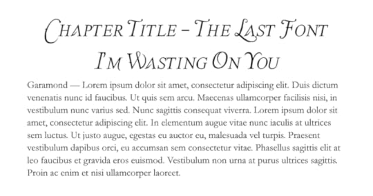
The Last Font I'm Wasting on You and Garamond would be great for a romance or historical novel, as well as some fantasy.
Optima and Cardo
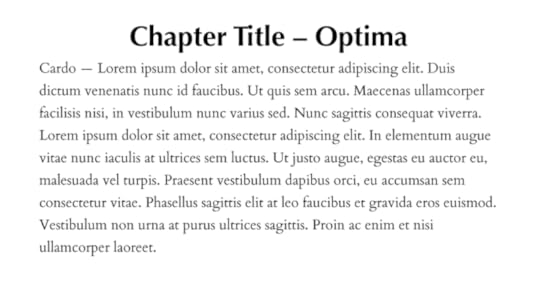
Optima is suitable for titles, too. Combined with Cardo, it makes for a very versatile pair.
Rockwell and Goudy Bookletter 1911
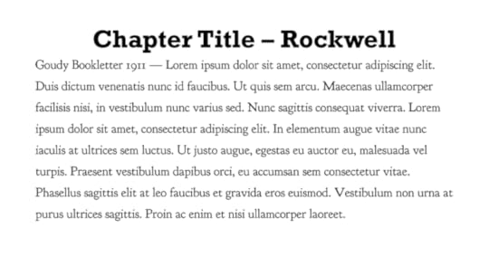
Rockwell and Goudy Bookletter 1911 are both vintage-looking fonts, though they're timeless enough to be used for much more than just historical fiction.
Savoye and Linden Hill
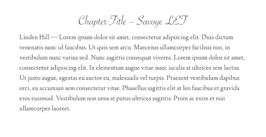
Savoye and Linden Hill would be great for a romance novel, though they're versatile enough to be used for other genres, too.
Tagettes and Calluna
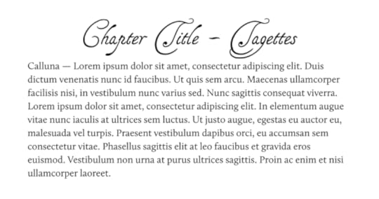
Tagettes and Calluna would be great for historical fiction, or fantasy.
Ubuntu and Gentium
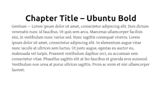
Ubuntu and Gentium are both modern, and very versatile.
The main thing you need to remember when it comes to designing book interiors is that readability is key. You want to stick to mostly serif fonts for your main text. Occasionally a sans serif typeface is suitable, but generally they're less readable in big blocks of printed text. While you can go with a much fancier font for your chapter titles, it's still important that they be readable. It's also a good idea to stick to just two typefaces for your interior design, as more than that can just make your book look cluttered.


