
More Recover!
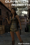
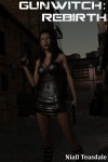
Okay, let’s get some opinions. I’ve got two options here which work with the lettering (I think) and add more light. The first has more general environment lighting, and some clouds to darken the sky. The second has a direct light on the foreground character, but has the original, dark background (which results in more contrast on the figure, but she isn’t quite as brightly lit…). Both look fairly good on my monitors. How do they look on yours? Which do you prefer?
I’ll add that I don’t have a solid preference. Both version have features I like and features I don’t.


No comments have been added yet.


