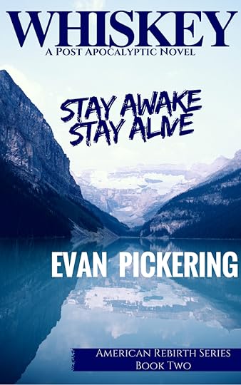
So I’m considering changing the title and cover for WHISKEY.
Truth be told, I like the cover and the title as it is… but I’m concerned it isn’t “connected” enough to HOOD so that the casual observer who sees it will recognize that it’s the sequel.
Maybe I’m overthinking things. But I’ve been toying around with covers to satisfy my meandering mind. Arguably, I’m not a digital design artist so my skills are pretty damn limited…
But I need some input from you, the reader/casual observer. Please let me know your thoughts on this matter…
Here’s the original cover:

And here’s the new one I’ve been playing with:

So, what do you think? Do you prefer the old one or the new one? Perhaps a mix of both? What do you think of the potential title change? Or the change of coloration to be more like HOOD?
Truth be told, things like title, cover art… these are just marketing tools. And I want BOOK 2 to feel as much like a spiritual successor to HOOD as possible.
Thanks peeps,
Evan Pickering


Published on December 03, 2016 11:46
