
A Tale of Two Covers (and a Contest)
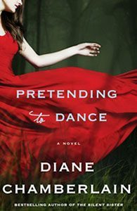
 About a year and a half ago, I first saw the design for the hardcover edition of my latest book, Pretending to Dance. To say I was blown away is an understatement. I thought the image with that vibrant red dress was stunning. I could feel the movement of that dress, and the woman wearing it came to life for me. But once the book was published, I discovered a problem. “I thought it would be a book about dance,” readers would write to me. Or, “From the cover, I had no idea the book would be a page-turner.”
Hmm. The beauty of the cover and the prettiness of the title, taken together, gave a misleading impression of the story. To be honest, my editor had wanted to change the title before the book was published, but I was adamant that we keep it. The title has great meaning in the story, as those of you who’ve read the book understand. I am usually at a loss when it comes to titles for my book, but I had this one before the book was even written. I was so wedded to the title that I couldn’t see my editor’s concerns . . . until after the book came out and I began to get that feedback from my readers.
So my publisher made the (very good) decision to change the cover when the book was reissued in paperback this month. Although the title is the same, the girl walking into the dark woods better depicts the suspense and mystery of the story, and I’ve been thrilled with the response from my readers. I was afraid that they would have loved the ‘pretty lady in red’ so much that this darker cover might turn them off. Their reaction has been the opposite. The new cover tells more of a story, and after all, that’s what readers are after. I’m grateful to my editor and publisher for making this change.
What are your thoughts? What does each cover say to you? How important is the cover image to you as a reader? Tomorrow, I’ll randomly pick one of your comments to win your choice of one of my available older novels. If you live outside the US, you’ll win a gift certificate to the online bookstore of your choice.
Happy reading!
The post A Tale of Two Covers (and a Contest) appeared first on Diane Chamberlain.


 I have the book but haven't read it yet. The red dress grabbed my attention. You made the right choice, I think.
 I absolutely loved Pretending to Dance. It was the first book I read by you Diane, and it made me a huge fan, I am working my way through all your previous books now
 Both covers are lovely, but the paperback cover draws me in more. It just feels more like what I would like to read and the story I hope to get from one of your books.
 I think the cover of the red dress sums up the novel beautifully. As I said in my review: "Chamberlain does it again. Picks a subject, gets you so entrapped by the subject, and weaves the stories of hurt, pain - psychical and mental, and how in the end we all just need to do a little "pretending." Loved it!"
I think for readers who haven't read the book - they might look at the cover and think something difference. But once you have read it, you just get it! I think the red sets a picture in your mind and you stick through it.
 I love both covers. I was initially drawn to the red dress cover more, but can understand the change and think the image of the girl dancing into the woods is perfect. Having read and once again loved this book I can't understand how people can be confused. yes the title and image of the red dress could lead you to the impression the book is about dance however as soon as you read the blurb you can tell this is not the case surely
 I believe that a cover is very important however it is just
there to grab the readers interest and there is the whole
never judge a book by its cover expression for a reason right.
Now for people who have never read your work I can understand
them thinking that the first one is about dance. But if you're a
fan then you should know better. I think the first one has
a kind of contemporary romance feel to it while the second cover
has more of a mystery. And like you said before I think that
the second one really has more of a mystery and suspense feeling
too it which suits a lot of your books.
The fact that it was written by you would grab my attention! But I like the mystery of the cover that shows the girl in the woods. The red dress cover, although lovely, sort of depicts a romance-type story
Love the red dress cover... it brought me directly onto the story Thank you for sticking with your gut feeling . I love your books but the second cover does not grab me ,
 They say that you shouldn't judge a book by its cover. The title and the cover art is what makes you stop to read the description of the story.
 I love the red.cover. I am unusual, I look at the cover after I read the book. I read the summary first
I was suprised firstly to only see a few comments, then i saw that this post is from october 31st, i recieved a notification today!(7th Nov). I am guessing the lack of comments may be due to this. I love this site but will not rely on automatic notifications anymore.
I love the red.cover. I am unusual, I look at the cover after I read the book. I read the summary first
I was suprised firstly to only see a few comments, then i saw that this post is from october 31st, i recieved a notification today!(7th Nov). I am guessing the lack of comments may be due to this. I love this site but will not rely on automatic notifications anymore.I love, love, love both covers, personally if they were both on shelf id go for the red dress. I am guilty of judging a book by its cover but not where certain authors are concerned, id buy a Diane Chamberlain book if it was wrapped in brown paper
 I disagree. I actually think the red dress cover better evokes the emotional components of the story and those, for me, were what made it moving and memorable.
 I am a "judge of books by their covers " reader and I am definitely drawn more to the paperback cover. However both are beautifully created and I would not have dismissed the hardcover version.
The red dress is gorgeous. The cover is stunning. I really like the woman in the woods cover also. Tough choice, both covers do however say READ ME.
I am a "judge of books by their covers " reader and I am definitely drawn more to the paperback cover. However both are beautifully created and I would not have dismissed the hardcover version.
The red dress is gorgeous. The cover is stunning. I really like the woman in the woods cover also. Tough choice, both covers do however say READ ME.


