Formatting for Ereaders
Today we are going to attack the subject of formatting for eReaders.
As children we are all taught to read on paper books. Those cute and colorful gems were designed to help us understand the words with the use of pictures and were entertaining enough to encourage us to continue along.

Our regular trips to the school library or perhaps the public library are fond memories and for many authors are the beginnings of a love a reading or perhaps the desire to be a writer.
The look, the feel, the smell of a paper book is something that evokes memories – perhaps is a source of comfort.
It’s not at all surprising that many authors focus on the paperback book when they are thinking about publishing.
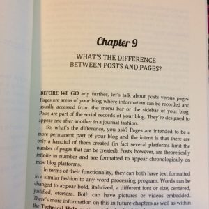
Looking at the example above of one of my books, we see so many things to focus our attention on.
What does the chapter title or chapter head look like?
Do we use drop caps on the first line?
Do we use capitalization on the first line?
Do we indent at the start of every paragraph?
What font do we choose?
The list of choices are endless it seems. To many, choices like the list above are very important – especially those authors who primarily read books in paperback from.
When creating a paper book, these choices are made and the finished product will reflect our vision. And since it is printed, the look and feel will not change – it is static.
In my experience, many authors assume that the same choices can be made for ebooks – and they can. However, what many authors are unaware of, is that the way the ebook version of their novel is viewed is dependent on factors outside of their control.
Let’s talk about some of these factors.


How are ebooks read? Three of the common devices are pictured above. A Tablet, a laptop and an ereader (Kindle, Kobo, Nook and others) are common choices. Research tells me that many people read books on their smart phone. Although I can’t imagine regularly reading on a smart phone, I have and do read books on all of the above. I have a Kindle, a Nook, an iPad and a laptop.
The first thing that we can tell from the above is that there is a variety of screen sizes, not to mention the variety of other factors. We know from Amazon, that they offer free reading apps so that you can read your Kindle books on almost any device. The same is true of other retailers, and even some publishers.
What many authors don’t know is how much control is allowed over the look and feel of the book being read on a device. All devices and reading apps have some sort of a settings menu. I admit than many don’t know these settings are present and read using the default settings of their device.
On my iPad’s Kindle app, if I tap in the upper right of the screen I can get what are called View Options
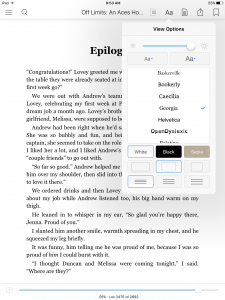
You’ll notice that not only can I control the brightness of my screen, but I can control the font size as well the color – I can even choose which font I want to read the book in – I’m presented with a small handful of choices.
I also have the app from Harper Collins :
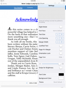
It has a settings menu that allows for even more customization of what I’m reading – it has a lot more power than the choices on the Kindle app. I’m offered a choice of 60 different fonts. I’m allowed to increase or decrease line spacing and margin width – even change the justification of the text.
These choices – this capability is not limited to the above two examples. In fact all reading devices will allow customization of the reading environment to some extent.
Let’s talk about what this means with some screenshots. I now format using Vellum (and yes, I’m a huge fan) When I format with Vellum, it allows me to see how the ebook will look on a device.
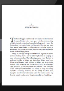

The graphic on the left is what Vellum tells me what the ebook will look like, and the graphic on the right is what the default setting looks like on my Kindle app. You’ll notice the chapter header is different – the underline is gone and the all caps are gone. The drop cap that I carefully chose is gone on the Kindle app version.

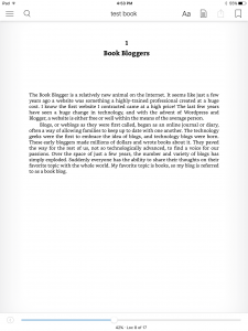
If I had better eyesight and read a book in a smaller font size, what takes up one page on the default according to Vellum, is barely half a page on my Kindle app. This clearly explains why ebooks don’t have page numbers – or the page numbers change. On the Kindle app, I’m offered with percentages of amount read. Different devices offer different methods of helping you understand how much you have read – but clearly, the amount can change from reader to reader.

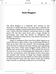
In actual fact, if I change the font family, I can change the whole look and feel of the book as you can see above.
So…what do we learn from this?
The obvious fact to point out to the people who exclusively read paper books, (yet sell their books in an eformat) is that what you choose for your book to look like, is not necessarily what it will look like to your readers. Although you many be offered with choices by the person/company who formats your book, those choices might not be reflected to your readers. When readers complain about ‘formatting issues’ they might be of their own making because they changed their settings.
If you sell your books in an eformat, I suggest that you get yourself some free reading apps and see what your books can look like to your readers 


