
You can judge a book by its cover
The Turn is coming! I’ve got the cover to prove it! And the tease in me is going to draw it out all week so I can take the time and tell you about the thought that should go into a cover.
There’s a joke in NY that the last person to design the cover should be the writer because most of us want it to be a pure expression of what’s inside, but after years of seeing how these are put together, I’ve learned a few things about what makes an effective cover, (I had a great teacher) and what isn’t as successful. Rarely does the cover ever look like a scene of the book, but rather, it has elements that tell you what’s inside. Something magical for paranormal, a man and a woman if there’s lots of romance, a flavor of setting, (space, fantasy, castle, city, futuristic) weapons if there’s danger, wolves if there’s Weres, and fangs for vampires, you get the idea.
If I were to duplicate an image from the book, Trisk would be in a lab coat, that wonderful hair of hers in a bun with maybe a man in a suit or lab coat behind her smiling wickedly against a backdrop of a tomato field (or city) putrefying in the sun. Personally, I like the red dress much better. Covers are not so much duplicating an image from the book as finding the feeling they contain. And even after that, even the professionals don’t know what makes one cover fly off the shelves and others not.
I’m hoping this one jumps off the shelves like it was on fire.

Yes, I know you can’t see the last half of it clearly. Tease, remember? And I want to slow down and talk about aspects of this absolutely fabulous cover as it evolved from what I first saw.
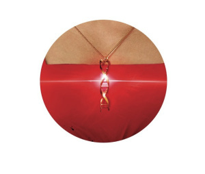
At the heart of the story, there is Trisk, Trent’s to-be mother, and the cover should have her on it. My editor chose the model and put her in a bright red dress, and I think it does a fantastic job of reflecting Trisk. She’s a dark elf, like Quen, sophisticated, smart, and has been expected to focus on security as her career. And as beauty can be equated with danger, the model is indeed, beautiful.
But Trisk, like the story itself, has a core of science running through her. The original cover had all the beauty, but none of the science, so I suggested a DNA helix necklace. The necklace does double duty as the glints tend to draw in the eye and give hints that there might be magic involved. I also asked for the neckline to shift to a straight cut as that was the style in the sixties and I felt that that element of the book needed to be on there somewhere.
Tomorrow, I’ll show you the background, and tell you why I love my editor’s choice there so much.


 I LOVE this cover. Looking forward to this book! :)


