"
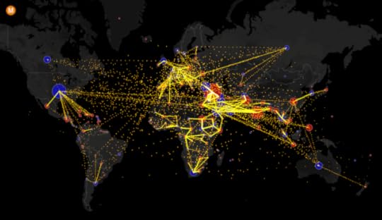
The world is experiencing the biggest displacement of people since the Second World War, with more than 22 million displaced from their home countries. More than 1 million people arrived in Europe in 2015 alone. This map, posted on metrocosm.com and based on estimates from the UN Population Division, gives a remarkable insight into the extent of global migration. It shows the estimated net migration by origin and destination between 2010 and 2015. Each yellow dot represents 1,000 people, while blue dots indicate positive net migration, and red negative net migration."
Read more from source
here.
Published on August 28, 2016 04:35
