
An Idleness Chart
Inspired by Mike Konczal here's a chart showing the aggregate quantity of hours of work done in the USA versus the size of the working age population. Both are indexed to 2002:
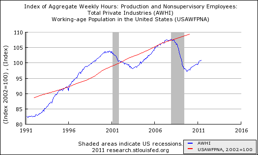
As you can see, the population has a "slow and steady" growth path. Aggregate hours work is more of an up-and-down thing driven by the business cycle, but with an upward trend since the number of working age people rises over time. And now we have this amazing gap. It's a staggering waste of the most precious resource we have: Human beings and their potential.


No comments have been added yet.
Matthew Yglesias's Blog

- Matthew Yglesias's profile
- 72 followers
Matthew Yglesias isn't a Goodreads Author
(yet),
but they
do have a blog,
so here are some recent posts imported from
their feed.

