Two Days to Book Launch! Yay
My physical proofs just arrived! I'm super stoked!

There's nothing like holding a physical copy of your book, smelling that new pages scent and seeing your name on it.
Well Createspace does give you an option to digitally proof or physically proof your book. I chose the physical option, even though it was more expensive, because of the following reasons:
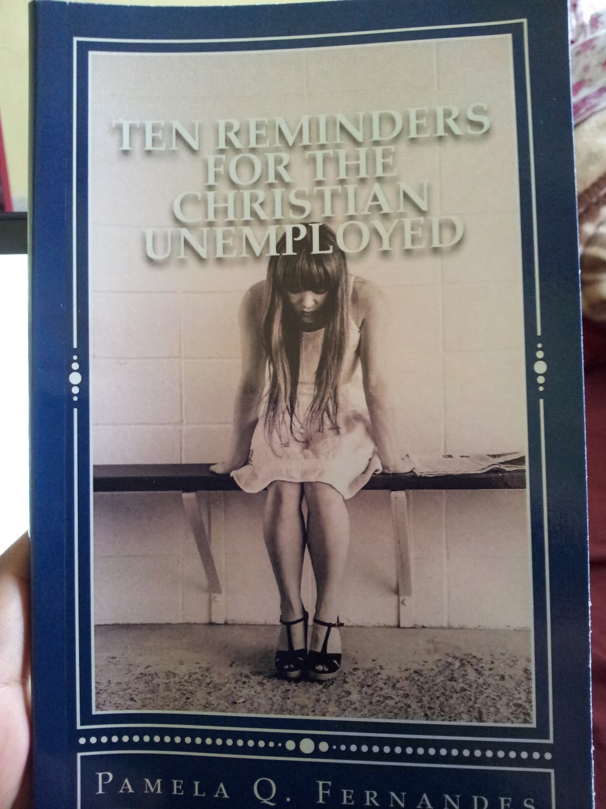
1. Design elements: I wasn't so sure about the ornament, the shade of blue and the image working together. Besides I wondered if a glossy cover was better than matte. I chose glossy and it certainly gives the cover some sparkle. Moreover all my previous books for some reason have been red and black. The ebook version of this is red & black again. The audio version(coming soon) is sepia and maroon. So I wasn't so sure about changing the color, even though the red format wasn't working for my cover or its genre.
2. Interior work : My most important reason for physical proofs was to check the font. When I submitted my final copy, Garamond 12 looked really small. I wanted to go large, but it also meant the pages would increase and the book would be more expensive. For my target audience, I want this book priced as low as possible so getting the font right was important. I have to say that its not bad. Garamond 12 is pretty clear and legible. Garamond is also the industry standard.
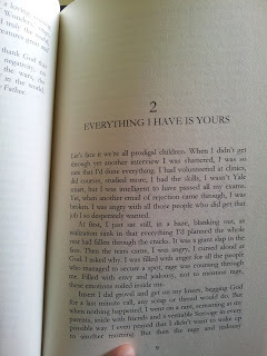
3.Final edits : I hate to admit, but I found the MS littered with errors that escaped me when I did the digital proof. For some reason, during the conversion, my exclamation marks became question marks. I'd also left the template instructions in. Plus I had edited out the e-book formats but had forgotten to include those edits in the print format. For anyone whose self-publishing, please make a separate template for your format. Mine was for a 5x8 book, so the interior changed and I used a standard template, which makes life much easy. Nothing too fancy, but it does the job.
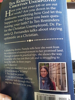
4. Back cover description: I missed the extra full stop at the beginning of the sentence, 'If you are.' It might seem like a glaring mistake, but when you're editing the cover, the print's too small. And you get so focused on other things, the bar code, the image, your photo, color of the heading, the font, the spelling. Its easy to slip past these minor things. A physical proof can help you see those descriptions again, in a new light and edit out whatever is unnecessary.
5. Just to savor it! - I do want to feel what the book feels like before it reaches the audiences hand. I want to see, smell and feel the physical copy, so that I know what my readers will experience when they see the book.
I did a weird little happy dance yesterday for my book. I'm so so so very happy.
Come pub day will share the links to the print version. Yippee! You can tell I'm happy right!
Songs on my playlist: Indescribable: By Laura Story
Movie I recommend: Brave

There's nothing like holding a physical copy of your book, smelling that new pages scent and seeing your name on it.
Well Createspace does give you an option to digitally proof or physically proof your book. I chose the physical option, even though it was more expensive, because of the following reasons:
1. Design elements: I wasn't so sure about the ornament, the shade of blue and the image working together. Besides I wondered if a glossy cover was better than matte. I chose glossy and it certainly gives the cover some sparkle. Moreover all my previous books for some reason have been red and black. The ebook version of this is red & black again. The audio version(coming soon) is sepia and maroon. So I wasn't so sure about changing the color, even though the red format wasn't working for my cover or its genre.
2. Interior work : My most important reason for physical proofs was to check the font. When I submitted my final copy, Garamond 12 looked really small. I wanted to go large, but it also meant the pages would increase and the book would be more expensive. For my target audience, I want this book priced as low as possible so getting the font right was important. I have to say that its not bad. Garamond 12 is pretty clear and legible. Garamond is also the industry standard.
3.Final edits : I hate to admit, but I found the MS littered with errors that escaped me when I did the digital proof. For some reason, during the conversion, my exclamation marks became question marks. I'd also left the template instructions in. Plus I had edited out the e-book formats but had forgotten to include those edits in the print format. For anyone whose self-publishing, please make a separate template for your format. Mine was for a 5x8 book, so the interior changed and I used a standard template, which makes life much easy. Nothing too fancy, but it does the job.
4. Back cover description: I missed the extra full stop at the beginning of the sentence, 'If you are.' It might seem like a glaring mistake, but when you're editing the cover, the print's too small. And you get so focused on other things, the bar code, the image, your photo, color of the heading, the font, the spelling. Its easy to slip past these minor things. A physical proof can help you see those descriptions again, in a new light and edit out whatever is unnecessary.

5. Just to savor it! - I do want to feel what the book feels like before it reaches the audiences hand. I want to see, smell and feel the physical copy, so that I know what my readers will experience when they see the book.
I did a weird little happy dance yesterday for my book. I'm so so so very happy.
Come pub day will share the links to the print version. Yippee! You can tell I'm happy right!
Songs on my playlist: Indescribable: By Laura Story
Movie I recommend: Brave


No comments have been added yet.