
Insanely Generous
My Terrible Idea!
What decisions did we make to launch Steve’s new book?
Did we actually follow my packaging and marketing principles from my past What it Takes posts?
Despite many missteps, I think we did.
It’s worth a review.
This is a longish article for the diehards, but there is a pretty cool stat as the payoff, so either skip to the end…or bear with the inside publishing baseball and get the how and why behind the insane number of eBooks we gave away the past two weeks.
The first and best packaging decision made was…Steve’s….and I loved it straightaway.
He decided to title his new book Nobody Wants to Read Your Sh*t. It was a title that had been percolating for him since October 2009, when he first explored the notion on this site that writers without empathy for their audience are their own worst enemies.
No-nonsense and cheeky titles like Adam Mansbach’s Go the F*ck to Sleep and Harry G. Frankfurt’s On Bullshit has a strong sales history and my initial reaction when Steve told me his idea was “I Love it! This will be easy!”
There is no arguing with the fact that Steve’s title is provocative…capable of getting a potential buyer to perk up the moment she sees it.
But on closer examination, Steve’s title doesn’t have Mansbach’s funny parental desperation baked into it or the faux academic seriousness of Frankfurt’s. It’s not humor and it’s not sociology…it’s self-help for creatives, a genre that might not be all that keen to hear a harsh profanity flavored truth.
Which posed a serious packaging problem.
The problem was this.
If we published a book called Nobody Wants to Read Your Sh*t, right from the start we could push away a very large segment of our target readership…writers/artists in the throes of Resistance looking for serious counsel.
They don’t want negative “you’ll never make it” messaging. Who does?
That’s certainly NOT THE THEME OF STEVE’S BOOK, but on first inspection, it would seem to be…
That’s a problem.
We’d already accepted that there are some readers who reject a work that contains profanity from the get-go. Did we want to turn off an even bigger segment? Those people who are more sensitive in terms of their approach to the creative arts?
These kinds of creatives subscribe to the method of getting in touch with one’s deeper self (their inner genius/muse) through reflection and gentle coaxing rather than us blunt blue-collar worker people with salty tongues.
Was our title going to alienate this compelling group of readers?
The answer was “Yes, it probably will.”
Of course most people on the softer side of the unleashing creative power debate would not be turned off by the title if they knew what was inside. If we could get them to read what was inside the book before they bought it…then we’d be home free. Sort of like letting people eat dinner before asking them to pay…
In fact, we were confident that any of those in this camp who were open to giving Steve’s book a try would find themselves gripped by the ideas inside and the narrative approach (a veteran writer confessing his own struggles with the harsh truths of art) so much so that they’d be changed by it.
They’d even embrace the message/s in the book and convince other members of their persuasion to give the book a chance. But they themselves wouldn’t if the title and packaging alienated them so much that they’d never open to page one.
So how could we combat that?
The answer would have to come from 1) adding a subtitle to diffuse the cold hard truth of the title and 2) in the visual packaging of the book. The package would have to yang the yin of the title. It would have to be soft, not harsh…
The subtitle wasn’t that difficult to come up with. Steve and I were on the phone one day thrashing all of this about when we spit-balled a bunch of subtitles. One of us said something like…“This book explains why nobody wants to read anything anymore and more importantly how the writer can change that.”
So that’s how, WHY THAT IS AND WHAT YOU CAN DO ABOUT IT came to be.
We like that subtitle because it makes a promise to skeptical readers that if they give the book a chance, it will explain the harsh point of view of the title and give them the tools necessary to solve the problem.
Okay, so the subtitle was the first step to soften the blow of the title for a potentially large segment of the audience.
Just a quick aside here to point out that Steve and I weren’t packaging the book just for his core audience…we purposefully decided to branch outside our solid core “look.”
We knew that fans of the trilogy The War of Art, Turning Pro, and Do The Work would eventually come to the book no matter what.
They’d read it even if we put the book in a brown paper bag.
The trick to packaging when you have a solid sales track record is to keep your fans fans, of course, which means consistently creating packages of a kind that reinforce the core ethos of the writer. But you also want to make tactical stretching decisions to bring in new members to the tribe.
At some point you just don’t keep preaching to the same choir. You need to go outside of the revival tent and recruit more singers…
With the subtitle figured out, now came the very difficult part of packaging Nobody Wants to Read Your Sh*t…settling on a vision for the cover art.
Remember my post about how the title and the image should yin and yang? Well, this was the principle that came to be indispensable for our final decision.
The first thing Steve and I did was to call our artist friend Derick Tsai at Magnus Rex. We explained what the book was all about and emailed the manuscript to him and asked him to noodle it around.
Oftentimes Derick nails the image before Steve and I have to even think about it.
Derick’s cover for the Do The Work paperback is a perfect example. We just told him we wanted Do The Work to be of a kind with The War of Art and Turning Pro. About a week after telling him that, he sent us the great idea with the worn down pencil.
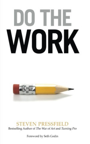
Derick’s cover for DO THE WORK
While the artwork is not an in your face contradiction of the title (my whole yin and yang approach was established by The War of Art series sensibility), it is an expression of the core ethos of the trilogy of works.
Plus it implies practicality. Those who wear down their pencils to the nub, aren’t just day-dreaming about being a writer…their writing…
While Derick came up with some interesting visual stuff for Nobody Wants to Read Your Sh*t, the ideas didn’t quite knock all of our socks off. But what they did do was give us direction.
Derick saw the title and the book itself as a guide to how to “break through the walls” that hold us back from realizing our visions. So he had some cool images of brick walls with outlines of invisible doors that would metaphorically lead the reader into turning the pages of the book.
The idea of the brick wall and the door was terrific, but we just couldn’t make the look of the wall etc. look all that interesting or appealing.
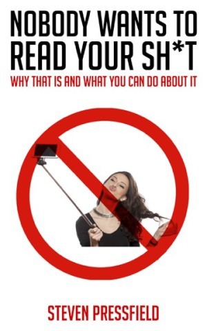
Next up was a terrible idea that I had, but at the time I thought was perfect. It was an image of a selfie-stick with one of those red circles with a line through it–like the one at the top of this post…so sorry again Derick for asking you to mock that up!
For me, one of the most important lessons in Steve’s book is that we can’t fall into the trap of writing all about our own inner and outer dramas…essentially using ourselves as the only drivers of our fiction (or nonfiction for that matter).
These kinds of “me, me, me” works are the equivalent of the selfie-stick photos that are so ubiquitous these days. Does anyone really enjoy looking at someone’s selfie? Unless they’re celebrity selfies that give viewers false senses of intimacy with “important people,” these photos are just plain ridiculous and self-indulgent.
So I thought having an image of a selfie-stick with a line through it, we would tell readers what this book was about…
Unless the writer/artist gives up his selfish need to dramatize his own shit in the hopes that he will be validated by third-party anonymous readers/viewers, he will never create a universal story or work of art. Instead, writers/artists need to empathize with their audiences and craft their works to be so utterly compelling that the reader/viewer projects his/her own life experience into their narrative universe.
Ugh… I think you can see just how difficult it would be to translate that message into a single cover image.
Plus that message is another negative connotation, akin to the title.
NEGATIVE title, NEGATIVE image won’t work for self-help creatives. It will turn people off immediately! Needless to say, the idea blew up. It looked terrible too!
Back to the drawing board.
After about six weeks of flailing, Steve, Derick and I were ready to jump off a cliff. We still had nothing and time was a wasting.
So we went back to basics.
We needed to soften the harsh tone of the title so as not to alienate readers. That was of utmost importance. And,
We also needed to let people know immediately that the book WAS NOT AN OPINION!
It is an unimpeachable and painful truth that has to be dealt with…just like one of those brilliant bits of truths that Ben Franklin was so good at coming up with “neither a borrower nor a lender be….”
Talking this through yet again somehow triggered an idea with Steve.
“This is like one of those things your grandmother would embroider and put on the wall above the kitchen table…” said the former Mad Man.
A sampler…
We all recognized that a warm and cozy grandmotherly sampler was the perfect yang to the yin of the profanity in the title.
So Derick did some mock ups that confirmed that the concept would work, but still there was something just didn’t feel right about the cover.
No matter how many times Derick tried, the texture of the mock up digital sampler just didn’t feel authentic. It looked and felt a bit cynical…exactly the opposite of what we wanted to project…
So we decided to go the full nine yards and actually commissioned a sampler. We’d literally photograph it tacked up on old-timey wallpaper that your grandma may have had up in her very own kitchen.
We turned to Julie Jackson at subversive cross stitch. Not only did she come through with a great design, she even hand-stitched and framed our sampler herself. I bought some old wallpaper from Hannahs Treasures and then I sent the whole shebang to Derick in Los Angeles.
Derick called in a favor from a buddy who owns an art studio and they shot the cover in a day. It looked great!
But we still weren’t finished.
We had to figure out how to handle the back cover copy…
Remember that my previous advice written up in this forum is to get some great quotes?
Well, we decided that Steve’s reputation would be enough to get people interested in this book. Plus the title and cover image were provocative in and of themselves. And if we were to call in a favor to get a famous writer friend to read and give us a front cover blurb for the book…then that favor for this book would be spent and we wouldn’t feel right asking for another from him and here.
So instead of getting quotes…we decided to keep any possible favors from friends for something else. Maybe we wouldn’t even be taking from them…maybe we could give something without a quid pro quo? More on that soon.
So for the back cover, we went with the obvious headline:
FROM THE AUTHOR OF THE WAR OF ART…
The headline immediately triggers to more than 300,000 readers that NWTRYS is “of a kind” with WOA. Keep it simple!
Then we went with a four-sentence set up to intrigue potential readers who’d never heard of The War of Art and for those who have read it, to offer them something fresh.
We followed that up with an excerpt of some meat and potatoes description from of the book itself, to let readers know what drives its argument/s and the kind of narrative voice to expect.
Lastly, Steve recently appeared at a good friend’s conference for creatives and there were some great new photographs of him available…
So we went with a warm and smiley shot (to again counterbalance the inherent negativity of the title) and added a longish version of his author bio. For those unfamiliar with his stuff…to pull them in with his bona fides.
And yet…
We were still concerned about alienating potential readers with that Sh*t in the title. What we needed was to jump-start discussions…we needed a lot of people (my good old 10,000 Reader Rule) to give it a chance so that they could spread the word of mouth necessary to counterbalance resistance people might have to the title.
How could we get word of mouth about the book going in a way that was organic and not heavy handed or cheesy?
This is when we came up with the idea of giving away a free eBook version to as many tribes as possible. This is when we reached out to our friends that we didn’t want to bother asking for advance blurbs.
We’d ask them instead if they’d let their tribes know that we were giving away a free eBook version and point them directly to the place they could download it.
Now the other thing we did to let our friends know that we were “Trojan horsing” them to hook-wink their subscribers to give us their emails so that we could market to them day and night was to decide NOT TO REQUIRE ANYTHING OF ANYONE WISHING TO DOWNLOAD THE BOOK.
We seriously just wanted enough people to read the book early so that we could ensure that the book had the best possible chance of finding a long term audience. The only way to make that clear to everyone was to not make people give up their email addresses to get the free book. It really would be free.
And then we launched.
We first alerted First Look Access Members from www.stevenpressfield.com. Great start!
And then we alerted The Story Grid Subscribers. The momentum built!
We were amazed by the early responses! We hit our 10,000-copy goal in three days!
And then we asked Jonathan Fields, Marie Forleo, Seth Godin, Jeff Goins, Tim Grahl, Eric Handler, Todd Henry, Victoria Labalme, Brett McKay, Mark McGuiness, and Joe Tye to alert their peeps. We worked through their schedules and let it ride.
What happened then is hard to metabolize.
I’m overjoyed to report (as is Steve, Callie and Jeff) that with such insanely generous help from our friends…
In just fifteen days (June 15 through June 30, 2016)…
123,453 people took advantage of the free download!
And judging by the reads and responses to the book, we think we’ve positioned Nobody Wants to Read Your Sh*t as an evergreen backlist bestseller that will one day join the ranks of The War of Art, Turning Pro, and Do The Work as must-reads for aspiring writers and for all of us pounding out copy professionally too.
Thank you.


