
garsh:
Ever wonder why Mega Man looked the way he did on...
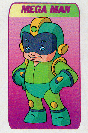
Ever wonder why Mega Man looked the way he did on Captain N: The Game Master? Read on for the answer, in the words of the artist who designed him: Fil Barlow.
To put it in perspective, I had less than a couple of weeks to do the art posted here. I was the last artist to be seasonally laid off by DiC. Once fired, my working Visa was terminated and I had to leave the country. I had one night to play the games and no further contact with the material, including the manuals. I had no idea who was involved in the making of the games, and I didn’t know the name Capcom back then, but I wasn’t in any position of authority to contact the clients at Nintendo. If anything it’s surprising how much I got right, considering.
Even this explanation doesn’t clarify the green color scheme disparity. He also said he was terrible at playing the game, so never confronted any of the bosses. If that’s true, he should have only ever seen Mega Man in blue. It turns out the TV he played on must have suffered from poor contrast settings, as he went on to add the following remark.
…Megaman’s appearance is simply how it looked to me on the TV I had and no one else checked…
And if you think that’s something, his original design concept included a whole “mega” family, with mom, pop and even mega pets. It was more of an Incredibles type of super hero situation than the Astro Boy / Tetsuwan Atom homage that Mega Man truly represented. Further, his early vision for what became Captain N was based primarily on the Paper Boy videogame and was entirely unlike the end product we saw on TV, for better or worse.
See for yourself in Fil Barlow’s Deviantart gallery:
http://filbarlow.deviantart.com/art/Before-Captain-Nintendo-there-was-Buddy-Boy-312281346


Brandon Graham's Blog

- Brandon Graham's profile
- 196 followers

