
Recession Watch, June 2016
Since Friday’s employment release, there’s been a surge in articles discussing the possibility of a recession.
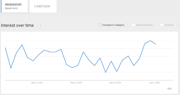
Figure 1: Google Trends index for “Recession”, last 30 days, in Business and Finance category. Source: Google, accessed 6/7, 11PM Pacific.
Time for a look at some key indicators the NBER Business Cycle Dating Committee [1] has looked at in the past.
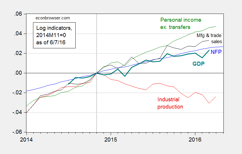
Figure 2: Log nonfarm payroll employment (blue), industrial production (red), personal income excluding transfers, in Ch.2009$ (green), manufacturing and trade sales, in Ch.2009$ (black), and Macroeconomic Advisers monthly GDP series (solid teal). Source: BLS (May release), Federal Reserve (April release), BEA, Macroeconomic Adviser (May 17), and author’s calculations.
While most series are still rising, as of latest reported observations, the decline in industrial production is worrisome.
The broadest measure of economic activity is GDP. Figure 3 presents the BEA series, and the Macroeconomic Advisers and e-forecasting monthly series, for comparison.
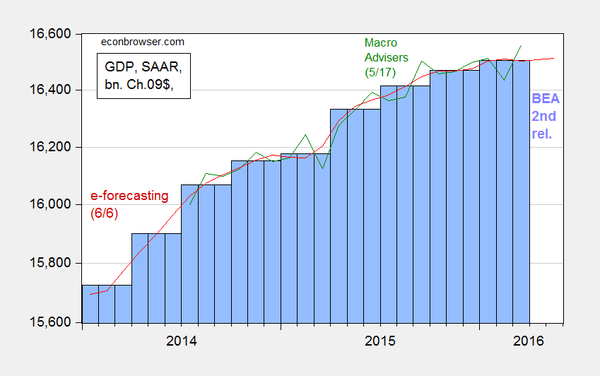
Figure 3: GDP as reported by BEA (blue bars), Macroeconomic Advisers (green line), and e-forecasting (red line), all in billions of Ch.2009$, SAAR. Log scale. Source: BEA (2016Q1 second release), Macroeconomic Advisers (5/17), and e-forecasting (6/6).
What’s obvious here is a flattening out of these series, although Jim’s recession indicator index still fails to call a recession as of the 2016Q1 advance release. Despite this, and an implied acceleration in GDP growth according most nowcasts of 2016Q2 GDP (see Jim’s post), count me worried.
I take some solace in the fact the yield curve has not inverted in the 6 months to one year prior to today, where an inversion of the yield curve has typically been a useful predictor of recessions (see this post, based on Chinn and Kucko (2015)). This point is shown by Figure 4.
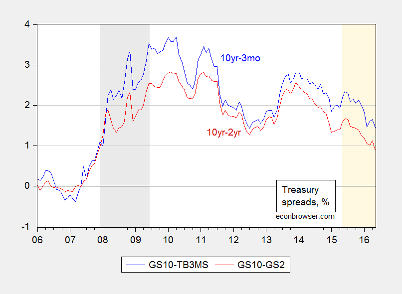
Figure 4: Ten year-three month Treasury spread (blue), and ten year-two year Treasury spread (red), in %. NBER defined recession dates shaded gray. Light tan shaded area pertains to the last year. Source: FRED and author’s calculations.
Note no inversion over the last year, denoted by the light tan shading; of course, the last 8 years has been an atypical period with short rates at the zero lower bound. In these conditions, it’s unclear whether the yield curve remains an accurate predictor given that the spread is being driven by changes in the long rate (see Fatas).
Despite the conflicting nature of the data, now does not seem the time to raise policy rates.


Menzie David Chinn's Blog


