A Small Snapshot of a Design in Progress
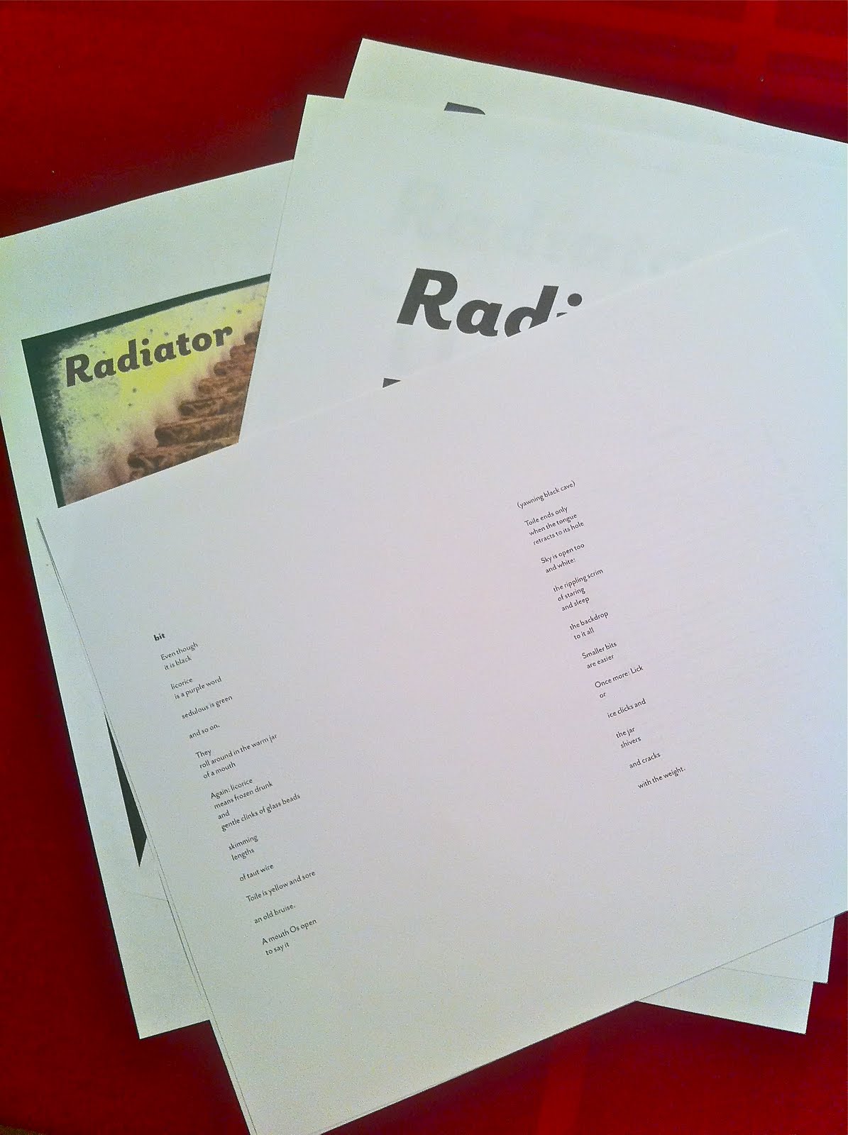
I'm working slowly, too slowly, at designing Nancy's book of poetry, which goes by the title Radiator. Even though the poems in the book are generally narrow, the book itself will be square to accommodate the cover image I want to use, which is a photograph by Nancy. Esthetic decisions are guided by structures we develop for ourselves.
I even bought a typeface for the book because I needed something I really enjoyed, something new, and something that works with the poems themselves. It is, unexpectedly, a sans serif face, but with enough character to carry this light text that bears yet some significant heft. There's beauty in those characters, the tiny bits of flair, the flaring at the ends of some letters, their hands waving.
Just read for the many-eth time the second poem in the book, the first lineated poem, after a little prose poem that sets the stage, one of many that open the sections of this book. It goes by the name "bit." All the titles are one word long, and only a syllable in length, a partial breath to say them. The poem grows into something quite great, but its opening still always stops me:
Even though
it is black
licorice
is a purple word
sedulous is green
and so on.
Setting this text and moving it across the page has caused me to look at it closely again. I bend down into it, my ear cock for its sounds, my eye in the corner of the eyelid watching for any movement.
Maybe tomorrow I can finish this typesetting and lift this book up into the air.
ecr. l'inf.


No comments have been added yet.