
And Then I Read: THOR GODSTORM

Images © Marvel Characters, Inc.
I missed this when it came out in 2001, so I was delighted to get this new hardcover collecting the three issue series, with some very short Tales of Asgard stories by Tom DeFalco and Mike Mignola rounding out the package. The book is larger than comics size, about 10 to 15% I'd guess, and printed on glossy stock. More about the reproduction later.
At the beginning of this tale, which takes place on the coast of the North Sea in 912 AD, two boys are scolded by a white-bearded elder, who vows to correct their foolishness with tales of great deeds by the god Thor, revolving around a mysterious stone worn by their tribe's leader. We soon find out that the Godstorm of the title is an actual thunderstorm which dares to rebel and disobey Thor, incited by Loki of course, and it continues to plague the thunder god through the centuries, with each issue focusing on a different time period, including our own time in the final issue.
Writer Kurt Busiek begins very much in the style of Stan Lee, and artist Steve Rude very much in the style of Jack Kirby in the "Tales of Asgard" stories by those two legends. The writing is fine, but to my taste doesn't really come alive fully until Kurt starts to stretch and breathe a little, loosening up as the tales unfold, adding more modern writing tropes and dialogue, especially in the final present-day issue. The wrap-up goes back to Stan Lee's somewhat over-the-top style, but by then we've been through enough with the characters that it still works fine.

The art by Steve Rude looks great overall, and I love Steve's work, so this was a pleasure to see. While he does draw heavily on Kirby, Steve's own style shows through more and more as the story progresses, and Rude has always declared his debt to Kirby, so it makes sense for him to use a lot of that style, especially here. I have to say Rude's women are a lot cuter than Kirby's, too, which is not a bad thing. The only thing I didn't like about this book is the reproduction of the art on the Rude pages. You have to look close to see it, but when you do look close, the lines are jaggy, meaning the scan resolution was not set high enough. Here's a close look at one of the balloons—the black lettering on white is where it's most noticeable:
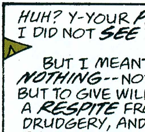
See how the lines aren't smooth, but instead broken into little jagged edges? This could have been avoided if the original scans were made at a higher resolution. I'm being picky here, and there's a good chance many readers might not even notice, but I did, so I thought I should point it out. And, on the original comics it would have been less noticeable. Making the art larger only serves to make this issue more visible.
It's a minor flaw on an otherwise fine package, though, and I had a fine time reading the book. The Mignola shorts aren't bad, though mostly I was looking at how Mike's art style has changed since they were done.
Highly recommended.


Todd Klein's Blog

- Todd Klein's profile
- 28 followers

