In Which, For Once, I Do Not Over-Do It.
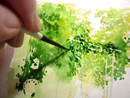
Last week I showed you how an illustration of a secret garden can go all wrong when you (that means me, I, the left-hander holding the brush above) over-do it. So this week, let’s not end with a much-needed glass of champagne consolation. . . what am I saying?? I love ending a painting session with champagne, even if it’s for consolation! Rule of Life: There Is Never a Bad Reason to Drink Champagne.
So, this week, let’s roll our painting session towards a glass of champagne just because, but hopefully not because we (that means me, I, the let-hander picking up the paint brush) have made yet another illustration go all wrong. OK?
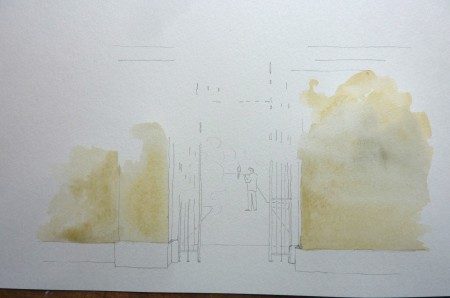
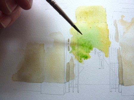
Today I am going to paint the secret entrance to a well-known secret London garden, the Chelsea Physic Garden, which is actually not at all secret anymore, having lately become one of the Top Ten tourist attraction sights in all of England. As you can see below, I have penciled in a few guide lines and put down a wash of yellowish-grayish watercolor in the area where the high brick wall (that surrounds the garden) will be:
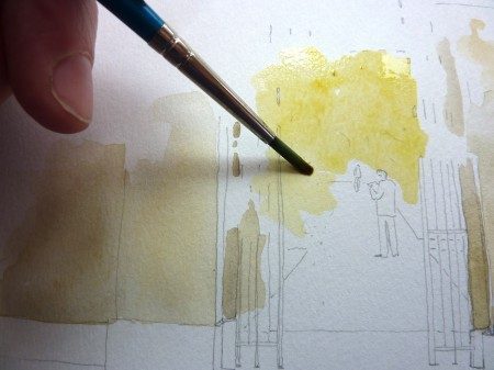
So far, it looks ugly, but that’s just for now. Because yet to come is the part where I am painting the Chelsea Physic Garden on a sunny day, and in the background I will lay down the color of sunbeams:
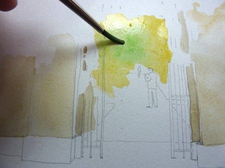
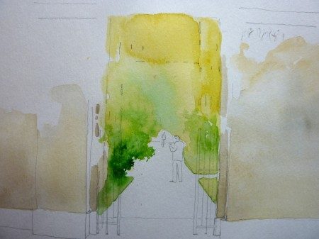
Quick, while it’s still wet, I blob in some pale greenery:
And more greenery:
I add some medium-dark greens for the middle ground:
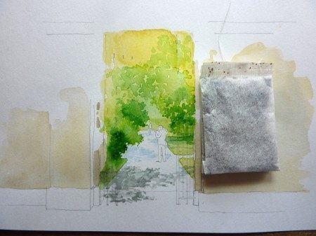
I dab in some detail foliage (but not too much, don’t want to over-do it) and add shadows, and if this were one of my famous tea-bag size miniatures, we’d almost be done:
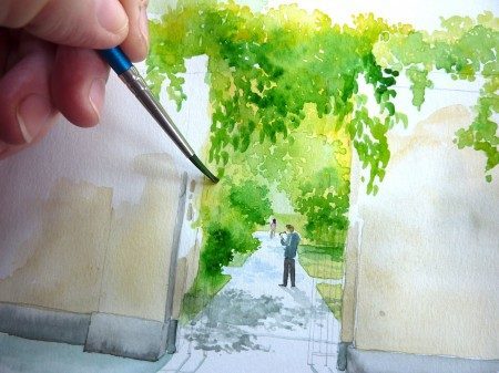
I paint in the two figures — for the record, a man in a grey shirt in front; a woman wearing a pink shirt in back — and in the foreground, I paint a foundation layer of greenery (I’m afraid I’m going to have to use the word “green” and “greenery” very often in this post):
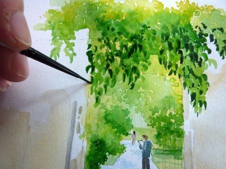
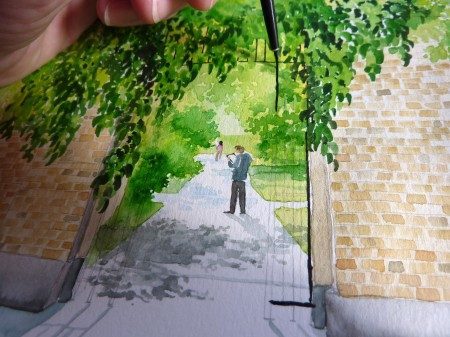
This next bit is fun for me: I get to paint some detail stuff in middlingly-darkish greens here. By the way, I practice making these itty bitty leaves in one sinuous stroke before I put them in this picture — think of it as calligraphy: it only looks good if you get the stroke right, and you only get one chance to get the stroke right:
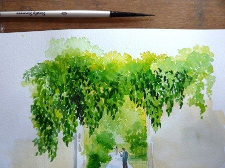
Using the same stroke, I add contrast by using a very dark green (which is regular green that I’ve mixed with black):
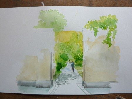
And here is where I lay my brush down because here is where I DID NOT OVER-DO IT!
Yay for me!
Next: The Wall.
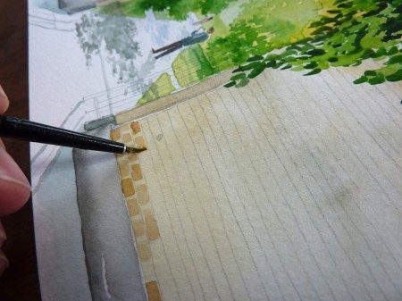
If I had drawn these penciled-in guidelines (see below) directly onto the watercolor paper before I put that ugly yellowish-grayish wash over on top of them, the pencil lines would be fixed permanently by the paint. But O Clever Mio, I instead I let the wash dry completely and put the pencil lines on top of the wash, where they are fungible and I will be able to erase them all off after I paint in these bricks:
Oh, how I love painting bricks. Yes, you have to concentrate on getting the teeny tiny spacing of these teeny tiny dashes of paint right, but it’s a pleasantly mindless concentration that permits you to paint while also listening closely to talk radio, or following the CD of the cast recording of Hamilton, or creating in your head the perfect put-downs to the jerk who was loud-mouthing against Boston Rob being the greatest champion of Survivor in history (He is. So shut up.) at your brother-in-law’s barbecue; it’s that kind of meditative, calming pondering that I only get done when I have a lot of bricks (or the like***) to paint. Ahhhhh. . . . I could paint bricks all day.
But sadly, the brick painting comes to an end and I must finish this task. So, lastly, I hold my breath and paint the grille. Yuk. I have to paint straight lines, in an uniform, unvarying width, with a 00-size brush. If I screw up at this final step and do something blobby and/or squiggly, I will have ruined the illustration and wasted hours and hours of work:
Whew.
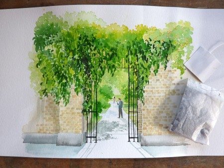
DONE:
Except. . . look at this closely:
The whole time I was painting this illustration, I kept thinking how odd it was that the entrance to the Chelsea Physic Garden was surprisingly un-symmertrical. Well, duh. Upon looking at other reference photos than the one I was stupidly fixated upon further research, of course I saw that the entrance to the venerable Chelsea Physic Garden is of course symmetrical.
Luckily, my superpower is The Rescue of Watercolor Illustrations. (Really. You can look them up, in the side bar to the right, under Rescues. )
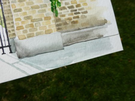
I do what I gotta do. I cut out the offending non-symmetry, I Elmer’s Glue-in a new piece of paper, and I paint in a new symmetry:
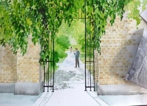
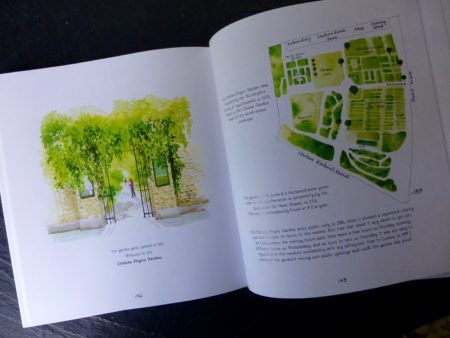
And the rest is history, on page 142 of my book, Gardens of Awe and Folly:
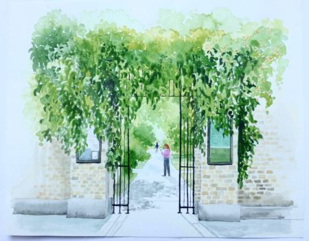
I don’t know why I can not get a good photo of this illustration — sorry, but this is the best that I can do!
P.S., I also decided to switch the people in the pic, moving the guy in the grey shirt to the back and the girl in the pink shirt to the front. It was a necessary edit to preserve the continuity of the narrative, or just a whim on my part.
So that’s how it’s not over-done, my Wonder Ones. Thank you all for your delicious stories In The Defense of Names two weeks ago — I have been traveling and have not been able to respond as I would want BUT. . .
. . . I am home from my roaming and I have so much to catch you all up on. I went to the Great Pacific Great Northwest and I met Dear Readers in Seattle! I met with Dear Readers in Portland! I happened upon Dear Readers in Cannon Beach!!!!
Next week it’s just you and me, catching up on life and adventures. Warning: There Will Be Cats.
*** The Like: I have a future blog post all about painting bricks and the like [stone walls] set up, for the perfect frantic too-busy aggravating day when we all would like to achieve a little Zen in our lives. Which should be real soon.
Have a great weekend, everyone.

