
My One Fail-Safe Rule for Packaging
If I had to give one and only one piece of advice about how best to generate a cover for a book, it would be this:
Yin and Yang the Image/s and the Word/s.
Huh?
Here’s Chip Kidd’s cover for his book on graphic design that I highly recommend…
It’s supposedly for kids and kids will absolutely love it, but I find it remarkably helpful too. And I’m on the back nine of my life:
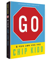
See what I mean? It even works in translation…
The image and words don’t match, which is inherently intriguing.
Here’s one more example.
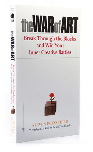
The paperback cover for The War of Art features an image created by the master of design…Milton Glaser, he of the I Love New York campaign and an absolute hero in innumerable ways.
I would love to take credit for the vision behind the paperback cover of The War of Art but I had nothing to do with it.
Back in my Rugged Land days (the perfectly aligned long-tail publishing company I started up before the ubiquity of Internet commerce, sometimes you get ahead of the market, timing is everything…) I published The War of Art in a super tricked out hardcover edition. The book sold well (a little under 10,000 hardcovers) but as a newbie publisher I decided to license paperback rights to Grand Central Publishing. GCP is a division of Hachette, one of the Big Five.
I’m the first to criticize Big Five’s standard operating procedures, but in this case, the process and professionalism of GCP’s art department and the editor who acquired the rights (Emily Griffin) really paid off. Emily is now at HarperCollins.
What my art director (the brilliant Timothy Hsu) and I went for the hardcover was to create a book that required the reader to self examine. So the cover was a sleek grid-like mosaic that had three tiny mirrors embedded. It was “paper/grid over boards.” The idea was to attract artists from any and all walks of life. I’m pleased with how it worked and it certainly did enough business to attract a major publisher’s paperback interest.
What Emily and GCP did though was to focus the book and target a very reliable market.
They decided that the paperback edition would be best served by directing it to writers. This makes absolute sense because paperbacks back then (and now) are quickly categorized in bookstores and stuck in particular shelves. Remember that this was the era of Amazon.com as a cute little online site…not the powerhouse it is today. There were no search engines that instantly gratified back then.
So Emily asked Steve if she could tweak his subtitle which was WINNING THE INNER CREATIVE BATTLE for the hardcover edition to: BREAK THROUGH THE BLOCKS AND WIN YOUR INNER CREATIVE BATTLES for the paperback.
Steve’s attitude then (and it still is today) is to cede control over the work he’s created to passionate professional advocates…even if he’s not 100% sure of what they are suggesting. Especially if he isn’t.
Emily Griffin was madly in love with The War of Art and she made a very strong case why we needed to change the subtitle and laser focus on writers. Her argument was air tight.
Obviously, the easier it is to get your book into a bookstore shelf, the better the chances of the book actually selling. Every single bookstore has a reference/writing section. If we marketed the book primarily to writers, we’d stand a good chance of getting slotted in that self-selecting section of the bookstore.
Steve signed off willingly.
And then they sent us the cover, which we both knew was perfect. It was perfect because it softened the title.
The image (a flower growing out of a block of cement) was the Yin to the title’s Yang.
Don’t forget that Steve spent years in advertising and he’s no rube when it comes to packaging, marketing, advertising etc. When he was flat broke, he was always able to get a job on Madison Avenue to refill his coffers. He’s a pro and no pushover.
The thing about the title The War of Art that Steve and I feared when we debated it is that creatives/artists are often resistant to the word WAR.
Conflict (even though it’s indispensable to any art) is not the thing people associate with art. Or want to. They want to think of art as beauty, which it certainly is. But conflict begets beauty. Ask any woman who has given birth if the process was conflicting… And no matter how odd looking, there isn’t anything more beautiful than a new baby.
I know it’s an unreliable generalization to say that creative/artists don’t want to think of the creative process as “War.” And it’s obvious untrue today after the hundreds of thousands of copies that The War of Art that have sold, but back then it was a real concern.
The title really could have backfired on us and destroyed the book’s ability to find an audience. Seriously, sometimes a title kills a book. Or the image on the cover does. But if you can Yin and Yang them, chances are they’ll intrigue…not repulse.
So back to my one ironclad, fail safe packaging rule. When in doubt, make your cover image “say” something antithetical to the title.


