
Spot the Difference
Look at this beautiful cover for the new UK paperback edition of Consequences of the Heart by Peter Cunningham. There's something strangely familiar about it . . .
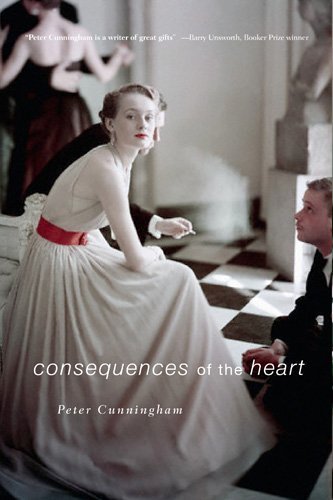
'Consequences of the Heart' by Peter Cunningham, UK paperback, released in May, 2011
But it's just one of those odd coincidences of publishing, that two book designers on opposite sides of the world would decide to use the same obscure 1930s photograph. It seems to happen fairly often. The Peter Cunningham book comes out next month, and sounds really interesting.
I must admit, though, that I prefer The FitzOsbornes in Exile cover, because it cuts out the dorky guy with the moustache, crouching on the floor. Also, that poor girl looks most uncomfortable, perched on the end of that sofa.
(Thank you to Daisy, whose comment at The Story Siren prompted me to investigate this. And by 'investigate', I mean, 'spend sixty seconds on Google'. Or possibly slightly more than sixty seconds. How distracting is that adorable Earth Day Google Doodle, with the ticklish pandas and the koala climbing the tree and the bear eating the salmon? Very, very distracting!)
In other news, The FitzOsbornes in Exile has received a starred review from Kirkus. Vicky Smith from Kirkus then asked me some thoughtful questions about the book and I did my best to answer them. The Australian edition has also been shortlisted for the 2011 Ethel Turner Prize for Young People's Literature and was named a Notable Book for Older Readers in the 2011 Children's Book Council of Australia awards. Congratulations to all the Australian authors whose books were shortlisted or named as notable books in these awards! You're all awesome!
I promise my next blog post will not mention the words 'FitzOsbornes' or 'Exile'.


