
The Making of FunnyBugs.org

Funny Bugs is a non-profit endeavor our family has been working on over the past several months. We think kids with Type 1 diabetes deserve a fun, educational, and social experience for managing their diabetes and helping others do the same. We're making plans to build that experience in our (very) limited spare time.
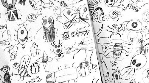
Our 7-year-old son, a Type 1 diabetic, has been the chieftain of the project. Funny Bugs is literally a product of his imagination. The name, the ideas for an app, and the initial rough sketches of bugs that are [insert obvious adjective] are all his.
The bumble bee you see on the site, based on our son's sketches above, is the handiwork of Jacob Souva. His initial sketch was exactly the direction we were seeking:
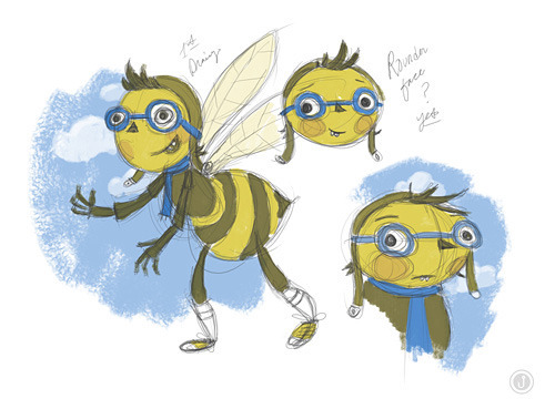
A few rounds of refining and texturizing led to the final raster image featured on the site. We couldn't be happier with the result.
As for the site, it has all the requisite bells and whistles for an HTML5/CSS3 experience: Modernizr, @font-face, parallax, CSS3 transitions and animations, and a few other tricks. This is the first site I've coded from start to finish in some time, as all front-end markup and styling for Authentic Jobs these days is in the very capable hands of Ben Bodien. I think I managed alright on my own.
The bee animation required some deft animation. The wings are a separate image from the body, allowing them to be animated by simply changing the opacity from 0 to 1:
@keyframes flap {
0% {opacity: 0;}
100% {opacity: 1;}
}
0% is the first keyframe of the animation. The second is 100%, or the ending frame. flap is the name I assigned to the animation. This name is referenced as follows:
.bee-wings {
position: absolute;
z-index: 1;
animation: flap 100ms infinite;
}
With a speed of 100ms and the animation set to infinite, the result is that the wing image shifts rapidly from fully transparent to fully opaque, making it appear as if the wings are flapping.
Note also the absolute positioning with a z-index of 1. This allows the wing image to appear behind the body image. The body image is given a value of 2, stacking it above the wing image:
.bee-body {
position: absolute;
z-index: 2;
}
The body image and wing image are wrapped in a div with the class name bee, and the entire div is animated as follows:
@keyframes flight {
0% {top: 0;}
50% {top: 15px;}
100% {top: 0;}
}
Here the div begins at the default position on the page in the first keyframe. The second keyframe, 50%, pushes the div down 15 px. The final key frame, 100%, returns the div to the default position.
To execute the animation, here's how the div is styled:
.bee {
animation: flight 2s infinite cubic-bezier(0.295, 0, 0.71, 1.0);
}
flight is the reference name I chose for the animation, 2 seconds in the duration of the animation, and infinite loops the animation. The final value, easing, is a custom value I created using Matthew Lein's Ceaser animation tool.
And that was that. I would have enjoyed the challenge of making the design responsive, but I was out of time. We had a walkathon to attend the day after I pushed the site live:

I bet you can't guess who chose the key lime color for the Funny Bugs tees.


Cameron Moll's Blog

- Cameron Moll's profile
- 4 followers

