Back to Pause on Error: My Layouts Suck
In my very earliest days of Filemakering, I latched on to the idea of making Pretty, user-friendly interfaces. I’m a true believer, partly because for many years before I developed, I worked in various offices using various interfaces of various levels of eye-ball-bleeding unfriendliness.
Anyway, when I was still threatening to stab myself in the chest with cascading deletes and poison myself with cartesian joins, I already considered myself pretty good at layouts.
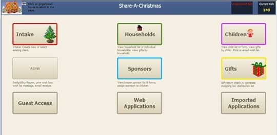
It’s true that users have thanked me for fixing their interfaces. I don’t junk up my layouts. I employ tool tips, group fields by purpose and organize by hierarchy. I’m all about the white space and consistency. Also, I like color. Sometimes too much color:
 WHAT??! It’s PRETTY!
On Monday at Pause on Error, I attended the What’s-His-Face?… session by Albert Harum-Alvarez from SmallCo. Albert is known as a layout guru.
He didn’t love my layouts.
He *sob* didn’t love my layouts.
I’m not one to let pride get in the way of my learning (usually) but truthfully it was a while before I “got” it. And I think I’ve really only “got” the tip of the iceberg, so let’s see if I can explain the flaw in my layout design.
My layouts are based on the logic of the solution I’ve just built. In the example above, most of those buttons represent a module or a process. My dashboards “think” exactly like my (also very pretty) relationship graphs.
Unfortunately, users don’t necessarily think this way, and they shouldn’t be required to.
Here are some notes from this session:
Even if the core of your interface is complex and rich, you may start out with the appealing and obvious. The extend to which your products come alive is the extent to which you can tell your story.
We like to see things as whole and complete — provide a sense of wholeness.
Questions to ask your app:
What is this? What kind of thing is it? Can I clearly make it out
Which one is it? Which individual? Can I identify it? Is it the one I’m looking for? Can the user spot the record they want easily?
What’s up with this thing? How is this thing doing right now? What should I do with it?
The 4 F’s: Fight, Feed, Flee, Mate. I wrote that, and literally do not remember what it means. I was too busy realizing how that last one started with F.
Provide name for the entity — clearly identifiable.
If these notes don’t make a ton of sense, it’s because I’m still pretty vague on the concept. I kind of “get” how my interfaces should be better, but I’m struggling how to explain it.
Something like: The user goes into the app for a reason. Let that reason be apparent. Instead of making her click to the thing she usually does, have it be in front of her. Let anything else be a logical progression from there.
This isn’t from Albert, but from my clumsy understanding: if you’ve got it right, then most of the time the user won’t have to go to another screen to do the thing that he does most of the time. He’s already there and it’s already spread before him.
If you want to know more (as in anything about this topic since I’ve conveyed no helpful information), Albert teaches the Design MasterClass, so check that out. Meantime, I’m going to go back and re-read the iOS Human Interface Guidelines.


