
Inflation Expectations And Unemployment Claims
Excellent chartwork from Tom Powers:
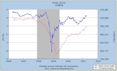
Keynesian models of unemployment predict that lower inflation expectations will correlate with new unemployment claims, at least in the short run. Does this hold up empirically? The blue line is the TIPS spread, where lower inflation expectations are lower on the graph. The red line is the negative four-week average of new unemployment claims (seasonally adjusted), where more claims are lower on the graph.
In short, the data appears to be in line with the theory. But I should note that while what we see empirically is a correlation, the theory states that the direction of causation runs from inflation expectations to employment. We're seeing the empirical correlation that the theory tells us to expect.


Matthew Yglesias's Blog

- Matthew Yglesias's profile
- 72 followers

