
Expectations of inflation
The FOMC and professional forecasters expect the Fed eventually to achieve its 2% inflation target. The market seems more skeptical.
The U.S. Treasury began offering Treasury Inflation Protected Securities to investors in 1997. These insure against inflation risk by having a coupon and par value that rise with the headline CPI. The difference between the yield on a normal Treasury security (which has no guarantee against inflation) and a TIPS of corresponding maturity is known as the break-even inflation rate. The break-even inflation rate is sometimes used as an indicator of the rate of inflation that bond market participants are expecting. That number currently is around 1.6% for every maturity.
The blue line in the graph below plots the current break-even inflation rate on the vertical axis as a function of the maturity of the security on the horizontal axis. This comes from the difference in continuously compounded pure discount bond yields as calculated by Gurkaynak, Sack and Wright. The height of the graph corresponds to the average expected inflation rate (quoted at an annual rate) between today and n years from today, plotted as a function of n.
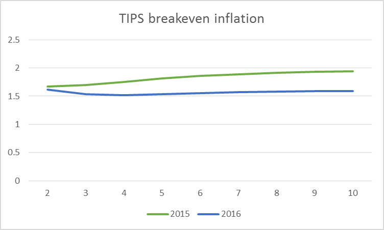
Horizontal axis: number of years looking ahead from indicated date. Blue: break-even inflation rates over that horizon as of May 4, 2016. Green: break-even inflation rates as of May 4, 2015. Data source: Gurkaynak, Sack and Wright.
The green line in the above graph plots the break-even inflation rate as of a year ago. At that time, the market seemed to have more faith that the Fed would gradually achieve its 2% inflation target.
A number of researchers have argued that risk premia and lack of liquidity in the market for TIPS make interpretation of the break-even inflation rate difficult. Haubrich, Pennacchi and Ritchken (2012) developed an alternative approach that relies on the prices of more liquid inflation swaps along with nominal interest rates and survey-based measures. Updates of their series are regularly posted by the Federal Reserve Bank of Cleveland. Although their series often differs from the TIPS break-even rates, at the moment they are virtually identical, signaling 1.6% inflation for most of the next decade.

Horizontal axis: number of years looking ahead from indicated date. Blue: average expected inflation rates over that horizon as of April 2016 as inferred from inflation swaps, nominal yields, and survey responses. Green: expected inflation rates as of April 2015. Data source: Inflation Central.
Boragan Aruoba has an interesting new approach to summarizing the answers given by survey respondents to questions about the future. The basic idea is to assume that graphs like the ones above can be represented using the functional form that is used in the dynamic Nelson-Siegel model of interest rates developed by Christensen, Diebold and Rudebusch (2011). The values of the functions at any point in time are then chosen to match as closely as possible the answers given to different questions in the Survey of Professional Forecasters as well as the Blue Chip forecasts. Unlike the TIPS- and swaps-based measures, Aruoba’s survey summary suggests an inflation rate that will average above the Fed’s 2% target. Moreover, the curve has moved up from where it was a year ago.

Horizontal axis: number of years looking ahead from indicated date. Blue: average expected inflation rates over that horizon as of April 2016 as inferred from Survey of Professional Forecasters and Blue Chip forecast. Green: expected inflation rates as of April 2015. Data source: Federal Reserve Bank of Philadelphia.
So who’s right? I know this much: inflation came in at 0.8% over the last 12 months and has averaged under 1.6% over the last 10 years.
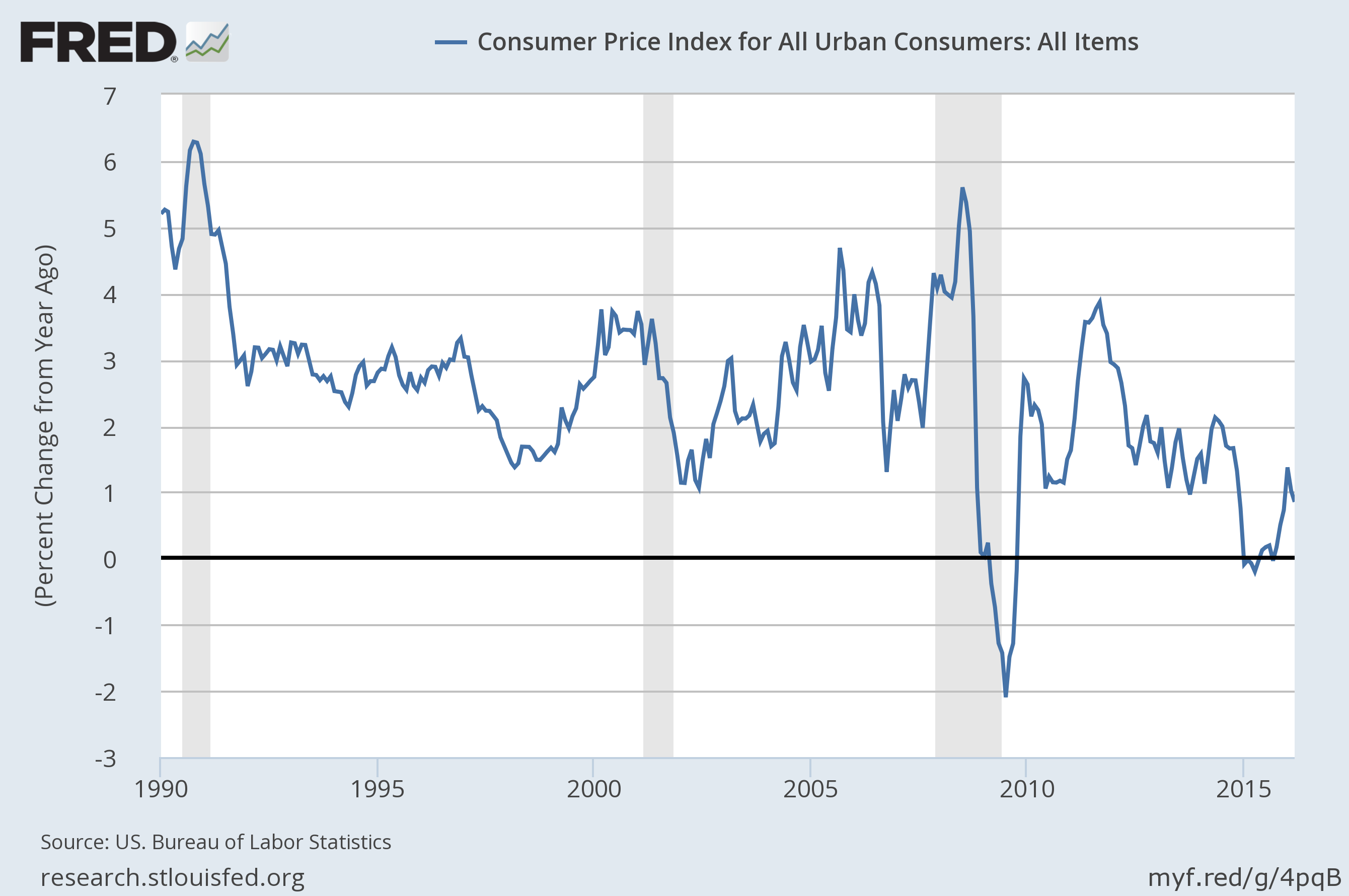
Year-over-year percent change in the seasonally unadjusted CPI. Source: FRED.
They say, “don’t bet against the Fed.” But the market seems to be doing just that.


Menzie David Chinn's Blog


