
Pulled From My Files #39: BLACK CONDOR LOGO

Images © DC Comics.
I have very little on this logo in my files, just two marker sketches. I like the Condor silhouette on this one, but the R looks too much like a B. That could have been fixed, but Curtis King and the editor must not have liked this direction for the revamp of the 1940s character in 1992.
 There must have been more sketches, but this is the other one I have. the triangle in the background is part of the character’s chest symbol. I don’t know where the idea for the rest came from.
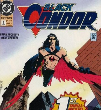 Nor do I have a copy of the finished logo, but here it is on the first issue, and it looks like an exact tracing of the second logo sketch. Not one of my best efforts, but not bad.


No comments have been added yet.
Todd Klein's Blog

- Todd Klein's profile
- 28 followers
Todd Klein isn't a Goodreads Author
(yet),
but they
do have a blog,
so here are some recent posts imported from
their feed.

