
FINAL SHADOWS ON THE MOON COVER!
It's here at last - the absolutely, positively FINAL version of the UK
Shadows on the Moon
 artwork.
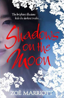
And look, look! Red lettering! This is a drama you guys don't even know about. When I was shown the very first version of this cover, the lettering was red. I was really pleased about that, because red is an important colour in the story, and it's a traditionally lucky colour in China and the east as well. However, some people in the marketing department felt that the red give the book more of a historical novel look, rather than fantasy. They switched to pale pink lettering.
I hate to be an awkward author (can't always avoid it, but I don't LIKE it) and I also know that marketing are far more experienced and knowledgeable on how cover art will be recieved than I. So I tried not to make a fuss about this. But I did express my love for the red to my editor and to Sophie, the designer. Time passed. The ARCs came out, and the lettering was pink. I resigned myself.
But I think my crafty editor was scheming in the background. She got Sophie to mock up a version of the new The Swan Kingdom cover with red lettering, and everyone in marketing liked it so much they asked Sophie to do a mock-up of
Shadows on the Moon
with red as well. And lo, somehow the planets aligned, the continents shifted, and my beloved red was BACK.
cover with red lettering, and everyone in marketing liked it so much they asked Sophie to do a mock-up of
Shadows on the Moon
with red as well. And lo, somehow the planets aligned, the continents shifted, and my beloved red was BACK.
I haven't got a finished version of the book yet (I'm hoping to see layout pages, or page proofs, soon, which is the final stage before the book goes to production) but I have been sent some cover flats, which are actual book covers which have not been bound to a manuscript. They are, frankly, breath-taking. The red lettering is a really deep, blood red, and it's foiled, which means it's *sparkly*. Another lovely effect is something called 'spot UV' on the Sakura - the white cherry blossoms on the cover - which is basically a clear glaze that makes them shiny.
Other features include a QR code on the back which owners of smartphones will be able to scan to see the official book trailer Walker Books plan to make. Next to the QR code is the Great Britain Sasakawa Foundation logo. Shadows on the Moon
won the Sasakawa Prize before it was even in its final draft, and I'm honoured to see that logo there.

The best thing about the cover, however, is undoubtedly that beautiful face, smiling so sadly and mysteriously around the spine, like a Japanese Mona Lisa. When I was asked what I would like to see on the cover, of course I knew that my suggestions would only ever be that, and that marketing and sales would naturally have a far bigger impact than I. But I begged - BEGGED - that if they use a picture of a girl on the cover, please let her be Japanese. Please let her be young enough to realistically pass for my heroine. And please, please, not wearing Geisha make-up. I'm so sick of seeing books with Asian heroines who are not even Geisha, and yet have a model with a thick coating of traditional Geisha make-up on the cover. This is called exoticising, and I feel it's patronising and wrong.
But despite my fears - and those were realistic fears, given the repeated instances of white-washing and RaceFail in YA - Walker Books came through. They gave this book a cover model who could truly BE my heroine, a cover I can be proud of, a cover that reflects the book in every way. I have been LUCKY with covers, yo, but this cover makes me feel luckiest of all.
In celebration of this my oh-my-God-I-can't-believe-I-got-so-lucky moment, I finished making two book trailers which I had been holding back on until I had the final cover image. Each trailer focuses on a different aspect of the story, and I hope you'll enjoy them. I think they are rather pretty. Feel free to disseminate them far and wide.
Happy Friday everyone!
artwork.
And look, look! Red lettering! This is a drama you guys don't even know about. When I was shown the very first version of this cover, the lettering was red. I was really pleased about that, because red is an important colour in the story, and it's a traditionally lucky colour in China and the east as well. However, some people in the marketing department felt that the red give the book more of a historical novel look, rather than fantasy. They switched to pale pink lettering.
I hate to be an awkward author (can't always avoid it, but I don't LIKE it) and I also know that marketing are far more experienced and knowledgeable on how cover art will be recieved than I. So I tried not to make a fuss about this. But I did express my love for the red to my editor and to Sophie, the designer. Time passed. The ARCs came out, and the lettering was pink. I resigned myself.
But I think my crafty editor was scheming in the background. She got Sophie to mock up a version of the new The Swan Kingdom
cover with red lettering, and everyone in marketing liked it so much they asked Sophie to do a mock-up of
Shadows on the Moon
with red as well. And lo, somehow the planets aligned, the continents shifted, and my beloved red was BACK.I haven't got a finished version of the book yet (I'm hoping to see layout pages, or page proofs, soon, which is the final stage before the book goes to production) but I have been sent some cover flats, which are actual book covers which have not been bound to a manuscript. They are, frankly, breath-taking. The red lettering is a really deep, blood red, and it's foiled, which means it's *sparkly*. Another lovely effect is something called 'spot UV' on the Sakura - the white cherry blossoms on the cover - which is basically a clear glaze that makes them shiny.
Other features include a QR code on the back which owners of smartphones will be able to scan to see the official book trailer Walker Books plan to make. Next to the QR code is the Great Britain Sasakawa Foundation logo. Shadows on the Moon
won the Sasakawa Prize before it was even in its final draft, and I'm honoured to see that logo there.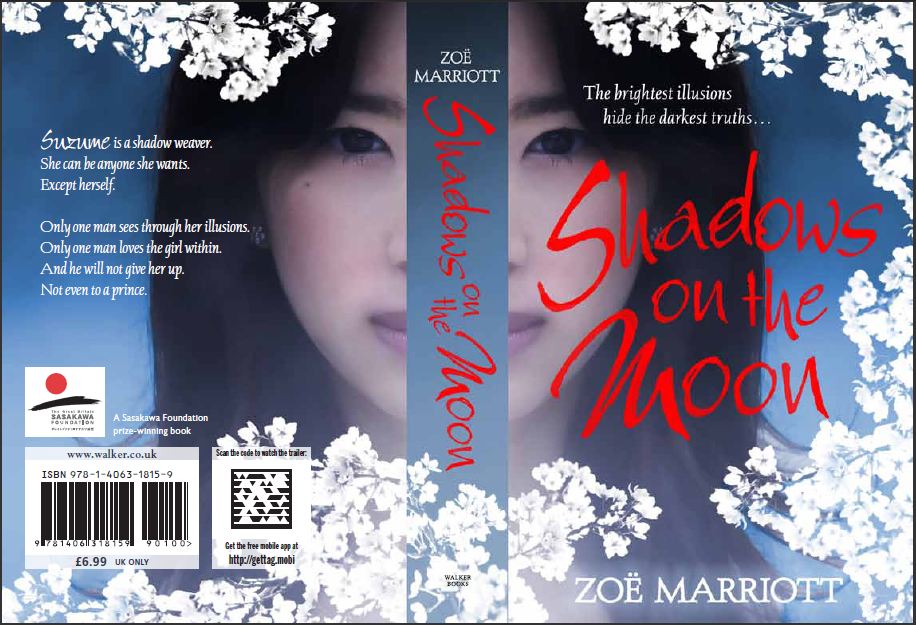
The best thing about the cover, however, is undoubtedly that beautiful face, smiling so sadly and mysteriously around the spine, like a Japanese Mona Lisa. When I was asked what I would like to see on the cover, of course I knew that my suggestions would only ever be that, and that marketing and sales would naturally have a far bigger impact than I. But I begged - BEGGED - that if they use a picture of a girl on the cover, please let her be Japanese. Please let her be young enough to realistically pass for my heroine. And please, please, not wearing Geisha make-up. I'm so sick of seeing books with Asian heroines who are not even Geisha, and yet have a model with a thick coating of traditional Geisha make-up on the cover. This is called exoticising, and I feel it's patronising and wrong.
But despite my fears - and those were realistic fears, given the repeated instances of white-washing and RaceFail in YA - Walker Books came through. They gave this book a cover model who could truly BE my heroine, a cover I can be proud of, a cover that reflects the book in every way. I have been LUCKY with covers, yo, but this cover makes me feel luckiest of all.
In celebration of this my oh-my-God-I-can't-believe-I-got-so-lucky moment, I finished making two book trailers which I had been holding back on until I had the final cover image. Each trailer focuses on a different aspect of the story, and I hope you'll enjoy them. I think they are rather pretty. Feel free to disseminate them far and wide.
Happy Friday everyone!


No comments have been added yet.


