Okay, recently a few covers have caught my eye, not because they are necessarily BAD, but because I can’t read the title. Now, maybe it’s just me, but I would consider it a problem if you can’t read the title when you look at the cover of a book. I would especially consider that a problem if a significant number of potential readers are probably looking at tiny little thumbnail online.
So, first:

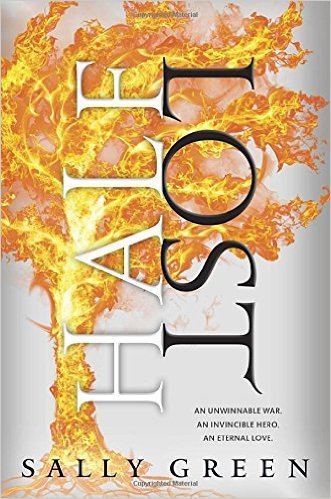
Quick, what is the title of that book?
LOST, right?
Did you actually see the “Half” right away? I didn’t. I was looking at a much smaller picture than this, in a row of little pictures of book covers.
Could you actually read the word “Half” right away? I couldn’t. I had to turn my head sideways and squint.
If the overall cover were darker . . . if the weird fiery tree were darker . . . if you saw the book full size and close up . . . then maybe. But I personally have trouble reading words that are printed sideways.
The titles of the other two books in the trilogy, Half Bad and Half Wild, are in the same style and equally difficult to read. As branding, the cover design is awesome. As readable covers, I think they’re . . . not quite ideal. But maybe that’s just me! What do you think? Thumbs up or thumbs down? Can you read the word “Half” easily, or does it not bother you even though you can’t?
Next:

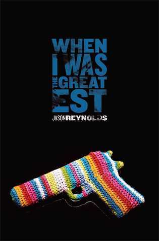
Quick, what does that say?
When . . . I . . . Was . . . um, what is that? oh . . . the Great . . . est.
I’m sorry, but that is ridiculously difficult. Is it supposed to be cute to cram all the words of the title together in this little box, even though you have to do this thing with great-est?
That weird potholder-covered gun doesn’t work for me, either. That’s a separate issue from an unreadable title, but I’m all, Wait, what? Is this a . . . cozy mystery? A murder mystery? Or wait! Could it be a gritty contemporary YA? Who would think of that, from this cover?
The title does sound like a YA, to me. “When I Was the Greatest,” sure, that sounds YA. Of course, it would be easier to tell that if I could read the title.
One more:

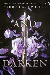
How about that? I like the title just fine: “And I Darken.” That’s good! Nothing wrong with the title!
But the “I” is hidden in the sword blade — so well hidden I actually missed it at first. I literally read this as “And … Darken.” That’s a terrible thing to do to a perfectly fine title.
Of course, maybe my eyes aren’t quite what they used to be. But I’m glad all my recent covers have featured type you can read, strongly contrasted with the background colors.

 newest »
 newest »
 The top one and the bottom one caught my eye as pieces of beautiful design, so I spent a bit more time trying to parse out the titles. (But thumbnail size I would have had significantly more trouble.) That middle one, though, would have lost me.

