
Book Cover – How to Create your Own
Anyone who knows me, knows I do my own covers. Why? To get a good cover design is expensive. There’s always Fiverr, but I know what my book is about and I already know what I’m looking for. I’m a bit of a control freak when it comes to my own work. It’s one of the primary reasons I self-publish.
Despite this, it’s usually preferred to get it professionally done, especially because the cover is what drives in interested readers.
Anyways, if you still want to create your own cover, this is what I recommend.
No more than three colors.
Pick three or less colors for the cover of your book. Too many colors does the opposite of what we want. It looks busy and uninteresting, like a grandma’s favorite floral dress. It’s so busy that we kind of look over it.
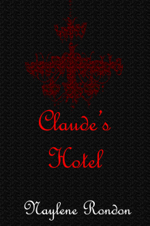 For example, my upcoming book Claude’s Hotel also uses three colors, Black, White, and Red. (I love black and white.)
Also, my book Native Foreigners. I won’t lie, it isn’t the greatest cover in the world, but it is passable. I focused on Black, White, and Orange. 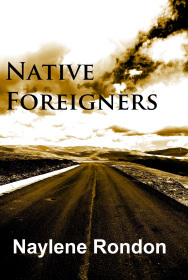
At the time, I didn’t have any photo editing softwares, so I controlled the colors with pixlr editor, using the color lookup feature. I love this feature. It allows you to control the colors in the image and the colors depth. When I had a photography class a few years ago, it was the only editing tool I would ever use. It helped create the most stunning black and white pictures. I’ll attach some examples.


Exceptions
There are exceptions, such as having people on your covers. Humans can’t help, but be multicolored. If you have a person or people on your cover, just make sure they are the focus. Then ensure whatever else is on the cover still follows the three colors rule.
Image Editing Software
To make a good cover, you need to have a decent image editing software.
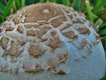
Personally, I don’t have much experience with Photoshop. I used it once for Claude’s Hotel cover. I admit, the layering tools were extremely helpful. Claude’s hotel was done with only two photos. One was multiplied with the other to create the unique chandelier. I’ll zoom in on the details.

However, you don’t need photoshop. As written above, Native Foreigners were done with free software. I used pixels editor for the color shift and then used Paint for the text. Simple, but it worked.
Stock Photos
Stock photos are your new best friends. You’ll need them if you want your cover to have any image or design that wasn’t hand-drawn(I don’t recommend hand drawing anything unless you are a stellar artist).
If you can afford buying the license and stock photo then go ahead. I always preferred free stock photos. They are limiting, however they also helped increase my creativity. My limitation helped me consider new ways of achieving something. My original idea for Claude’s Hotel’s cover would have been a disaster if I bought the stock photo wanted. I would have never gotten it so close.
Here’s some free stock photo websites I recommend.


More Than Scribbles

- Naylene Rondon's profile
- 22 followers

